Huge last-minute discounts for FabCon Vienna from September 15-18, 2025
Supplies are limited. Contact info@espc.tech right away to save your spot before the conference sells out.
Get your discount- Power BI forums
- Get Help with Power BI
- Desktop
- Service
- Report Server
- Power Query
- Mobile Apps
- Developer
- DAX Commands and Tips
- Custom Visuals Development Discussion
- Health and Life Sciences
- Power BI Spanish forums
- Translated Spanish Desktop
- Training and Consulting
- Instructor Led Training
- Dashboard in a Day for Women, by Women
- Galleries
- Data Stories Gallery
- Themes Gallery
- Contests Gallery
- Quick Measures Gallery
- Notebook Gallery
- Translytical Task Flow Gallery
- TMDL Gallery
- R Script Showcase
- Webinars and Video Gallery
- Ideas
- Custom Visuals Ideas (read-only)
- Issues
- Issues
- Events
- Upcoming Events
Score big with last-minute savings on the final tickets to FabCon Vienna. Secure your discount
- Power BI forums
- Forums
- Get Help with Power BI
- Desktop
- Re: Enhanced Line and Clustered Column Chart with ...
- Subscribe to RSS Feed
- Mark Topic as New
- Mark Topic as Read
- Float this Topic for Current User
- Bookmark
- Subscribe
- Printer Friendly Page
- Mark as New
- Bookmark
- Subscribe
- Mute
- Subscribe to RSS Feed
- Permalink
- Report Inappropriate Content
Enhanced Line and Clustered Column Chart with Table
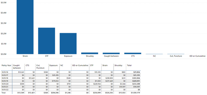
I have the Definite Logic Stacked Column or Clustered Column Chart with Table.
Is there a visual like that that allows for expanded table like example below. Currently I use Clustered Column Chart and Matrix Table.
It would be nice if table values lined up under thier corresponding column like we see in Excel.
Solved! Go to Solution.
- Mark as New
- Bookmark
- Subscribe
- Mute
- Subscribe to RSS Feed
- Permalink
- Report Inappropriate Content
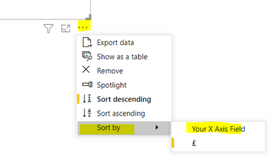
You can change the sort order of the columns in your chart to be alphabetical based on your X axis field.
Then you could try and size the chart and the table columns to align.
- Mark as New
- Bookmark
- Subscribe
- Mute
- Subscribe to RSS Feed
- Permalink
- Report Inappropriate Content
When you say "user can select their choice" do you mean clicking on a value or column in one of the visuals to apply a filter? If so you could edit interactions to force one to highlight the other instead of filtering out the other values?
- Mark as New
- Bookmark
- Subscribe
- Mute
- Subscribe to RSS Feed
- Permalink
- Report Inappropriate Content
You can change the sort order of the columns in your chart to be alphabetical based on your X axis field.
Then you could try and size the chart and the table columns to align.
- Mark as New
- Bookmark
- Subscribe
- Mute
- Subscribe to RSS Feed
- Permalink
- Report Inappropriate Content
I forgot ahout ToolTip to add a field to sort on which solves the issue of sorting on the same field for Chart and Table. My problem is that a user can select their choice for the report, so results in Chart and Table change and vary by person, so no way to line up table to chart?


