FabCon is coming to Atlanta
Join us at FabCon Atlanta from March 16 - 20, 2026, for the ultimate Fabric, Power BI, AI and SQL community-led event. Save $200 with code FABCOMM.
Register now!- Power BI forums
- Get Help with Power BI
- Desktop
- Service
- Report Server
- Power Query
- Mobile Apps
- Developer
- DAX Commands and Tips
- Custom Visuals Development Discussion
- Health and Life Sciences
- Power BI Spanish forums
- Translated Spanish Desktop
- Training and Consulting
- Instructor Led Training
- Dashboard in a Day for Women, by Women
- Galleries
- Data Stories Gallery
- Themes Gallery
- Contests Gallery
- QuickViz Gallery
- Quick Measures Gallery
- Visual Calculations Gallery
- Notebook Gallery
- Translytical Task Flow Gallery
- TMDL Gallery
- R Script Showcase
- Webinars and Video Gallery
- Ideas
- Custom Visuals Ideas (read-only)
- Issues
- Issues
- Events
- Upcoming Events
The Power BI Data Visualization World Championships is back! Get ahead of the game and start preparing now! Learn more
- Power BI forums
- Forums
- Get Help with Power BI
- Desktop
- Dynamically setting the x-axis of date values base...
- Subscribe to RSS Feed
- Mark Topic as New
- Mark Topic as Read
- Float this Topic for Current User
- Bookmark
- Subscribe
- Printer Friendly Page
- Mark as New
- Bookmark
- Subscribe
- Mute
- Subscribe to RSS Feed
- Permalink
- Report Inappropriate Content
Dynamically setting the x-axis of date values based on slicer selection
Hi All,
I have a master calendar table with Date,Year, Month, YearMonthShortName and more
The fact data has values from Year 2013 till Year 2018 July month.
I have slicers for Year, Month from the calendar table.
I have a trend line chart of sales from fact table.
The requirement is like this.
a) If no year and month is selected the x-Axis value of the trend line chart to be restricted to Months between Jan and July of 2018.
b) If a year is selected the x-axis value of the trend line chart should be from Jan of the selected year to the max month of the selected year.
c) if a year and month has been selected only the year & month value.
d) If two years are selected and no month then x-axis value should be from the 1st month of the minimum year to the last month of the max year.
And more scenarios.
Any help will be appreciated.
Cheers
CheenuSing
Solved! Go to Solution.
- Mark as New
- Bookmark
- Subscribe
- Mute
- Subscribe to RSS Feed
- Permalink
- Report Inappropriate Content
hi,@CheenuSing
After my test, You may try to create dynamic measures to achieve your requirement a,
and b,c,d can be achieved by add year column and month column.
use the below video to do it, https://www.youtube.com/watch?v=gYbGNeYD4OY
and i have done a demo by it.
Result:
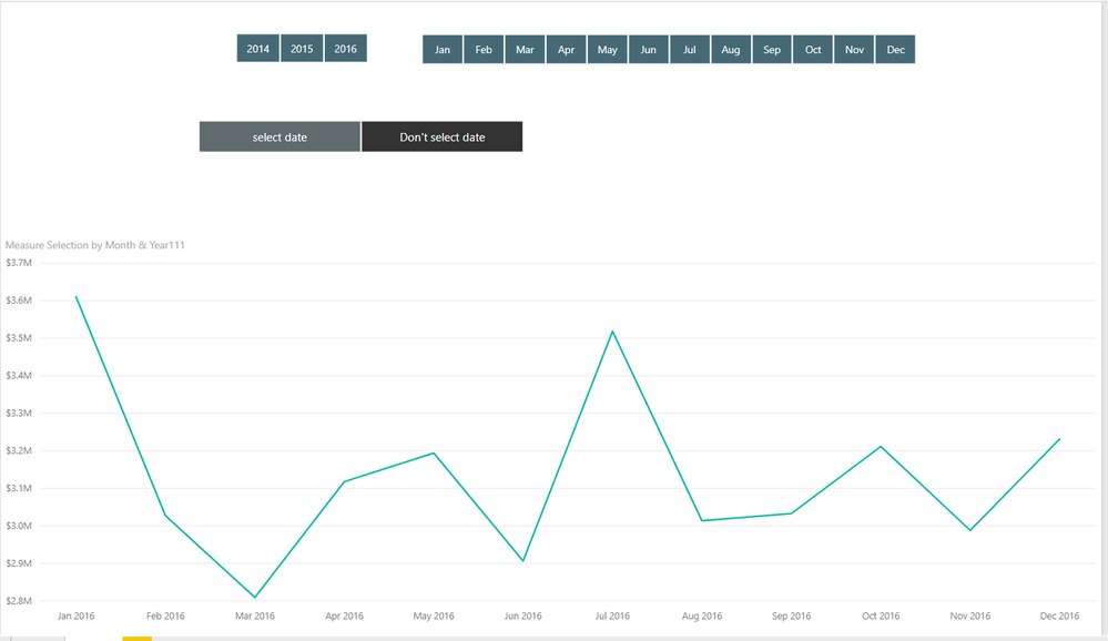
when i don't select any date in slicer
the x-Axis value of the trend line chart is only year of 2016
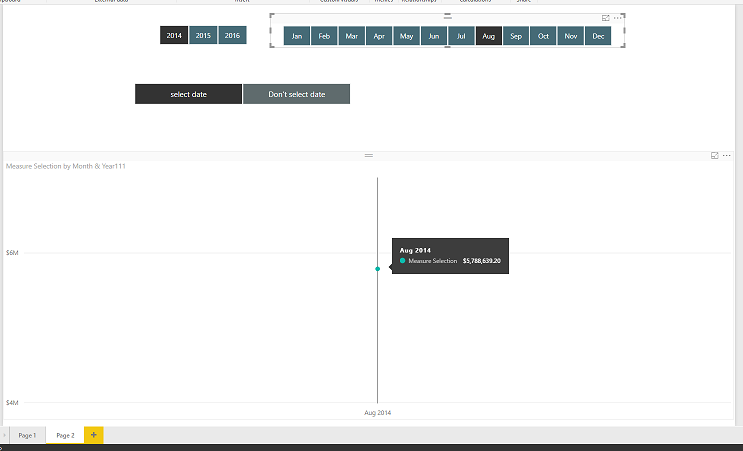
then i select year 2014 ,the x-Axis value of the trend line chart is all the month of year 2014
then i select year 2014 and month Aug ,the x-Axis value of the trend line chart is the month Aug and the year 2014
Here is my demo, please try it
Best Regards,
Lin
If this post helps, then please consider Accept it as the solution to help the other members find it more quickly.
- Mark as New
- Bookmark
- Subscribe
- Mute
- Subscribe to RSS Feed
- Permalink
- Report Inappropriate Content
Many a thanks for the solution . It meets my requirement to some extent.
The solution works perfectly for some scenarios.
In one of the scenarios I need to show from the minimum of the year in the data to the selected year or till the end of the date if no year is selected. Say I have 2014, 2015,2016,2017 andd 2018 data upto Jul.
When no year is selected I need to show from 2014 Jan to 2018 Jul. WHen a year is selected then from 2014 Jan to the last month of Year selected or upto the month of the Year selected in slicer. Under this scenario, since the slicer is already selected the x-axis used in the sample always shows for the year selected only. Trying to loop the dates table based on the Min of Year also does not work because of row context.
How do we go about this then.
Cheers
CheenuSing
Helpful resources

Power BI Dataviz World Championships
The Power BI Data Visualization World Championships is back! Get ahead of the game and start preparing now!

| User | Count |
|---|---|
| 62 | |
| 47 | |
| 40 | |
| 36 | |
| 23 |
| User | Count |
|---|---|
| 184 | |
| 123 | |
| 106 | |
| 78 | |
| 52 |


