Get Fabric certified for FREE!
Don't miss your chance to take the Fabric Data Engineer (DP-700) exam on us!
Learn more- Power BI forums
- Get Help with Power BI
- Desktop
- Service
- Report Server
- Power Query
- Mobile Apps
- Developer
- DAX Commands and Tips
- Custom Visuals Development Discussion
- Health and Life Sciences
- Power BI Spanish forums
- Translated Spanish Desktop
- Training and Consulting
- Instructor Led Training
- Dashboard in a Day for Women, by Women
- Galleries
- Data Stories Gallery
- Themes Gallery
- Contests Gallery
- QuickViz Gallery
- Quick Measures Gallery
- Visual Calculations Gallery
- Notebook Gallery
- Translytical Task Flow Gallery
- TMDL Gallery
- R Script Showcase
- Webinars and Video Gallery
- Ideas
- Custom Visuals Ideas (read-only)
- Issues
- Issues
- Events
- Upcoming Events
The FabCon + SQLCon recap series starts April 14th at 8am Pacific. If you’re tracking where AI is going inside Fabric, this first session is a can't miss. Register now
- Power BI forums
- Forums
- Get Help with Power BI
- Desktop
- Dynamic time hierarchy Filter selection
- Subscribe to RSS Feed
- Mark Topic as New
- Mark Topic as Read
- Float this Topic for Current User
- Bookmark
- Subscribe
- Printer Friendly Page
- Mark as New
- Bookmark
- Subscribe
- Mute
- Subscribe to RSS Feed
- Permalink
- Report Inappropriate Content
Dynamic time hierarchy Filter selection
Hi Power BI Community,
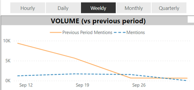
I'm suddenly view a report with the period filter selection.
When you choose the period in the filter pannel, line chart wil be reflected.
How can we archive this, assume we have data in lowest level (data by daily or hourly)?
View by daily
View by weekly
Solved! Go to Solution.
- Mark as New
- Bookmark
- Subscribe
- Mute
- Subscribe to RSS Feed
- Permalink
- Report Inappropriate Content
Hi @Anonymous ,
There is another way to achieve your requirements. You can try to allow a user to make a slicer selection that dynamically updates the x-axis. Here are some blogs for your reference:
Dynamic X axis on charts - Power BI - RADACAD;
Dynamic Attributes In A Power BI Report - P3 Adaptive;
Solved: Dynamic change in X Axis - Microsoft Power BI Community.
Best Regards,
Icey
If this post helps, then please consider Accept it as the solution to help the other members find it more quickly.
- Mark as New
- Bookmark
- Subscribe
- Mute
- Subscribe to RSS Feed
- Permalink
- Report Inappropriate Content
@Anonymous , You need to use bookmark for this
refer
https://blog.crossjoin.co.uk/2018/04/20/dynamically-changing-a-chart-axis-in-power-bi-using-bookmarks-and-buttons/
https://radacad.com/bookmarks-and-buttons-making-power-bi-charts-even-more-interactive
Helpful resources

New to Fabric Survey
If you have recently started exploring Fabric, we'd love to hear how it's going. Your feedback can help with product improvements.

Power BI DataViz World Championships - June 2026
A new Power BI DataViz World Championship is coming this June! Don't miss out on submitting your entry.

Join our Fabric User Panel
Share feedback directly with Fabric product managers, participate in targeted research studies and influence the Fabric roadmap.

| User | Count |
|---|---|
| 53 | |
| 39 | |
| 37 | |
| 19 | |
| 18 |
| User | Count |
|---|---|
| 67 | |
| 66 | |
| 34 | |
| 32 | |
| 29 |


