FabCon is coming to Atlanta
Join us at FabCon Atlanta from March 16 - 20, 2026, for the ultimate Fabric, Power BI, AI and SQL community-led event. Save $200 with code FABCOMM.
Register now!- Power BI forums
- Get Help with Power BI
- Desktop
- Service
- Report Server
- Power Query
- Mobile Apps
- Developer
- DAX Commands and Tips
- Custom Visuals Development Discussion
- Health and Life Sciences
- Power BI Spanish forums
- Translated Spanish Desktop
- Training and Consulting
- Instructor Led Training
- Dashboard in a Day for Women, by Women
- Galleries
- Data Stories Gallery
- Themes Gallery
- Contests Gallery
- Quick Measures Gallery
- Notebook Gallery
- Translytical Task Flow Gallery
- TMDL Gallery
- R Script Showcase
- Webinars and Video Gallery
- Ideas
- Custom Visuals Ideas (read-only)
- Issues
- Issues
- Events
- Upcoming Events
Join the Fabric FabCon Global Hackathon—running virtually through Nov 3. Open to all skill levels. $10,000 in prizes! Register now.
- Power BI forums
- Forums
- Get Help with Power BI
- Desktop
- Re: Dynamic text box on top of column charts
- Subscribe to RSS Feed
- Mark Topic as New
- Mark Topic as Read
- Float this Topic for Current User
- Bookmark
- Subscribe
- Printer Friendly Page
- Mark as New
- Bookmark
- Subscribe
- Mute
- Subscribe to RSS Feed
- Permalink
- Report Inappropriate Content
Dynamic text box on top of column charts
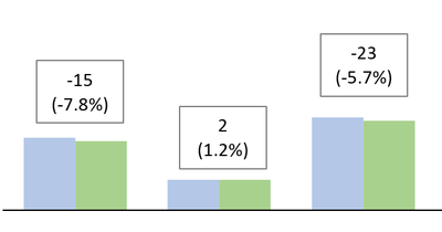
I have a clustered column chart that shows data for two years (in blue and green) and each cluster corresponds to a different deparment.
Is there a way to add some kind of text box (or similar) on top of the bars indicating the delta between the two? I want to explicitely show the delta (and percentage) between the two years. (See below).
Solved! Go to Solution.
- Mark as New
- Bookmark
- Subscribe
- Mute
- Subscribe to RSS Feed
- Permalink
- Report Inappropriate Content
Hello @zervino ,
check this out https://youtu.be/RaHi6yc02Tc?si=7RKPn_w1lH21v86c
Proud to be a Super User! |  |
- Mark as New
- Bookmark
- Subscribe
- Mute
- Subscribe to RSS Feed
- Permalink
- Report Inappropriate Content
Hi @zervino ,
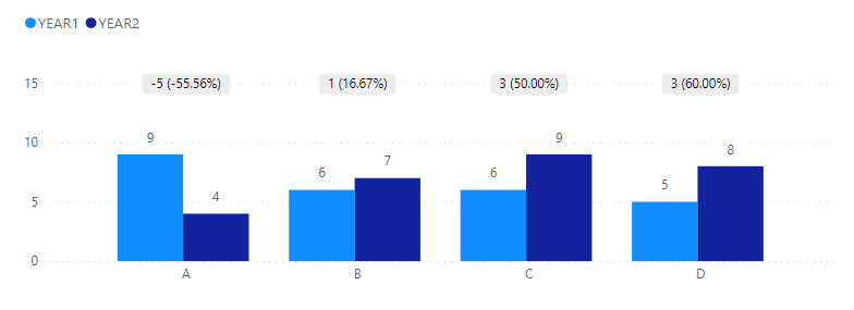
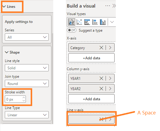
I tried to make one with line and clustered bar charts.
Unfortunately it does not recognize line breaks. Please check the example file.
Diff =
VAR _Diff = [YEAR2] - [YEAR1]
VAR _Rate = FORMAT( DIVIDE(_Diff,[YEAR1]),"Percent")
RETURN
_Diff & UNICHAR(10) & "(" & _Rate & ")"
Best Regards,
Gao
Community Support Team
If there is any post helps, then please consider Accept it as the solution to help the other members find it more quickly.
If I misunderstand your needs or you still have problems on it, please feel free to let us know. Thanks a lot!
How to get your questions answered quickly -- How to provide sample data in the Power BI Forum -- China Power BI User Group
- Mark as New
- Bookmark
- Subscribe
- Mute
- Subscribe to RSS Feed
- Permalink
- Report Inappropriate Content
Hello @zervino ,
check this out https://youtu.be/RaHi6yc02Tc?si=7RKPn_w1lH21v86c
Proud to be a Super User! |  |
Helpful resources

FabCon Global Hackathon
Join the Fabric FabCon Global Hackathon—running virtually through Nov 3. Open to all skill levels. $10,000 in prizes!

Power BI Monthly Update - September 2025
Check out the September 2025 Power BI update to learn about new features.


