FabCon is coming to Atlanta
Join us at FabCon Atlanta from March 16 - 20, 2026, for the ultimate Fabric, Power BI, AI and SQL community-led event. Save $200 with code FABCOMM.
Register now!- Power BI forums
- Get Help with Power BI
- Desktop
- Service
- Report Server
- Power Query
- Mobile Apps
- Developer
- DAX Commands and Tips
- Custom Visuals Development Discussion
- Health and Life Sciences
- Power BI Spanish forums
- Translated Spanish Desktop
- Training and Consulting
- Instructor Led Training
- Dashboard in a Day for Women, by Women
- Galleries
- Data Stories Gallery
- Themes Gallery
- Contests Gallery
- QuickViz Gallery
- Quick Measures Gallery
- Visual Calculations Gallery
- Notebook Gallery
- Translytical Task Flow Gallery
- TMDL Gallery
- R Script Showcase
- Webinars and Video Gallery
- Ideas
- Custom Visuals Ideas (read-only)
- Issues
- Issues
- Events
- Upcoming Events
View all the Fabric Data Days sessions on demand. View schedule
- Power BI forums
- Forums
- Get Help with Power BI
- Desktop
- Dynamic measure on the x-axis in simple bar chart ...
- Subscribe to RSS Feed
- Mark Topic as New
- Mark Topic as Read
- Float this Topic for Current User
- Bookmark
- Subscribe
- Printer Friendly Page
- Mark as New
- Bookmark
- Subscribe
- Mute
- Subscribe to RSS Feed
- Permalink
- Report Inappropriate Content
Dynamic measure on the x-axis in simple bar chart diagram
Hi,
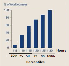
the dataset contains a number of journeys with different length in hours. In a simple clusted column chart, I want to display on the y-axis the number of journeys (as % of total number of journeys) and on the x-axis percentiles which are labelled 1-x for 10th percentile (can be 5 as in the example visualisation below), 1-y for the 25th percentile, and so on, where x, y etc are calculated with the PERCENTICE.EXC DAX-function and will return the max range number for 10%, 25%, 50%, 75%, 90% and 100%-tiles. I.e., the labels on the x-axis are not fixed, but dynamic. It seems it is not possible to put measures that calculate the percentile ranges on it. Or is it possible to achive through some trick (with disconnected tables or similar)?
Kind regards
C
Solved! Go to Solution.
- Mark as New
- Bookmark
- Subscribe
- Mute
- Subscribe to RSS Feed
- Permalink
- Report Inappropriate Content
Hi @PowerBINewbie66 ,
In this visual, measure cannot be used as x-axis. You need to convert the measure into calculated columns and create a slicer based on the calculate column to filter the x-axis.
If this post helps, then please consider Accept it as the solution to help the other members find it.
- Mark as New
- Bookmark
- Subscribe
- Mute
- Subscribe to RSS Feed
- Permalink
- Report Inappropriate Content
Thanks for your help! /C
- Mark as New
- Bookmark
- Subscribe
- Mute
- Subscribe to RSS Feed
- Permalink
- Report Inappropriate Content
A clarification, the x-axis contains the hour banding groups/percentiles where 10%, 25%, 50%, 75%, 90% and 100% of the journeys fall withing
Helpful resources

Power BI Monthly Update - November 2025
Check out the November 2025 Power BI update to learn about new features.

Fabric Data Days
Advance your Data & AI career with 50 days of live learning, contests, hands-on challenges, study groups & certifications and more!


