FabCon is coming to Atlanta
Join us at FabCon Atlanta from March 16 - 20, 2026, for the ultimate Fabric, Power BI, AI and SQL community-led event. Save $200 with code FABCOMM.
Register now!- Power BI forums
- Get Help with Power BI
- Desktop
- Service
- Report Server
- Power Query
- Mobile Apps
- Developer
- DAX Commands and Tips
- Custom Visuals Development Discussion
- Health and Life Sciences
- Power BI Spanish forums
- Translated Spanish Desktop
- Training and Consulting
- Instructor Led Training
- Dashboard in a Day for Women, by Women
- Galleries
- Data Stories Gallery
- Themes Gallery
- Contests Gallery
- QuickViz Gallery
- Quick Measures Gallery
- Visual Calculations Gallery
- Notebook Gallery
- Translytical Task Flow Gallery
- TMDL Gallery
- R Script Showcase
- Webinars and Video Gallery
- Ideas
- Custom Visuals Ideas (read-only)
- Issues
- Issues
- Events
- Upcoming Events
The Power BI Data Visualization World Championships is back! Get ahead of the game and start preparing now! Learn more
- Power BI forums
- Forums
- Get Help with Power BI
- Desktop
- Dynamic line chart axis based on the date selectio...
- Subscribe to RSS Feed
- Mark Topic as New
- Mark Topic as Read
- Float this Topic for Current User
- Bookmark
- Subscribe
- Printer Friendly Page
- Mark as New
- Bookmark
- Subscribe
- Mute
- Subscribe to RSS Feed
- Permalink
- Report Inappropriate Content
Dynamic line chart axis based on the date selection
Hi ,
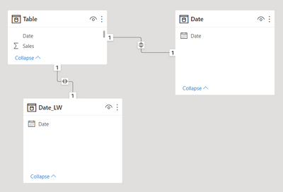
I am creating a simple sales dashboard with last week & current week sales. The requirement is to have the last week sales and current week sales in seperate line charts. The axis of the last week sales line chart should be the last week start date & end date of the selected date range. I created following measures

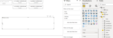
I created a line chart with DateLw as X axis & LastWkSales as Y axis.

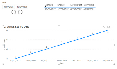
This chart is showing Selected Date range as the X axis. The expected output is to show dates between the Last week start & End date as the X axis. For eg : If the daterange selected is between Jan 9th & Jan 15th , the chart should show the X axis with dates between Jan 2nd & jan 8th
Solved! Go to Solution.
- Mark as New
- Bookmark
- Subscribe
- Mute
- Subscribe to RSS Feed
- Permalink
- Report Inappropriate Content
Hi @baijumohan1990 ,
According to your description, you want to create a dynamic DateLw table changed by the Date slicer, but a calculated table/column can't affected by slicers, it's by design. You can go to the Data view of the DateLw table to see, it always stays the same no matter how the slicer changes.
Here's my solution.
1. Modify the DateLw table like below. Don't make relationship between DateLw table and other tables.
DateLw = CALENDARAUTO()2. Modify the LastWkSales measure:
LastWkSales =
IF (
    MAX ( 'DateLw'[Date] ) >= [LastWkStart]
        && MAX ( 'DateLw'[Date] ) <= [LastWkEnd],
    CALCULATE (
        SUM ( 'Table'[Sales] ),
        FILTER ( ALL ( 'Table' ), 'Table'[Date] = MAX ( 'DateLw'[Date] ) )
    ),
    BLANK ()
)
Get the correct result.
I attach my sample below for reference.
Best Regards,
Community Support Team _ kalyj
If this post helps, then please consider Accept it as the solution to help the other members find it more quickly.
- Mark as New
- Bookmark
- Subscribe
- Mute
- Subscribe to RSS Feed
- Permalink
- Report Inappropriate Content
Thank you. that's works like a charm 🙂
- Mark as New
- Bookmark
- Subscribe
- Mute
- Subscribe to RSS Feed
- Permalink
- Report Inappropriate Content
hi @amitchandak
I tried your solution as suggested
1. Created an indepdendant date table

- Mark as New
- Bookmark
- Subscribe
- Mute
- Subscribe to RSS Feed
- Permalink
- Report Inappropriate Content
@baijumohan1990 , In case you need display a range different then what you selected. You need an independent date table
Need of an Independent Date Table:https://www.youtube.com/watch?v=44fGGmg9fHI
//Date1 is independent Date table, Date is joined with Table
new measure =
var _max =maxx(allseleceted(date1),date1[date])
var _min =maxx(allseleceted(date1),date1[date])
var datediff1 = datediff(_min,_max,day)+1
var _maxX = _max-datediff1
var _minX = _min -datediff1
return
calculate( sum(Table[Value]), filter('Date', 'Date'[Date] >=_minX && 'Date'[Date] <=_maxX))
Helpful resources

Power BI Monthly Update - November 2025
Check out the November 2025 Power BI update to learn about new features.

Fabric Data Days
Advance your Data & AI career with 50 days of live learning, contests, hands-on challenges, study groups & certifications and more!

| User | Count |
|---|---|
| 57 | |
| 43 | |
| 41 | |
| 22 | |
| 17 |
| User | Count |
|---|---|
| 183 | |
| 114 | |
| 93 | |
| 62 | |
| 45 |

