- Power BI forums
- Get Help with Power BI
- Desktop
- Service
- Report Server
- Power Query
- Mobile Apps
- Developer
- DAX Commands and Tips
- Custom Visuals Development Discussion
- Health and Life Sciences
- Power BI Spanish forums
- Translated Spanish Desktop
- Training and Consulting
- Instructor Led Training
- Dashboard in a Day for Women, by Women
- Galleries
- Data Stories Gallery
- Themes Gallery
- Contests Gallery
- QuickViz Gallery
- Quick Measures Gallery
- Visual Calculations Gallery
- Notebook Gallery
- Translytical Task Flow Gallery
- TMDL Gallery
- R Script Showcase
- Webinars and Video Gallery
- Ideas
- Custom Visuals Ideas (read-only)
- Issues
- Issues
- Events
- Upcoming Events
Learn from the best! Meet the four finalists headed to the FINALS of the Power BI Dataviz World Championships! Register now
- Power BI forums
- Forums
- Get Help with Power BI
- Desktop
- Dynamic histogram?
- Subscribe to RSS Feed
- Mark Topic as New
- Mark Topic as Read
- Float this Topic for Current User
- Bookmark
- Subscribe
- Printer Friendly Page
- Mark as New
- Bookmark
- Subscribe
- Mute
- Subscribe to RSS Feed
- Permalink
- Report Inappropriate Content
Dynamic histogram?
Hello!
Could you help me, please.
I have a table with field adr_id and two dates - date_start and date_end.
I want to show slicer to set the range of dates , and show a histogram with two bins - count records in range of dates, and count records NOT in range of dates...
it very simply with static data, we should just create calculated fields....
But I absolutely lost how to do it in dynamic...
Okay, I may create a table filled with dates (CALENDAR), make a slicer with this table, but - what next?
Calculated fields are not calculated dynamically as I see...
Measure? I think solution is very simple but can't find it )
Any ideas, friends?
Solved! Go to Solution.
- Mark as New
- Bookmark
- Subscribe
- Mute
- Subscribe to RSS Feed
- Permalink
- Report Inappropriate Content
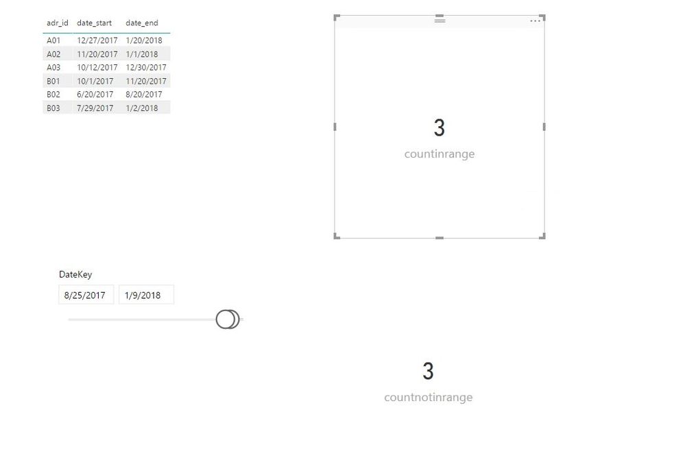
Create the following measures in your table. Please note that there is no relationship between your table and calendar table.
mindate = MIN('Date'[DateKey])
Maxdate = MAX('Date'[DateKey])
countinrange = CALCULATE(COUNTA(Table[adr_id]),FILTER(Table,Table[date_start]>=[mindate]&&Table[date_end]<=[Maxdate]))
countnotinrange = CALCULATE(COUNTA(Table[adr_id]),FILTER(Table,Table[date_start]<=[mindate]||Table[date_end]>=[Maxdate]))
Regards,
Lydia
- Mark as New
- Bookmark
- Subscribe
- Mute
- Subscribe to RSS Feed
- Permalink
- Report Inappropriate Content
@fedorez,
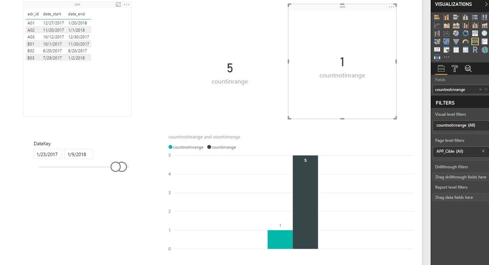
You can create one chart to display the measures, see the example below.
Regards,
Lydia
- Mark as New
- Bookmark
- Subscribe
- Mute
- Subscribe to RSS Feed
- Permalink
- Report Inappropriate Content
Create the following measures in your table. Please note that there is no relationship between your table and calendar table.
mindate = MIN('Date'[DateKey])
Maxdate = MAX('Date'[DateKey])
countinrange = CALCULATE(COUNTA(Table[adr_id]),FILTER(Table,Table[date_start]>=[mindate]&&Table[date_end]<=[Maxdate]))
countnotinrange = CALCULATE(COUNTA(Table[adr_id]),FILTER(Table,Table[date_start]<=[mindate]||Table[date_end]>=[Maxdate]))
Regards,
Lydia
- Mark as New
- Bookmark
- Subscribe
- Mute
- Subscribe to RSS Feed
- Permalink
- Report Inappropriate Content
Thank you for your answer, @Anonymous
In your example, countinrange and countnotinrange - two charts... Is where the way to see this bins in one chart? The reason is scale. When we are using Auto scale mode for Y-axis, we have different scales for out two charts. Course, we can set min and max for Y-axis manually in design mode, but we don't know the limits for Y in real life.... it's a problem
Regards,
Denis
- Mark as New
- Bookmark
- Subscribe
- Mute
- Subscribe to RSS Feed
- Permalink
- Report Inappropriate Content
@fedorez,
You can create one chart to display the measures, see the example below.
Regards,
Lydia
- Mark as New
- Bookmark
- Subscribe
- Mute
- Subscribe to RSS Feed
- Permalink
- Report Inappropriate Content
Thanks a lot!
And one last impotent question.
May I do the same in case of Calculated table , when my Table based on some more tables?
Like this:
Table = GROUPBY(Table2;[name];"days_average";AVERAGEX(CURRENTGROUP();[period]))
- Mark as New
- Bookmark
- Subscribe
- Mute
- Subscribe to RSS Feed
- Permalink
- Report Inappropriate Content
- Mark as New
- Bookmark
- Subscribe
- Mute
- Subscribe to RSS Feed
- Permalink
- Report Inappropriate Content
Thank you, Lydia.
- Mark as New
- Bookmark
- Subscribe
- Mute
- Subscribe to RSS Feed
- Permalink
- Report Inappropriate Content
@fedorez,
If you solve your issue, please accept my replies as answer, that way, other community members could easily find the answer when they get same issues.
Regards,
Lydia
Helpful resources
| User | Count |
|---|---|
| 58 | |
| 45 | |
| 31 | |
| 17 | |
| 16 |
| User | Count |
|---|---|
| 75 | |
| 65 | |
| 46 | |
| 23 | |
| 22 |


