FabCon is coming to Atlanta
Join us at FabCon Atlanta from March 16 - 20, 2026, for the ultimate Fabric, Power BI, AI and SQL community-led event. Save $200 with code FABCOMM.
Register now!- Power BI forums
- Get Help with Power BI
- Desktop
- Service
- Report Server
- Power Query
- Mobile Apps
- Developer
- DAX Commands and Tips
- Custom Visuals Development Discussion
- Health and Life Sciences
- Power BI Spanish forums
- Translated Spanish Desktop
- Training and Consulting
- Instructor Led Training
- Dashboard in a Day for Women, by Women
- Galleries
- Data Stories Gallery
- Themes Gallery
- Contests Gallery
- QuickViz Gallery
- Quick Measures Gallery
- Visual Calculations Gallery
- Notebook Gallery
- Translytical Task Flow Gallery
- TMDL Gallery
- R Script Showcase
- Webinars and Video Gallery
- Ideas
- Custom Visuals Ideas (read-only)
- Issues
- Issues
- Events
- Upcoming Events
Vote for your favorite vizzies from the Power BI Dataviz World Championship submissions. Vote now!
- Power BI forums
- Forums
- Get Help with Power BI
- Desktop
- Re: Dynamic histogram?
- Subscribe to RSS Feed
- Mark Topic as New
- Mark Topic as Read
- Float this Topic for Current User
- Bookmark
- Subscribe
- Printer Friendly Page
- Mark as New
- Bookmark
- Subscribe
- Mute
- Subscribe to RSS Feed
- Permalink
- Report Inappropriate Content
Dynamic histogram?
Hello!
Could you help me, please.
I have a table with field adr_id and two dates - date_start and date_end.
I want to show slicer to set the range of dates , and show a histogram with two bins - count records in range of dates, and count records NOT in range of dates...
it very simply with static data, we should just create calculated fields....
But I absolutely lost how to do it in dynamic...
Okay, I may create a table filled with dates (CALENDAR), make a slicer with this table, but - what next?
Calculated fields are not calculated dynamically as I see...
Measure? I think solution is very simple but can't find it )
Any ideas, friends?
Solved! Go to Solution.
- Mark as New
- Bookmark
- Subscribe
- Mute
- Subscribe to RSS Feed
- Permalink
- Report Inappropriate Content
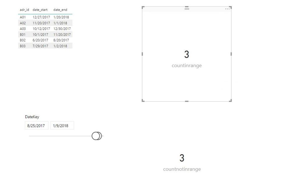
Create the following measures in your table. Please note that there is no relationship between your table and calendar table.
mindate = MIN('Date'[DateKey])
Maxdate = MAX('Date'[DateKey])
countinrange = CALCULATE(COUNTA(Table[adr_id]),FILTER(Table,Table[date_start]>=[mindate]&&Table[date_end]<=[Maxdate]))
countnotinrange = CALCULATE(COUNTA(Table[adr_id]),FILTER(Table,Table[date_start]<=[mindate]||Table[date_end]>=[Maxdate]))
Regards,
Lydia
- Mark as New
- Bookmark
- Subscribe
- Mute
- Subscribe to RSS Feed
- Permalink
- Report Inappropriate Content
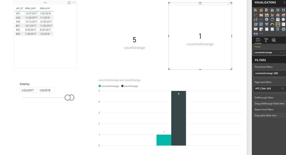
@fedorez,
You can create one chart to display the measures, see the example below.
Regards,
Lydia
- Mark as New
- Bookmark
- Subscribe
- Mute
- Subscribe to RSS Feed
- Permalink
- Report Inappropriate Content
Create the following measures in your table. Please note that there is no relationship between your table and calendar table.
mindate = MIN('Date'[DateKey])
Maxdate = MAX('Date'[DateKey])
countinrange = CALCULATE(COUNTA(Table[adr_id]),FILTER(Table,Table[date_start]>=[mindate]&&Table[date_end]<=[Maxdate]))
countnotinrange = CALCULATE(COUNTA(Table[adr_id]),FILTER(Table,Table[date_start]<=[mindate]||Table[date_end]>=[Maxdate]))
Regards,
Lydia
- Mark as New
- Bookmark
- Subscribe
- Mute
- Subscribe to RSS Feed
- Permalink
- Report Inappropriate Content
Thank you for your answer, @Anonymous
In your example, countinrange and countnotinrange - two charts... Is where the way to see this bins in one chart? The reason is scale. When we are using Auto scale mode for Y-axis, we have different scales for out two charts. Course, we can set min and max for Y-axis manually in design mode, but we don't know the limits for Y in real life.... it's a problem
Regards,
Denis
- Mark as New
- Bookmark
- Subscribe
- Mute
- Subscribe to RSS Feed
- Permalink
- Report Inappropriate Content
@fedorez,
You can create one chart to display the measures, see the example below.
Regards,
Lydia
- Mark as New
- Bookmark
- Subscribe
- Mute
- Subscribe to RSS Feed
- Permalink
- Report Inappropriate Content
Thanks a lot!
And one last impotent question.
May I do the same in case of Calculated table , when my Table based on some more tables?
Like this:
Table = GROUPBY(Table2;[name];"days_average";AVERAGEX(CURRENTGROUP();[period]))
- Mark as New
- Bookmark
- Subscribe
- Mute
- Subscribe to RSS Feed
- Permalink
- Report Inappropriate Content
- Mark as New
- Bookmark
- Subscribe
- Mute
- Subscribe to RSS Feed
- Permalink
- Report Inappropriate Content
Thank you, Lydia.
- Mark as New
- Bookmark
- Subscribe
- Mute
- Subscribe to RSS Feed
- Permalink
- Report Inappropriate Content
@fedorez,
If you solve your issue, please accept my replies as answer, that way, other community members could easily find the answer when they get same issues.
Regards,
Lydia
Helpful resources

Join our Community Sticker Challenge 2026
If you love stickers, then you will definitely want to check out our Community Sticker Challenge!

Power BI Monthly Update - January 2026
Check out the January 2026 Power BI update to learn about new features.

| User | Count |
|---|---|
| 65 | |
| 65 | |
| 45 | |
| 21 | |
| 18 |
| User | Count |
|---|---|
| 115 | |
| 114 | |
| 38 | |
| 36 | |
| 26 |


