Get Fabric certified for FREE!
Don't miss your chance to take the Fabric Data Engineer (DP-600) exam for FREE! Find out how by attending the DP-600 session on April 23rd (pacific time), live or on-demand.
Learn more- Power BI forums
- Get Help with Power BI
- Desktop
- Service
- Report Server
- Power Query
- Mobile Apps
- Developer
- DAX Commands and Tips
- Custom Visuals Development Discussion
- Health and Life Sciences
- Power BI Spanish forums
- Translated Spanish Desktop
- Training and Consulting
- Instructor Led Training
- Dashboard in a Day for Women, by Women
- Galleries
- Data Stories Gallery
- Themes Gallery
- Contests Gallery
- QuickViz Gallery
- Quick Measures Gallery
- Visual Calculations Gallery
- Notebook Gallery
- Translytical Task Flow Gallery
- TMDL Gallery
- R Script Showcase
- Webinars and Video Gallery
- Ideas
- Custom Visuals Ideas (read-only)
- Issues
- Issues
- Events
- Upcoming Events
Next up in the FabCon + SQLCon recap series: The roadmap for Microsoft SQL and Maximizing Developer experiences in Fabric. All sessions are available on-demand after the live show. Register now
- Power BI forums
- Forums
- Get Help with Power BI
- Desktop
- Re: Dynamic graph changes as filter changes
- Subscribe to RSS Feed
- Mark Topic as New
- Mark Topic as Read
- Float this Topic for Current User
- Bookmark
- Subscribe
- Printer Friendly Page
- Mark as New
- Bookmark
- Subscribe
- Mute
- Subscribe to RSS Feed
- Permalink
- Report Inappropriate Content
Dynamic graph changes as filter changes
Hi all,
is it possible to create a graph that change X-axis as the filer change.
For example, if i am select fruit, then the graph show number of Orange and Apple.
If i select Meat, then it shows Beef and Pork
thanks, here is the link the PBI file :Dynamic Graph.pbix
Solved! Go to Solution.
- Mark as New
- Bookmark
- Subscribe
- Mute
- Subscribe to RSS Feed
- Permalink
- Report Inappropriate Content
Hi @ktt777
Please try this:
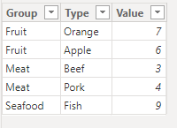
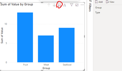
First of all, I create a set of sample because the link you provided can't be opened:
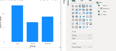
Then add a column chart and a slicer
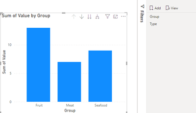
Select the bookmark in the View pane:
And add a bookmark named 'Group' :
Click this icon and add a bookmark as 'Type':
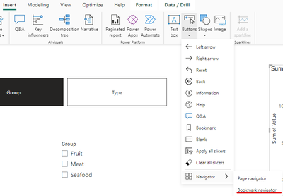
Next, select bookmark navigator in the Insert pane:
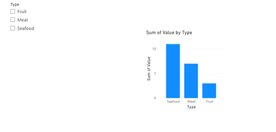
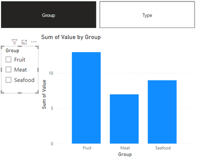
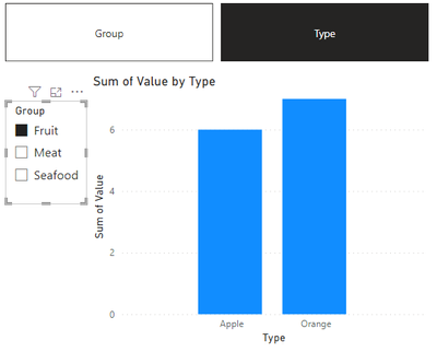
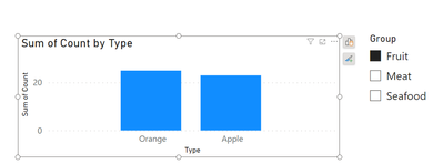
So you can change the x-axis by the two bookmark and select by slicer, the result is as follow:
Best Regards
Zhengdong Xu
If this post helps, then please consider Accept it as the solution to help the other members find it more quickly.
- Mark as New
- Bookmark
- Subscribe
- Mute
- Subscribe to RSS Feed
- Permalink
- Report Inappropriate Content
thank you, but i want the graph still show at group type when the fillter does not select for any type.
the graph and change to product when one of the group type is selected
- Mark as New
- Bookmark
- Subscribe
- Mute
- Subscribe to RSS Feed
- Permalink
- Report Inappropriate Content
You can do this base on how your data is structure.
If all the data like the Group Type and Product is on the same table then you can build your graph base on the Product (Apple, Orange,et..) Then just have your filter build on the group type.
If you have your data in different tables they you need to create a relationship between and do the same as above create the graph base on the product and your filter base on the group type.
If you do not have the product type any where then you would need to create a table that you would need to maintain as you add new products and add the group they belong to. Then create a relationship with the main table and create the graph again base on the products filter on group type.
Helpful resources

New to Fabric Survey
If you have recently started exploring Fabric, we'd love to hear how it's going. Your feedback can help with product improvements.

Power BI DataViz World Championships - June 2026
A new Power BI DataViz World Championship is coming this June! Don't miss out on submitting your entry.

Join our Fabric User Panel
Share feedback directly with Fabric product managers, participate in targeted research studies and influence the Fabric roadmap.

| User | Count |
|---|---|
| 48 | |
| 45 | |
| 41 | |
| 20 | |
| 17 |
| User | Count |
|---|---|
| 69 | |
| 63 | |
| 32 | |
| 31 | |
| 25 |
