FabCon is coming to Atlanta
Join us at FabCon Atlanta from March 16 - 20, 2026, for the ultimate Fabric, Power BI, AI and SQL community-led event. Save $200 with code FABCOMM.
Register now!- Power BI forums
- Get Help with Power BI
- Desktop
- Service
- Report Server
- Power Query
- Mobile Apps
- Developer
- DAX Commands and Tips
- Custom Visuals Development Discussion
- Health and Life Sciences
- Power BI Spanish forums
- Translated Spanish Desktop
- Training and Consulting
- Instructor Led Training
- Dashboard in a Day for Women, by Women
- Galleries
- Data Stories Gallery
- Themes Gallery
- Contests Gallery
- QuickViz Gallery
- Quick Measures Gallery
- Visual Calculations Gallery
- Notebook Gallery
- Translytical Task Flow Gallery
- TMDL Gallery
- R Script Showcase
- Webinars and Video Gallery
- Ideas
- Custom Visuals Ideas (read-only)
- Issues
- Issues
- Events
- Upcoming Events
The Power BI Data Visualization World Championships is back! Get ahead of the game and start preparing now! Learn more
- Power BI forums
- Forums
- Get Help with Power BI
- Desktop
- Re: Dynamic formatting of measures - tutorial
- Subscribe to RSS Feed
- Mark Topic as New
- Mark Topic as Read
- Float this Topic for Current User
- Bookmark
- Subscribe
- Printer Friendly Page
- Mark as New
- Bookmark
- Subscribe
- Mute
- Subscribe to RSS Feed
- Permalink
- Report Inappropriate Content
Dynamic formatting of measures - tutorial
Hi everyone - I would like to share how to use dynamic formatting on measures in Power BI.
This has already been available by using FORMAT DAX function, however that function converts measures to text and so it could not be used on most visuals.
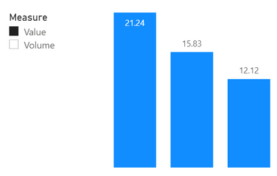
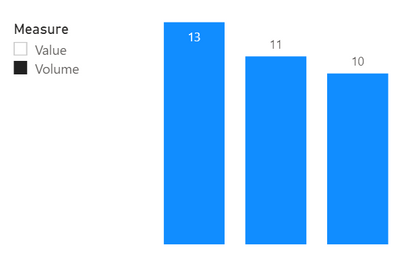
Here is the final result that we will get. With a selection of a measure the formatting will change (2 decimal places for Value and 0 for Volume):
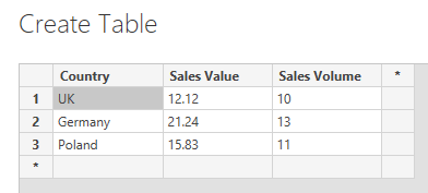
I will be working on a simple sales table with data:
Tutorial - step by step:
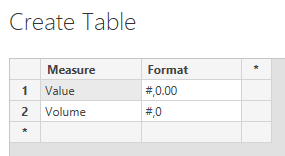
1. Create a table with measures that you would like to select on the report. Add additional column that describes the desired measure format (you can use any format string that you would normaly use in the FORMAT() DAX function)
2. Create a Dynamic measure with switch.
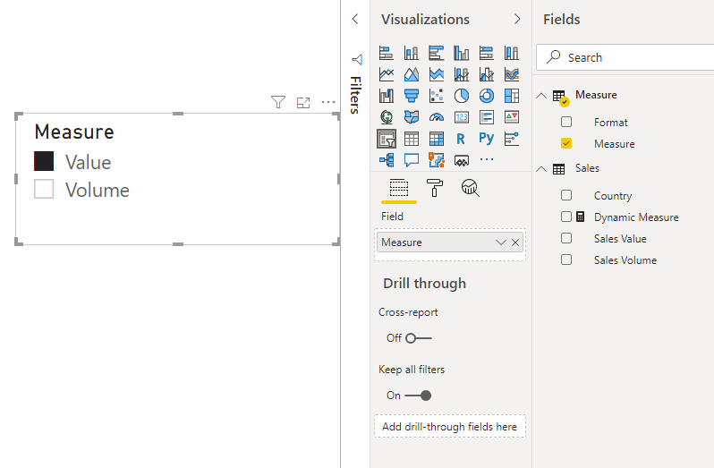
3. Add a slicer and add your Measure column to it so that we can select the measure we wish to see. Select a random value in the slicer.
4. Create a visual and add a desired Dimension (in my case Country) and Dynamic Measure as Value.
You will now be able to swap the measure on the graph based on the selection from the slicer but both measures still have the same format.
5. Now we get to the hard part. You will need to add a Calculation Group using Tabular Editor.
You need to download and install it and then you will see it on the "External Tools" ribon in Power BI.
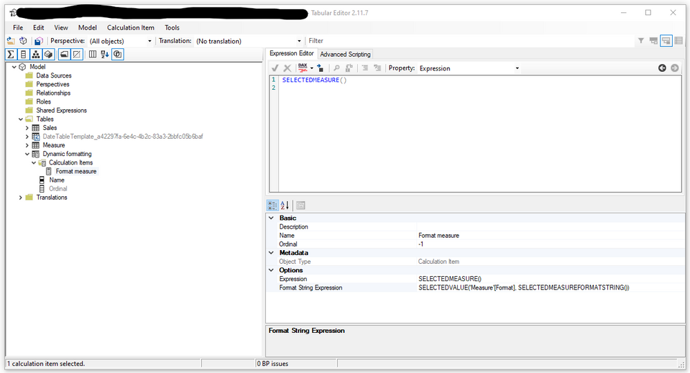
Open Tabular Editor and create a new Calculation Group. I have called mine Dynamic formatting.
Add new Calculation Item. I have called mine Format Measure.
In the Expression Editor add SELECTEDMEASURE()
In Format String Expression add SELECTEDVALUE('Measure'[Format], SELECTEDMEASUREFORMATSTRING())
This will take the measure used on the visual and format it by the definition from 'Measure'[Format]
Click Save Changes and return to Power BI
6. Include Dynamic formatting in the graph. You can do it in two ways:
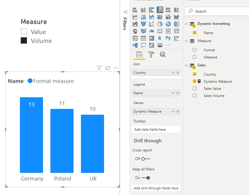
a. Add the Name from Dynamic formatting to graph legend (I had some problems with graph colors with this aproach)
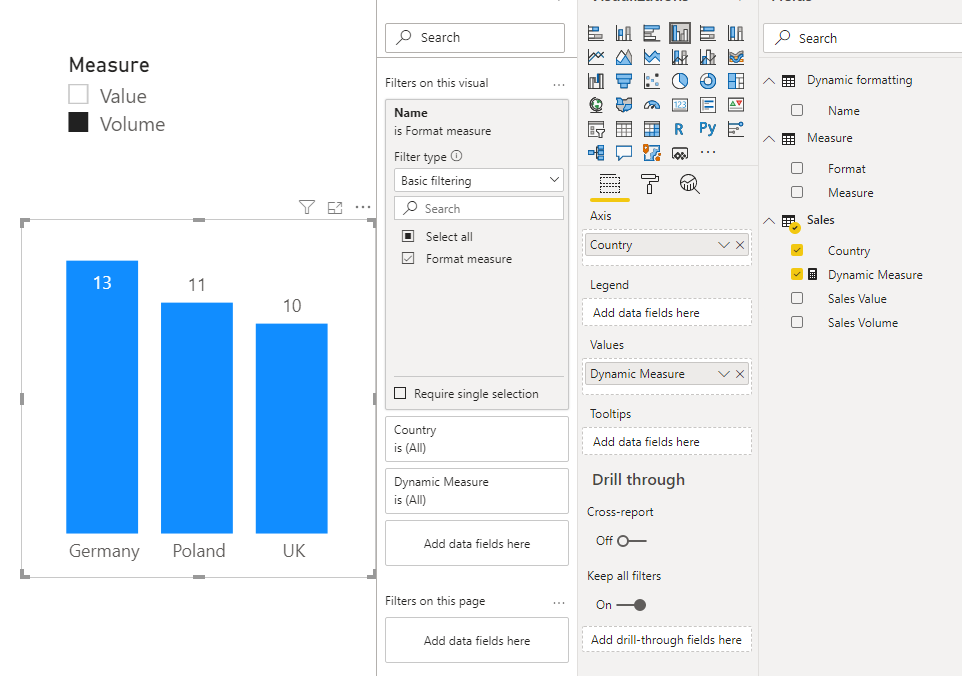
b. Add Name from Dynamic formatting to visual filters and just select the only value
That's it.
-- UPDATE --
This solution can generate issues on the report.
1. Once this is implemented, all of your numerical column will loose the "aggregate icon" in the model.
This behaviour will persist even when you set the column aggregation to SUM or any other aggregation method.
You will not be able to simply drag and drop them to a visualization. A measure based on that column needs to be created first and then used in the visual.
I have also had a problem with creating a "Line and stacked column chart". Adding both - chart and line ended up with a Power BI error.
Regards
- Mark as New
- Bookmark
- Subscribe
- Mute
- Subscribe to RSS Feed
- Permalink
- Report Inappropriate Content
Thank you so much for this! Is there a way for you to make certain fields "ignore" the formatting. I.E. the user selects "Sales" and there is a meausure ($), growth ($), and % Growth (%). I want the formatting to apply to the first two measures, but have the Growth % Ignore the formating.
To deploy, i followed step 6b. Add Name from Dynamic formatting to visual filters. Therefore I tried to use ALL in the Growth % calculation, but it is still recognizing the filter.
- Mark as New
- Bookmark
- Subscribe
- Mute
- Subscribe to RSS Feed
- Permalink
- Report Inappropriate Content
Hi, I met the same problem as you - cannot make this way of formatting to ignore some of the fields. Have you had solution for this?
- Mark as New
- Bookmark
- Subscribe
- Mute
- Subscribe to RSS Feed
- Permalink
- Report Inappropriate Content
Hi Rafal,
Thanks so much for posting that! It has been really helpful and has been the first time I have used Tabular Editor. I have no idea how the solution worked but my report is looking very sleek now!
Best wishes, Laurence
- Mark as New
- Bookmark
- Subscribe
- Mute
- Subscribe to RSS Feed
- Permalink
- Report Inappropriate Content
Despite the limitations, this is by far the most useful approach to the selectable measure formatting problem I've seen. Every other tutorial on the topic involves setting static measures and/or formatting assignments, where this leaves it fully dynamic and based entirely on an easy adjustable table.
- Mark as New
- Bookmark
- Subscribe
- Mute
- Subscribe to RSS Feed
- Permalink
- Report Inappropriate Content
Hi Rafal,
Thanks for your solution.
I tried all the steps laid out 1 by 1 but it didn't work out with option 6 (b).
I am using Line and Clustered Column chart.
Do you have any new updates for this kind of charts.
Appreciate your help.
Thank you.
- Mark as New
- Bookmark
- Subscribe
- Mute
- Subscribe to RSS Feed
- Permalink
- Report Inappropriate Content
Awesome sulution! This helped me A LOT! I was using the Switch Measure option for 53 different metrics, some needed to be displayed as 1, some as 1.1, some as 1.11, some as 1.1% and some as 1.11% (you get the idea).
With this solution I'm now able to display every metrics in it's own format!
However, is this approach also working for formatting?
- Mark as New
- Bookmark
- Subscribe
- Mute
- Subscribe to RSS Feed
- Permalink
- Report Inappropriate Content
Hello, Thank you for the guide, it helped me with a visual where I was using a Dynamic Measure.
But....
It seems to have an effect on a lot of other visuals as well. Some measures suddenly take a different format then what I set it to.
Those are measures that have nothing to do with the ones I made it for. Sorting options dont work properly anymore because of it.
When I remove the Dynamic Formating table, it goes back to normal.
Simple example, I have a different measure that is a Percentage, but as a Gauge it simply won't show it as a percentage. In a matrix or table, it shows it as percentage, but not as a gauge.
How do i make it so that the Dynamic Formatting only works for the Dynamic Measure?
- Mark as New
- Bookmark
- Subscribe
- Mute
- Subscribe to RSS Feed
- Permalink
- Report Inappropriate Content
Hi - yea there are some problems with the method.
For 1 it works best if you have just one measure on the visual. If you add more they will all be formated.
As for your Gauge I'm not sure wht it is the case. Perpaps the format you are using is not the same "percentage" format as the visual requires? All I can suggest here is to use the original measure without the dynamic format option.
- Mark as New
- Bookmark
- Subscribe
- Mute
- Subscribe to RSS Feed
- Permalink
- Report Inappropriate Content
Hi thanks for the reply.
Oh well it still helps knowing there is a work around 🙂
Hope they will add something in the future so you can use FORMAT and that it wont be text or something
Thanks for the guide!
- Mark as New
- Bookmark
- Subscribe
- Mute
- Subscribe to RSS Feed
- Permalink
- Report Inappropriate Content
Do you have the .pbix for this? I'm trying something very similar but I'm not sure if it's going to work and my dataset is very large making experimentation on it extremely difficult. Thanks.
- Mark as New
- Bookmark
- Subscribe
- Mute
- Subscribe to RSS Feed
- Permalink
- Report Inappropriate Content
Great idea, thank you for sharing with us! 🙂
Helpful resources

Power BI Monthly Update - November 2025
Check out the November 2025 Power BI update to learn about new features.

Fabric Data Days
Advance your Data & AI career with 50 days of live learning, contests, hands-on challenges, study groups & certifications and more!

| User | Count |
|---|---|
| 57 | |
| 43 | |
| 41 | |
| 22 | |
| 17 |
| User | Count |
|---|---|
| 183 | |
| 114 | |
| 93 | |
| 62 | |
| 45 |
