Join us at FabCon Vienna from September 15-18, 2025
The ultimate Fabric, Power BI, SQL, and AI community-led learning event. Save €200 with code FABCOMM.
Get registered- Power BI forums
- Get Help with Power BI
- Desktop
- Service
- Report Server
- Power Query
- Mobile Apps
- Developer
- DAX Commands and Tips
- Custom Visuals Development Discussion
- Health and Life Sciences
- Power BI Spanish forums
- Translated Spanish Desktop
- Training and Consulting
- Instructor Led Training
- Dashboard in a Day for Women, by Women
- Galleries
- Data Stories Gallery
- Themes Gallery
- Contests Gallery
- Quick Measures Gallery
- Notebook Gallery
- Translytical Task Flow Gallery
- TMDL Gallery
- R Script Showcase
- Webinars and Video Gallery
- Ideas
- Custom Visuals Ideas (read-only)
- Issues
- Issues
- Events
- Upcoming Events
Compete to become Power BI Data Viz World Champion! First round ends August 18th. Get started.
- Power BI forums
- Forums
- Get Help with Power BI
- Desktop
- Re: Dynamic display of concurrent and sequential e...
- Subscribe to RSS Feed
- Mark Topic as New
- Mark Topic as Read
- Float this Topic for Current User
- Bookmark
- Subscribe
- Printer Friendly Page
- Mark as New
- Bookmark
- Subscribe
- Mute
- Subscribe to RSS Feed
- Permalink
- Report Inappropriate Content
Dynamic display of concurrent and sequential events
I have event records containing eventID, eventStart & eventEnd time stamps.
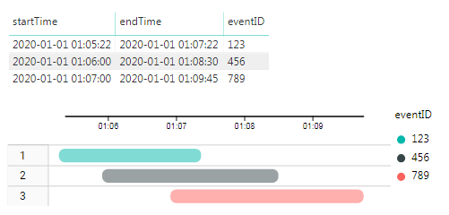
The requirement is to produce a visual which displays them in a “compact” fashion. It is basically a Gantt chart. Specifically:
- The x-axis will be a timeline
- The y-axis will be categorical with slot numbers (slot1, slot2, …slotN)
- Each event must be assigned dynamically to the first available (not occupied) slot number
- Once an event is assigned to a slot, the slot is occupied for the duration of the event
Examples follow. In the second example, since the third event starts after the first one has finished, it is allocated the first slot.
Note: The Timeline Storyteller visual “sort of” does the job. The major problem is described in this post and the minor one is the lack of flexibility in formatting.
Solved! Go to Solution.
- Mark as New
- Bookmark
- Subscribe
- Mute
- Subscribe to RSS Feed
- Permalink
- Report Inappropriate Content
To get better help for issues like this, please see this link: How to Get Your Question Answered Quickly
Based on the information given so far it's hard to know where to begin to help.
David
- Mark as New
- Bookmark
- Subscribe
- Mute
- Subscribe to RSS Feed
- Permalink
- Report Inappropriate Content
Hi @cgi
Have you tried Gantt Chart by MAQ Software (available in Marketplace) ?
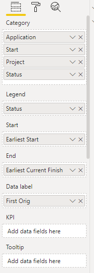
It has quite a few options that you can manipulate and get the visual you're looking for (Legend drives the color)
The only issue is it may only go down to the day level in terms of granularity.
Hope this helps
David
- Mark as New
- Bookmark
- Subscribe
- Mute
- Subscribe to RSS Feed
- Permalink
- Report Inappropriate Content
@dedelman_clng, thank you for the reply, David.
Unfortunately, the visual you mentioned does not improve the situation.
To clarify the original post, my problem focuses on two issues:
- Write a DAX measure to dynamically calculate the slot number
- Display the DAX measure as the y-axis in the Gantt chart visual (by Microsoft) in the “Task” field.
The second can hopefuly be done with a disconnected table.
For the first, I have an algorithm in Python, but I am lost on how to implement it in DAX! Will be happy to share it, if it helps.
- Mark as New
- Bookmark
- Subscribe
- Mute
- Subscribe to RSS Feed
- Permalink
- Report Inappropriate Content
To get better help for issues like this, please see this link: How to Get Your Question Answered Quickly
Based on the information given so far it's hard to know where to begin to help.
David
- Mark as New
- Bookmark
- Subscribe
- Mute
- Subscribe to RSS Feed
- Permalink
- Report Inappropriate Content
Hi David,
Thank you for the advice. I had actually read that post, and tried to be concise and give clear examples.
I was obviously TOO concise! 🙂
So, I am closing this one and opening another, describing only the my algorithm for the measure.
I appreciate your time!
Helpful resources
| User | Count |
|---|---|
| 83 | |
| 83 | |
| 37 | |
| 34 | |
| 32 |
| User | Count |
|---|---|
| 92 | |
| 79 | |
| 61 | |
| 51 | |
| 51 |


