FabCon is coming to Atlanta
Join us at FabCon Atlanta from March 16 - 20, 2026, for the ultimate Fabric, Power BI, AI and SQL community-led event. Save $200 with code FABCOMM.
Register now!- Power BI forums
- Get Help with Power BI
- Desktop
- Service
- Report Server
- Power Query
- Mobile Apps
- Developer
- DAX Commands and Tips
- Custom Visuals Development Discussion
- Health and Life Sciences
- Power BI Spanish forums
- Translated Spanish Desktop
- Training and Consulting
- Instructor Led Training
- Dashboard in a Day for Women, by Women
- Galleries
- Data Stories Gallery
- Themes Gallery
- Contests Gallery
- QuickViz Gallery
- Quick Measures Gallery
- Visual Calculations Gallery
- Notebook Gallery
- Translytical Task Flow Gallery
- TMDL Gallery
- R Script Showcase
- Webinars and Video Gallery
- Ideas
- Custom Visuals Ideas (read-only)
- Issues
- Issues
- Events
- Upcoming Events
Get Fabric Certified for FREE during Fabric Data Days. Don't miss your chance! Request now
- Power BI forums
- Forums
- Get Help with Power BI
- Desktop
- Re: Dynamic change in X Axis
- Subscribe to RSS Feed
- Mark Topic as New
- Mark Topic as Read
- Float this Topic for Current User
- Bookmark
- Subscribe
- Printer Friendly Page
- Mark as New
- Bookmark
- Subscribe
- Mute
- Subscribe to RSS Feed
- Permalink
- Report Inappropriate Content
Dynamic change in X Axis
Hello Everyone,
I am trying a scenario where I need one chart, and it should shows two visuals like sales(YOY) by year and sales(YOY) by area.
The x-axis should be change by using Slicer which have two values Year and Area.
Is there any way to achieve this. I don't need any alternatives for that like drill down etc. I need that exact thing to be done.
If it is possible by dax please suggest something. (I am trying different dax functions to solve this problem but don't know what exact function should be used to do this.)
Thanks,
Akash Singhal
Solved! Go to Solution.
- Mark as New
- Bookmark
- Subscribe
- Mute
- Subscribe to RSS Feed
- Permalink
- Report Inappropriate Content
Hi @singhal14
Here's one idea of how it can be done using a bridging table.
Could well be other ways of handling this 🙂
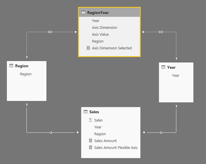
- Assuming you have Region and Year lookup tables, create a RegionYear table which is the cross product of Region & Year tables.
- Duplicate each row of RegionYear and add an Axis Dimension column which is "Region" for half the rows and "Year" for the other half, and an Axis Value column which is the Region or Year value for each row (depending on the Axis Dimension value).
- Relate Year and Region to RegionYear using inactive bidirectional relationships:
- Create an Axis Dimension Selected measure to harvest the value of Axis Dimension. Something equivalent to this (this guards against multiple selection):
Axis Dimension Selected = IF ( ISFILTERED ( RegionYear[Axis Dimension] ), IF ( CALCULATE ( HASONEVALUE ( RegionYear[Axis Dimension] ), ALLSELECTED () ), VALUES ( RegionYear[Axis Dimension] ) ) ) - Create a Sales Amount Flexible Axis measure like this (assuming Sales Amount is the normal measure):
Sales Amount Flexible Axis =
IF (
    NOT ( ISBLANK ( [Axis Dimension Selected] ) ),
    SWITCH (
        [Axis Dimension Selected],
        "Region",
        CALCULATE (
            [Sales Amount],
            USERELATIONSHIP ( RegionYear[Region], Region[Region] )
        ),
        "Year",
        CALCULATE (
            [Sales Amount],
            USERELATIONSHIP ( RegionYear[Year], 'Year'[Year] )
        )
    )
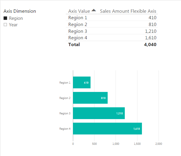
) - Then you can create visualizations using RegionYear[Axis Value] and [Sales Amount Flexible Axis]
- Mark as New
- Bookmark
- Subscribe
- Mute
- Subscribe to RSS Feed
- Permalink
- Report Inappropriate Content
It's was fine using card until user not select foucs mode.If the user click on focus mode card will disappear. 🙂
Thanks
- Mark as New
- Bookmark
- Subscribe
- Mute
- Subscribe to RSS Feed
- Permalink
- Report Inappropriate Content
There is a better solution in this blog :
http://tinylizard.com/dynamically-changing-chart-axis/
The only change is because we use Power BI we can enable the filtering in both directions , so we dont need any complex measure.
- Mark as New
- Bookmark
- Subscribe
- Mute
- Subscribe to RSS Feed
- Permalink
- Report Inappropriate Content
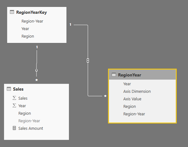
You're right @uria! It would be more elegant to use @Anonymous's method, like this example
Then there is no complexity in the DAX.
Since we have to combine Region and Year, would you imagine the data model looking something like this?
- Mark as New
- Bookmark
- Subscribe
- Mute
- Subscribe to RSS Feed
- Permalink
- Report Inappropriate Content
HI @OwenAuger
It was nice idea, But when we select any value from Axis Dimension (Like Region), Region name should reflect in table Header instead of displaying the Axis value. can we achive this in Power BI. If yes kindly let me know.
Thanks in Advance
- Mark as New
- Bookmark
- Subscribe
- Mute
- Subscribe to RSS Feed
- Permalink
- Report Inappropriate Content
- Mark as New
- Bookmark
- Subscribe
- Mute
- Subscribe to RSS Feed
- Permalink
- Report Inappropriate Content
What i mean to say . when we select Region or Year in slicer , it's reflecting in the table, it's fine , But Column title name is showing only Axis value. My requirment is if we select Region in slicer, Region name also should come on the column title and also same for year, if we select year , year name should reflect on the column title instead of displaying column name (Axis Value)
U have done good job. if you can find the answer of my question that's a great achivement.
Hope u understand.
- Mark as New
- Bookmark
- Subscribe
- Mute
- Subscribe to RSS Feed
- Permalink
- Report Inappropriate Content
Interesting idea @harib 🙂
I can't find a particularly elegant way to have the column header update based on the Axis Dimension selection.
The best I can do is create a measure and place it on a card over the top of the original column heading:
I updated my file to do this - same link here.
Regards,
Owen
- Mark as New
- Bookmark
- Subscribe
- Mute
- Subscribe to RSS Feed
- Permalink
- Report Inappropriate Content
Hi @singhal14,
>>I am trying a scenario where I need one chart, and it should shows two visuals like sales(YOY) by year and sales(YOY) by area.
The x-axis should be change by using Slicer which have two values Year and Area
According to your description, you want to use slicer to choose which column displayed on the visual as the axis,right?
Based on test, currently power bi desktop visuals not support this feature.
For your requirement, you can post it to idea.
https://ideas.powerbi.com/forums/265200-power-bi
Regards,
Xiaoxin Sheng
- Mark as New
- Bookmark
- Subscribe
- Mute
- Subscribe to RSS Feed
- Permalink
- Report Inappropriate Content
Hi @Anonymous,
Thanks for Reaching out.
I am aware about that power bi does not support this feature.
But if we try it with using DAX funtions, may be we can achieve it.
I need your suggestions can we do it by using DAX Functions and if the answer is YES then what would be the approach?
Thanks,
Akash Singhal
- Mark as New
- Bookmark
- Subscribe
- Mute
- Subscribe to RSS Feed
- Permalink
- Report Inappropriate Content
Hi @singhal14
Here's one idea of how it can be done using a bridging table.
Could well be other ways of handling this 🙂
- Assuming you have Region and Year lookup tables, create a RegionYear table which is the cross product of Region & Year tables.
- Duplicate each row of RegionYear and add an Axis Dimension column which is "Region" for half the rows and "Year" for the other half, and an Axis Value column which is the Region or Year value for each row (depending on the Axis Dimension value).
- Relate Year and Region to RegionYear using inactive bidirectional relationships:
- Create an Axis Dimension Selected measure to harvest the value of Axis Dimension. Something equivalent to this (this guards against multiple selection):
Axis Dimension Selected = IF ( ISFILTERED ( RegionYear[Axis Dimension] ), IF ( CALCULATE ( HASONEVALUE ( RegionYear[Axis Dimension] ), ALLSELECTED () ), VALUES ( RegionYear[Axis Dimension] ) ) ) - Create a Sales Amount Flexible Axis measure like this (assuming Sales Amount is the normal measure):
Sales Amount Flexible Axis =
IF (
    NOT ( ISBLANK ( [Axis Dimension Selected] ) ),
    SWITCH (
        [Axis Dimension Selected],
        "Region",
        CALCULATE (
            [Sales Amount],
            USERELATIONSHIP ( RegionYear[Region], Region[Region] )
        ),
        "Year",
        CALCULATE (
            [Sales Amount],
            USERELATIONSHIP ( RegionYear[Year], 'Year'[Year] )
        )
    )
) - Then you can create visualizations using RegionYear[Axis Value] and [Sales Amount Flexible Axis]
- Mark as New
- Bookmark
- Subscribe
- Mute
- Subscribe to RSS Feed
- Permalink
- Report Inappropriate Content
Hi @OwenAuger ,
Thanks for commenting,
here the are slicers to change the visual, if i use this then again i need to use the slicer to change the X axis and also i need to provide the orginal slicer which is Region to selected specific region and Year to select specifi year.
The partner want to see the year(Changing for region X axis) when they select any region in region filter itself. They dont want seprate slicer to change the X axis.
regards,
Nagesh
- Mark as New
- Bookmark
- Subscribe
- Mute
- Subscribe to RSS Feed
- Permalink
- Report Inappropriate Content
Hi @Anonymous
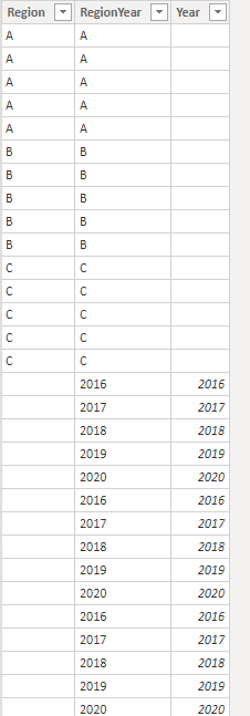
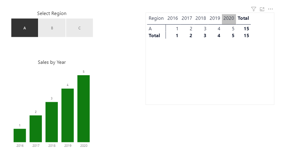
You could do something like this, with a disconnected Region/Year dimension that contains values from both Region & Year. This dimension is used on the axis of your visual(s).
Then you can create a measure that detects whether Region is filtered.
Here is an example I set up (PBIX link).
I have a Sales table with columns Region, Year & Sales.
RegionYear (disconnected table) looks like this:
Then write a measure like this:
Sales for Chart =
IF (
    ISFILTERED ( Sales[Region] ),
    CALCULATE (
        SUM ( Sales[Sales] ),
        TREATAS (
            VALUES ( RegionYear[Year] ),
            Sales[Year]
        )
    ),
    CALCULATE (
        SUM ( Sales[Sales] ),
        TREATAS (
            VALUES ( RegionYear[Region] ),
            Sales[Region]
        )
    )
)
Then the visuals look like this:
Regards,
Owen
- Mark as New
- Bookmark
- Subscribe
- Mute
- Subscribe to RSS Feed
- Permalink
- Report Inappropriate Content
I followed the steps, but i am facing sum of region or month. i am getting sum of whole column for every region or month. can you please help me to resolve the issue.
Thanks.
- Mark as New
- Bookmark
- Subscribe
- Mute
- Subscribe to RSS Feed
- Permalink
- Report Inappropriate Content
I am trying to implement same approach, however try to avoid dupliation of the table rows to create the "Bridge Table" due to large amount of data. Wondering if any way to achive this without duplicate table? - "Duplicate each row of RegionYear and add an Axis Dimension column which is "Region" for half the rows and "Year" for the other half, and an Axis Value column which is the Region or Year value for each row (depending on the Axis Dimension value)."
One approach tried is to use a report level @Parameter called Para_XAxis for the switch function, however though the Parameter's value is updated smoothly and readable in card, the switch function just failed to get a valid value from the @Parameter. Wondering if anything I missed?
Sales Amount Flexible Axis =
IF (
    NOT ( ISBLANK ( Para_XAxis[Parameter Value] ) ),
    SWITCH (
        Para_XAxis[Parameter Value],
        "Region",
        CALCULATE (
            [Sales Amount],
            USERELATIONSHIP ( RegionYear[Region], Region[Region] )
        ),
        "Year",
        CALCULATE (
            [Sales Amount],
            USERELATIONSHIP ( RegionYear[Year], 'Year'[Year] )
        )
    )
)
- Mark as New
- Bookmark
- Subscribe
- Mute
- Subscribe to RSS Feed
- Permalink
- Report Inappropriate Content
@Anonymous
Thanks for your responce and solution. If u have any sample file can u please upload .
Thanks
- Mark as New
- Bookmark
- Subscribe
- Mute
- Subscribe to RSS Feed
- Permalink
- Report Inappropriate Content
It's really great,but in my senario If we dont select any value from slicer(Axis Dimension) can we get aggregated sale amount value (4040) . If it's possible kindly let me know.
Thanks in advance
- Mark as New
- Bookmark
- Subscribe
- Mute
- Subscribe to RSS Feed
- Permalink
- Report Inappropriate Content
Hi @singhal14,
You can use dax to write a measure which can work with the slicer, but you can't use dax to create a dynamic column.(measure can't drag to axis field)
Sample:
Measure to get the slicer value:
Selected Value = if(HASONEVALUE('Table 2'[Type]),VALUES('Table 2'[Type]),BLANK())
Calculate column:
Measure:
Regards,
Xiaoxin Sheng
Helpful resources

Power BI Monthly Update - November 2025
Check out the November 2025 Power BI update to learn about new features.

Fabric Data Days
Advance your Data & AI career with 50 days of live learning, contests, hands-on challenges, study groups & certifications and more!

