A new Data Days event is coming soon!
This time we’re going bigger than ever. Fabric, Power BI, SQL, AI and more. We're covering it all. You won't want to miss it.
Learn more- Power BI forums
- Get Help with Power BI
- Desktop
- Service
- Report Server
- Power Query
- Mobile Apps
- Developer
- DAX Commands and Tips
- Custom Visuals Development Discussion
- Health and Life Sciences
- Power BI Spanish forums
- Translated Spanish Desktop
- Training and Consulting
- Instructor Led Training
- Dashboard in a Day for Women, by Women
- Galleries
- Data Stories Gallery
- Themes Gallery
- Contests Gallery
- QuickViz Gallery
- Quick Measures Gallery
- Visual Calculations Gallery
- Notebook Gallery
- Translytical Task Flow Gallery
- TMDL Gallery
- R Script Showcase
- Webinars and Video Gallery
- Ideas
- Custom Visuals Ideas (read-only)
- Issues
- Issues
- Events
- Upcoming Events
Did you hear? There's a new SQL AI Developer certification (DP-800). Start preparing now and be one of the first to get certified. Register now
- Power BI forums
- Forums
- Get Help with Power BI
- Desktop
- Re: Dynamic Y Axis Using Parameter
- Subscribe to RSS Feed
- Mark Topic as New
- Mark Topic as Read
- Float this Topic for Current User
- Bookmark
- Subscribe
- Printer Friendly Page
- Mark as New
- Bookmark
- Subscribe
- Mute
- Subscribe to RSS Feed
- Permalink
- Report Inappropriate Content
Dynamic Y Axis Using Parameter
Hello,
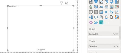
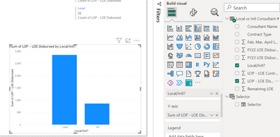
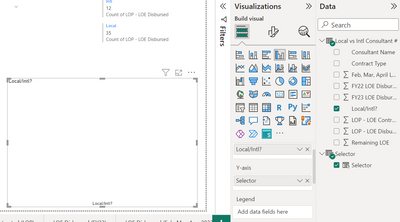
I'd like to create a dashboard containing a bar chart with a user-selected y-axis. I've created a parameter with a slicer on the page that allows user-selection of the variable. I have that parameter listed in the y axis section for the bar chart, but my chart appears blank. It feels like there is a step missing. The graph does show a result when I put the parameter in the x-axis and my intended x-axis value in the y-axis, but this of course is not the data I want to display.
I am hoping to have the user select from the options below, and the graph to return this data disaggregated by two columns: local vs. international.
Parameter slicer displayed on the page:
Blank graph with x-axis and y-axis selected.
Any guidance is very much appreciated, thank you.
- Mark as New
- Bookmark
- Subscribe
- Mute
- Subscribe to RSS Feed
- Permalink
- Report Inappropriate Content
you can use field parameters to create 2 slicers/filters:
one slicer to select One KPI Measure (Y-Axis)
another slicer to select X-Axis (by country, department etc),
maybe check this out for step-by-step instructions: https://www.youtube.com/watch?v=rmzHwFZLvlQ
- Mark as New
- Bookmark
- Subscribe
- Mute
- Subscribe to RSS Feed
- Permalink
- Report Inappropriate Content
I've arrived here late, but in case this helps anyone I've found a solution. Basically the issue is that the field parameter doesn't know how to aggregate the column. When you plot the column directly there will be an associated aggregate function (eg sum), but when you select that same column via a field parameter Power BI doesn't seem to recognise that. The way I found around it was to make a new measure for each of the columns, which includes the aggregation eg `tonnes_sum_measure = sum(table[tonnes])`, then have the field parameter reference those measures instead of the columns. It worked for me, so hope it can help someone else too!
I realised this would work after watching this video from Guy In A Cube:
Dynamic X and Y Axis in Power BI visuals? Yes please!
- Mark as New
- Bookmark
- Subscribe
- Mute
- Subscribe to RSS Feed
- Permalink
- Report Inappropriate Content
The solution is actually pretty simple, for my knowledge y-axis always uses aggregated values so u just need to create parameter with aggregated measures instead of just table columns.
- Mark as New
- Bookmark
- Subscribe
- Mute
- Subscribe to RSS Feed
- Permalink
- Report Inappropriate Content
@Anonymous , If you have created this on the column, this needs to be on the x-axis. This on measure , it can be on y-axis(Value axis, assumed column bar)
refer if needed
Power BI Field Parameters — A Quick way for Dynamic Visuals: https://amitchandak.medium.com/power-bi-field-parameters-a-quick-way-for-dynamic-visuals-fc4095ae9afd
Power BI Field Parameters- Measure Slicer and Axis/Dimension slicer: https://youtu.be/lqF3Wa1FllE
Switch TOPN with Field Parameters: https://amitchandak.medium.com/switch-topn-with-field-parameters-299a0ae3725f
Field Parameters- Conditional Formatting
: https://amitchandak.medium.com/field-parameters-conditional-formatting-517aacc23fdf
- Mark as New
- Bookmark
- Subscribe
- Mute
- Subscribe to RSS Feed
- Permalink
- Report Inappropriate Content
Thanks very much for your reply. I suppose what I don't understand is why it works when I have my y-axis value selected normally from the 'Data' panel
but not when that same value is selected in the parameter?
- Mark as New
- Bookmark
- Subscribe
- Mute
- Subscribe to RSS Feed
- Permalink
- Report Inappropriate Content
Me looking for solution too
- Mark as New
- Bookmark
- Subscribe
- Mute
- Subscribe to RSS Feed
- Permalink
- Report Inappropriate Content
I am having the same issue, did you ever figure out how to do this?
Helpful resources

Power BI Monthly Update - April 2026
Check out the April 2026 Power BI update to learn about new features.

Data Days 2026 coming soon!
Sign up to receive a private message when registration opens and key events begin.

New to Fabric Survey
If you have recently started exploring Fabric, we'd love to hear how it's going. Your feedback can help with product improvements.

| User | Count |
|---|---|
| 34 | |
| 31 | |
| 25 | |
| 20 | |
| 16 |
| User | Count |
|---|---|
| 61 | |
| 49 | |
| 28 | |
| 23 | |
| 23 |


