FabCon is coming to Atlanta
Join us at FabCon Atlanta from March 16 - 20, 2026, for the ultimate Fabric, Power BI, AI and SQL community-led event. Save $200 with code FABCOMM.
Register now!- Power BI forums
- Get Help with Power BI
- Desktop
- Service
- Report Server
- Power Query
- Mobile Apps
- Developer
- DAX Commands and Tips
- Custom Visuals Development Discussion
- Health and Life Sciences
- Power BI Spanish forums
- Translated Spanish Desktop
- Training and Consulting
- Instructor Led Training
- Dashboard in a Day for Women, by Women
- Galleries
- Data Stories Gallery
- Themes Gallery
- Contests Gallery
- Quick Measures Gallery
- Notebook Gallery
- Translytical Task Flow Gallery
- TMDL Gallery
- R Script Showcase
- Webinars and Video Gallery
- Ideas
- Custom Visuals Ideas (read-only)
- Issues
- Issues
- Events
- Upcoming Events
To celebrate FabCon Vienna, we are offering 50% off select exams. Ends October 3rd. Request your discount now.
- Power BI forums
- Forums
- Get Help with Power BI
- Desktop
- Re: Dynamic Tooltip on bar charts
- Subscribe to RSS Feed
- Mark Topic as New
- Mark Topic as Read
- Float this Topic for Current User
- Bookmark
- Subscribe
- Printer Friendly Page
- Mark as New
- Bookmark
- Subscribe
- Mute
- Subscribe to RSS Feed
- Permalink
- Report Inappropriate Content
Dynamic Tooltip on bar charts
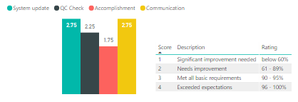
Using the following data structure, is it possible to have a dynamic tooltip for each column of my bar chart?
| Name | System Update | QC Check | Accomplishment | Communication |
| A | 3 | 3 | 2 | 3 |
| B | 3 | 4 | 3 | 3 |
| C | 2 | 1 | 3 | 3 |
| D | 2 | 2 | 2 | 3 |
| E | 4 | 3 | 2 | 3 |
| F | 4 | 2 | 3 | 3 |
| A | 3 | 3 | 2 | 3 |
| B | 1 | 1 | 3 | 3 |
| C | 2 | 1 | 2 | 4 |
| D | 3 | 3 | 3 | 3 |
| E | 3 | 4 | 2 | 3 |
| F | 2 | 4 | 3 | 3 |
I will be averaging those scores and placing the four columns as Value fields on a bar chart. The content of the tooltip should be the one on the table beside the chart. In the System Update, when the user hovers that bar, the tooltip should say "Needs improvement" (and so on). Is this possible?
Solved! Go to Solution.
- Mark as New
- Bookmark
- Subscribe
- Mute
- Subscribe to RSS Feed
- Permalink
- Report Inappropriate Content
Hi @olimilo,
You can create 4 measure for four categories, and create a card visual for each category. We can't use measure in text box, so we display measure in card visual. If you create a measure for System update, please use the similar sturcture formula.
description=IF(AVERAGEX(FILTER(Table,Table[category]=System update),Table[scores])<3.00,"Need to improved", IF(AVERAGEX(FILTER(Table,Table[category]=System update),Table[scores])<3.99,"Satisfactory","Good"))
Best Regards,
Angelia
- Mark as New
- Bookmark
- Subscribe
- Mute
- Subscribe to RSS Feed
- Permalink
- Report Inappropriate Content
- Mark as New
- Bookmark
- Subscribe
- Mute
- Subscribe to RSS Feed
- Permalink
- Report Inappropriate Content
Hi @v-huizhn-msft, is there no measure that I can use to check if the average of the scores for that column would fall on a particular range? eg: if it falls on 3.00 - 3.99, it should display satisfactory, etc
- Mark as New
- Bookmark
- Subscribe
- Mute
- Subscribe to RSS Feed
- Permalink
- Report Inappropriate Content
Hi @olimilo,
Have you resolved your issue? If you have, welcome to share your solution or mark the right reply as answer. More people will benefit from here.
Best Regards,
Angelia
- Mark as New
- Bookmark
- Subscribe
- Mute
- Subscribe to RSS Feed
- Permalink
- Report Inappropriate Content
Hi @olimilo,
You can create a measure using the formula.
description=IF(AVERAGE(Table[scores])<3.00,"Need to improved", IF(AVERAGE(Table[scores])<3.99,"Satisfactory","Good"))
But we can't set the measure to appear when we hover any bar. We just can display the measure in a visual. When you click one bar, the measure value changes automatically.
Best Regards,
Angelia
- Mark as New
- Bookmark
- Subscribe
- Mute
- Subscribe to RSS Feed
- Permalink
- Report Inappropriate Content
Hi Angelia,
Is it possible to use this on a context where it applies to each column?
description=IF(AVERAGE(Table[scores])<3.00,"Need to improved", IF(AVERAGE(Table[scores])<3.99,"Satisfactory","Good"))
The code above would only work on 1 column, as of now, I have 4 different columns for the 4 rating categories (System update, QC Check, Accomplishment, Communication). Like, if the user would hover over the System update column, it would get the description for the rating for that column only, QC Check description when the user hovers only on the QC Check chart and so on?
- Mark as New
- Bookmark
- Subscribe
- Mute
- Subscribe to RSS Feed
- Permalink
- Report Inappropriate Content
Hi @olimilo,
You can create 4 measure for four categories, and create a card visual for each category. We can't use measure in text box, so we display measure in card visual. If you create a measure for System update, please use the similar sturcture formula.
description=IF(AVERAGEX(FILTER(Table,Table[category]=System update),Table[scores])<3.00,"Need to improved", IF(AVERAGEX(FILTER(Table,Table[category]=System update),Table[scores])<3.99,"Satisfactory","Good"))
Best Regards,
Angelia
- Mark as New
- Bookmark
- Subscribe
- Mute
- Subscribe to RSS Feed
- Permalink
- Report Inappropriate Content
Alright, thanks for the clarification. Although I have to admit that doesn't seem to be a good way of doing things.


