Get Fabric certified for FREE!
Don't miss your chance to take the Fabric Data Engineer (DP-700) exam on us!
Learn more- Power BI forums
- Get Help with Power BI
- Desktop
- Service
- Report Server
- Power Query
- Mobile Apps
- Developer
- DAX Commands and Tips
- Custom Visuals Development Discussion
- Health and Life Sciences
- Power BI Spanish forums
- Translated Spanish Desktop
- Training and Consulting
- Instructor Led Training
- Dashboard in a Day for Women, by Women
- Galleries
- Data Stories Gallery
- Themes Gallery
- Contests Gallery
- QuickViz Gallery
- Quick Measures Gallery
- Visual Calculations Gallery
- Notebook Gallery
- Translytical Task Flow Gallery
- TMDL Gallery
- R Script Showcase
- Webinars and Video Gallery
- Ideas
- Custom Visuals Ideas (read-only)
- Issues
- Issues
- Events
- Upcoming Events
We've captured the moments from FabCon & SQLCon that everyone is talking about, and we are bringing them to the community, live and on-demand. Starts on April 14th. Register now
- Power BI forums
- Forums
- Get Help with Power BI
- Desktop
- Dynamic Reference Line: Scatter Chart
- Subscribe to RSS Feed
- Mark Topic as New
- Mark Topic as Read
- Float this Topic for Current User
- Bookmark
- Subscribe
- Printer Friendly Page
- Mark as New
- Bookmark
- Subscribe
- Mute
- Subscribe to RSS Feed
- Permalink
- Report Inappropriate Content
Dynamic Reference Line: Scatter Chart
Hi everyone,
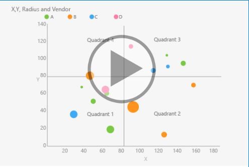
I am currently trying to display a reference line on the X and Y axis to generate a form of magic quadrant that splits the data up into 4 sections. Essentially, I want the reference line to always be placed half way between the minimum and maximum value of both x and y axis, rather than a static reference line - dynamic, if you will.
The 4 quadrants will be based on the data points having a value higher or lower than the two dynamic lines. If the point falls above both of lines, its in the top right quadrant. If it falls below both of lines, the data point will fall in the bottom left quadrant. TL;DR - I want the legend to be dynamic rather than static based on two reference lines (number of transactions and size of transactions).
Is this possible to do given this visual? I highly doubt it, but I thought I would ask.
Any help would be appreciated.
Regards and thanks!
- Mark as New
- Bookmark
- Subscribe
- Mute
- Subscribe to RSS Feed
- Permalink
- Report Inappropriate Content
Hi @Anonymous
It seems you'd like the visual as below

You could find Quadrant Chart custom visual in Power BI.
The default Scatter chart doesn't support to add such feature,
If the custom visual doesn't meet your requirement completely,
you could vote the similar idea here.
Best Regards
Maggie
Community Support Team _ Maggie Li
If this post helps, then please consider Accept it as the solution to help the other members find it more quickly.
Helpful resources

New to Fabric Survey
If you have recently started exploring Fabric, we'd love to hear how it's going. Your feedback can help with product improvements.

Power BI DataViz World Championships - June 2026
A new Power BI DataViz World Championship is coming this June! Don't miss out on submitting your entry.

Join our Fabric User Panel
Share feedback directly with Fabric product managers, participate in targeted research studies and influence the Fabric roadmap.

| User | Count |
|---|---|
| 53 | |
| 37 | |
| 35 | |
| 19 | |
| 17 |
| User | Count |
|---|---|
| 74 | |
| 70 | |
| 39 | |
| 35 | |
| 23 |
