FabCon is coming to Atlanta
Join us at FabCon Atlanta from March 16 - 20, 2026, for the ultimate Fabric, Power BI, AI and SQL community-led event. Save $200 with code FABCOMM.
Register now!- Power BI forums
- Get Help with Power BI
- Desktop
- Service
- Report Server
- Power Query
- Mobile Apps
- Developer
- DAX Commands and Tips
- Custom Visuals Development Discussion
- Health and Life Sciences
- Power BI Spanish forums
- Translated Spanish Desktop
- Training and Consulting
- Instructor Led Training
- Dashboard in a Day for Women, by Women
- Galleries
- Data Stories Gallery
- Themes Gallery
- Contests Gallery
- QuickViz Gallery
- Quick Measures Gallery
- Visual Calculations Gallery
- Notebook Gallery
- Translytical Task Flow Gallery
- TMDL Gallery
- R Script Showcase
- Webinars and Video Gallery
- Ideas
- Custom Visuals Ideas (read-only)
- Issues
- Issues
- Events
- Upcoming Events
The Power BI Data Visualization World Championships is back! Get ahead of the game and start preparing now! Learn more
- Power BI forums
- Forums
- Get Help with Power BI
- Desktop
- Dynamic KPI
- Subscribe to RSS Feed
- Mark Topic as New
- Mark Topic as Read
- Float this Topic for Current User
- Bookmark
- Subscribe
- Printer Friendly Page
- Mark as New
- Bookmark
- Subscribe
- Mute
- Subscribe to RSS Feed
- Permalink
- Report Inappropriate Content
Dynamic KPI
HI All,
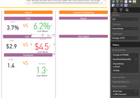
I am using a KPI to color green, red, orange from two fields which use dynamically changing data ie. the value changes. But when the value change the KPI displays the wrong color.
Desired Logic;
IF (B-A)>0, THEN [Green]
IF(B-A) <0, THEN [Red]
IF(B-A)=0, THEN [Orange]
You can see in screen shot that B is larger than A but it is red.
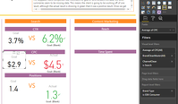
Second screen shot shows the fields used for A.
These columns are in different data sets. So we are unable to do a merge join or condiitonal formatting on the data, so I need a custom DAX for this?
Thanks for any assistance.
- Mark as New
- Bookmark
- Subscribe
- Mute
- Subscribe to RSS Feed
- Permalink
- Report Inappropriate Content
This might be a silly question, but did you check the formatting of the KPI?
In the Color Coding section you can set the Direction - either 'low is good' or 'high is good'. Maybe you just have that around the wrong way?
- Mark as New
- Bookmark
- Subscribe
- Mute
- Subscribe to RSS Feed
- Permalink
- Report Inappropriate Content
Nevermind - I see that the goal value is blank on the KPI, so ignore my last post.
The KPI is using the most recent (based on the trend axis) value for the Indicator and the Target Goal. If you do a simple table with your Trend Axis field (ChannelClean), your Indicator field (CPC) and Target Goal field (Average of CPC) included, then scroll to the very bottom - what do you see? Is the Average of CPC value blank? If so, that is going to cause problems.
Normally the Trend Axis is a list of dates from a calendar table. What is the ChannelClean field that you are using for the Trend Axis? Is it a list of dates, or something else?
Regards,
Mal
Helpful resources

Power BI Dataviz World Championships
The Power BI Data Visualization World Championships is back! Get ahead of the game and start preparing now!

| User | Count |
|---|---|
| 40 | |
| 35 | |
| 34 | |
| 31 | |
| 28 |
| User | Count |
|---|---|
| 137 | |
| 102 | |
| 68 | |
| 66 | |
| 64 |


