Fabric Data Days starts November 4th!
Advance your Data & AI career with 50 days of live learning, dataviz contests, hands-on challenges, study groups & certifications and more!
Get registered- Power BI forums
- Get Help with Power BI
- Desktop
- Service
- Report Server
- Power Query
- Mobile Apps
- Developer
- DAX Commands and Tips
- Custom Visuals Development Discussion
- Health and Life Sciences
- Power BI Spanish forums
- Translated Spanish Desktop
- Training and Consulting
- Instructor Led Training
- Dashboard in a Day for Women, by Women
- Galleries
- Data Stories Gallery
- Themes Gallery
- Contests Gallery
- Quick Measures Gallery
- Visual Calculations Gallery
- Notebook Gallery
- Translytical Task Flow Gallery
- TMDL Gallery
- R Script Showcase
- Webinars and Video Gallery
- Ideas
- Custom Visuals Ideas (read-only)
- Issues
- Issues
- Events
- Upcoming Events
Get Fabric Certified for FREE during Fabric Data Days. Don't miss your chance! Learn more
- Power BI forums
- Forums
- Get Help with Power BI
- Desktop
- Dynamic Grouping of Data in Visual Columns using A...
- Subscribe to RSS Feed
- Mark Topic as New
- Mark Topic as Read
- Float this Topic for Current User
- Bookmark
- Subscribe
- Printer Friendly Page
- Mark as New
- Bookmark
- Subscribe
- Mute
- Subscribe to RSS Feed
- Permalink
- Report Inappropriate Content
Dynamic Grouping of Data in Visual Columns using Age(Values on X Axis) Slicer
Hello All Colleagues,
I want to group data(should come on Y Axis) in columns based on Age division(Age should come on X Axis) such that I need to select Maximum and Minimum Age based on What-if slicer values selection.
What approach do I need to follow??
Can someone give a quick solution to this. It will be much helpful
Solved! Go to Solution.
- Mark as New
- Bookmark
- Subscribe
- Mute
- Subscribe to RSS Feed
- Permalink
- Report Inappropriate Content
Hi, @Anonymous
Solution1:
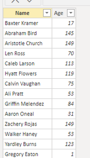
I created a sample with the following data:
Create 2 measures to determine the maximum and minimum values. It acts as a slicer
_min = 60

_max = 120
Create another measure to group ages.
Group =
var _age=MAX('Table'[Age])
var _if=
    SWITCH(TRUE(),
    _age<[_min],"<"&[_min],
    _age>[_max],">"&[_max],
    [_min]&"~"&[_max])
return IF(ISFILTERED('Table'[Name]),_if)
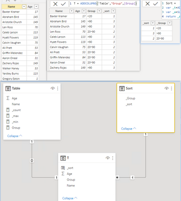
Then, create a calculated table to get the grouped fields.
T = ADDCOLUMNS('Table',"Group",[Group])
Finally, create a measure to count users.
Model:
result:
Edit:
Solution2:
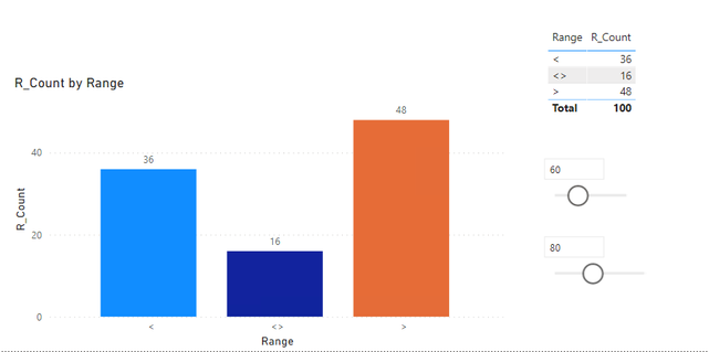
1. Create 2 whatif parameters to control the maximum and minimum values.
2. Create a grouping table, which contains three groups, namely <,<>,>.
3. Then create a measure to calculate the count of names in the group.
R_Count =
var _swith=
SWITCH(
    MAX('_Range'[Range]),
    "<",CALCULATE(COUNT('Table'[Name]),FILTER(ALL('Table'),'Table'[Age]<[_MINage Value])),
    ">",CALCULATE(COUNT('Table'[Name]),FILTER(ALL('Table'),'Table'[Age]>[_MAXage Value])),
    CALCULATE(COUNT('Table'[Name]),FILTER(ALL('Table'),'Table'[Age]<=[_MAXage Value]&&'Table'[Age]>=[_MINage Value])))
return IF(HASONEVALUE('_Range'[Range]),_swith,COUNT('Table'[Name]))
Finally, a bar graph is created with the groups and measures of the grouping table.
Please refer to the attachment below for details. Hope this helps.
Best Regards,
Community Support Team _ Zeon Zheng
If this post helps, then please consider Accept it as the solution to help the other members find it more quickly.
- Mark as New
- Bookmark
- Subscribe
- Mute
- Subscribe to RSS Feed
- Permalink
- Report Inappropriate Content
@Anonymous
Not clear enough but as I read your question, you can add Parameter on the report and modify your measure to within the Min and Max values selected in the Paramter.
You can find many articles and videos on google
⭕ Subscribe and learn Power BI from these videos
⚪ Website ⚪ LinkedIn ⚪ PBI User Group
- Mark as New
- Bookmark
- Subscribe
- Mute
- Subscribe to RSS Feed
- Permalink
- Report Inappropriate Content
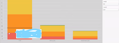
It is like the screenshot below, such that when I select limit1 as 60 and limit2 as 120, so the bar graph will show like 1st bar should be '<60', 2nd bar should be between '60 to 120', 3rd bar should be 'more than 120'.
Helpful resources

Fabric Data Days
Advance your Data & AI career with 50 days of live learning, contests, hands-on challenges, study groups & certifications and more!

Power BI Monthly Update - October 2025
Check out the October 2025 Power BI update to learn about new features.

| User | Count |
|---|---|
| 84 | |
| 49 | |
| 35 | |
| 31 | |
| 30 |


