Get certified for free when you join Fabric Data Days 2026 and dive into Fabric, Power BI, SQL, AI, and other essential data skills.
Join nowJuly 7 - July 17 | Round 2 of the Power BI Dataviz World Championships. Don't miss your chance! Learn more
Hello All,
Long time reader, first time questioner, as I can't figure this one out, even after scouring the site.
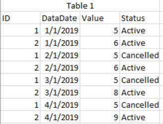
So, I have a table like so
I want to create a visual that allows the user to choose a minimum and maximum datadate and then see what has changed between those 2 periods by ID.
For example, if a user selected 1/1/2018 and 3/1/2018, the visual would then show the below
Any help would be greatly appreciated. I don't want to list out everything I've tried as I don't want to deter anyone. I may have been going down the right path at one point and just missed a key component.
Solved! Go to Solution.
Hi @Anonymous ,
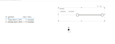
If I understand the issue, drop the table on a visual, select two slicers.
Here is my PBIXSelect Date
Let me know if you have any questions.
If this solves your issues, please mark it as the solution, so that others can find it easily. Kudos are nice too.
Nathaniel
Proud to be a Super User!
Hi @Anonymous ,
If I understand the issue, drop the table on a visual, select two slicers.
Here is my PBIXSelect Date
Let me know if you have any questions.
If this solves your issues, please mark it as the solution, so that others can find it easily. Kudos are nice too.
Nathaniel
Proud to be a Super User!
Join us in Barcelona for FabCon and SQLCon, the Fabric, Power BI, SQL, and AI community event. Save €200 with code FABCMTY200.
Join Data Days 2026: 60 days of free live/on-demand sessions, challenges, study groups, and certification opportunities.
| User | Count |
|---|---|
| 26 | |
| 23 | |
| 19 | |
| 18 | |
| 15 |
| User | Count |
|---|---|
| 46 | |
| 46 | |
| 43 | |
| 36 | |
| 31 |