FabCon is coming to Atlanta
Join us at FabCon Atlanta from March 16 - 20, 2026, for the ultimate Fabric, Power BI, AI and SQL community-led event. Save $200 with code FABCOMM.
Register now!- Power BI forums
- Get Help with Power BI
- Desktop
- Service
- Report Server
- Power Query
- Mobile Apps
- Developer
- DAX Commands and Tips
- Custom Visuals Development Discussion
- Health and Life Sciences
- Power BI Spanish forums
- Translated Spanish Desktop
- Training and Consulting
- Instructor Led Training
- Dashboard in a Day for Women, by Women
- Galleries
- Data Stories Gallery
- Themes Gallery
- Contests Gallery
- QuickViz Gallery
- Quick Measures Gallery
- Visual Calculations Gallery
- Notebook Gallery
- Translytical Task Flow Gallery
- TMDL Gallery
- R Script Showcase
- Webinars and Video Gallery
- Ideas
- Custom Visuals Ideas (read-only)
- Issues
- Issues
- Events
- Upcoming Events
The Power BI Data Visualization World Championships is back! Get ahead of the game and start preparing now! Learn more
- Power BI forums
- Forums
- Get Help with Power BI
- Desktop
- Dynamic Commentary in PowerBI
- Subscribe to RSS Feed
- Mark Topic as New
- Mark Topic as Read
- Float this Topic for Current User
- Bookmark
- Subscribe
- Printer Friendly Page
- Mark as New
- Bookmark
- Subscribe
- Mute
- Subscribe to RSS Feed
- Permalink
- Report Inappropriate Content
Dynamic Commentary in PowerBI
Hi,
I have a Power BI dashboard with multiple filters - Region, Priority, Portfolio etc.
I've added a title to the page which changes according to Region selected.
example:
default is - x% projects delivered in 2017
If a region is selected: x% projects in <region> delivered in 2017.
The above works fine when no selections are made in other filters.
What I want is to modify my title to included selections in other filters as well:
For example:
x% <priority> projects in <region> delivered in 2017.
The measure I'm using for the title is as follows:
Main_Title1 = IF(HASONEVALUE(DATA[Region]), " projects in " & VALUES(DATA[Region]) & " delivered on time"," projects in ITPS delivered On time")
Any help would be really appreciated.
Thank You,
Parul.
Solved! Go to Solution.
- Mark as New
- Bookmark
- Subscribe
- Mute
- Subscribe to RSS Feed
- Permalink
- Report Inappropriate Content
Hi,
I understand that this is basically to keep track of all the selections in the PBI window for easier understanding by somewone who is the end consumer of your report.
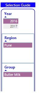
To solve it, I add a rectangular box with title 'Selection guide'. WIthin this, I include table with title eg. Region, Subregion, Product. Now, to keep them all just as visual guides, I remove thier interactions with other graphics on the tile.
Hope this helps
- Mark as New
- Bookmark
- Subscribe
- Mute
- Subscribe to RSS Feed
- Permalink
- Report Inappropriate Content
Pls refer to the snapshot aboove. It is a set of multiple tables for key attributes one has to keep track of during analysis and presentations. It does consume some space of the window, but some Clients are really choosy about it.
- Mark as New
- Bookmark
- Subscribe
- Mute
- Subscribe to RSS Feed
- Permalink
- Report Inappropriate Content
Thank You 🙂
Helpful resources

Power BI Dataviz World Championships
The Power BI Data Visualization World Championships is back! Get ahead of the game and start preparing now!

Power BI Monthly Update - November 2025
Check out the November 2025 Power BI update to learn about new features.

| User | Count |
|---|---|
| 59 | |
| 46 | |
| 42 | |
| 23 | |
| 18 |
| User | Count |
|---|---|
| 193 | |
| 123 | |
| 99 | |
| 67 | |
| 49 |

