FabCon is coming to Atlanta
Join us at FabCon Atlanta from March 16 - 20, 2026, for the ultimate Fabric, Power BI, AI and SQL community-led event. Save $200 with code FABCOMM.
Register now!- Power BI forums
- Get Help with Power BI
- Desktop
- Service
- Report Server
- Power Query
- Mobile Apps
- Developer
- DAX Commands and Tips
- Custom Visuals Development Discussion
- Health and Life Sciences
- Power BI Spanish forums
- Translated Spanish Desktop
- Training and Consulting
- Instructor Led Training
- Dashboard in a Day for Women, by Women
- Galleries
- Data Stories Gallery
- Themes Gallery
- Contests Gallery
- QuickViz Gallery
- Quick Measures Gallery
- Visual Calculations Gallery
- Notebook Gallery
- Translytical Task Flow Gallery
- TMDL Gallery
- R Script Showcase
- Webinars and Video Gallery
- Ideas
- Custom Visuals Ideas (read-only)
- Issues
- Issues
- Events
- Upcoming Events
The Power BI Data Visualization World Championships is back! Get ahead of the game and start preparing now! Learn more
- Power BI forums
- Forums
- Get Help with Power BI
- Desktop
- Dynamic Coloring with R Scripting
- Subscribe to RSS Feed
- Mark Topic as New
- Mark Topic as Read
- Float this Topic for Current User
- Bookmark
- Subscribe
- Printer Friendly Page
- Mark as New
- Bookmark
- Subscribe
- Mute
- Subscribe to RSS Feed
- Permalink
- Report Inappropriate Content
Dynamic Coloring with R Scripting
Hello!
I have a side-passion project I'm working on. Including a very basic DUMMY data set below. What I am trying to create is a box and whisker plot through R, for each individual ID. I can actually do this part, but what I also need is for the individual points to appear by company, and for a single company to be a different color, depending on user choice.
For example, if the first sheet of the dashboard had a slicer where the end user chose their company (with this data, lets say they chose Z, from their choices of X, Y and Z). When they go to the next tab, when looking at the box/whisker plot for ID a, they would see 3 points with the graph (X,Y,Z), and the point for Z would be colored RED and the others would be GREY (or something to this effect).
I can create the R-boxplot visuals, but cannot get the dynamic color changing. Any suggestions? I'm not sure if I need measures, or columns, or what might be best. Thank you all for your help in advance.
Company ID PRICE
Z a 100
Z b 99
Z c 98
Z d 98
Y a 99
Y b 99
X a 100
X c 101
X d 98
- Mark as New
- Bookmark
- Subscribe
- Mute
- Subscribe to RSS Feed
- Permalink
- Report Inappropriate Content
Hi @Anonymous ,
- Mark as New
- Bookmark
- Subscribe
- Mute
- Subscribe to RSS Feed
- Permalink
- Report Inappropriate Content
Hi @Anonymous ,
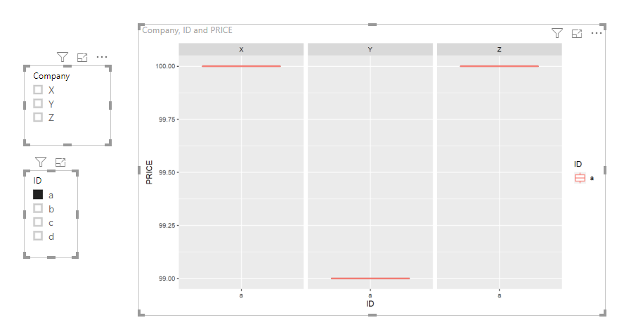
I am currently unable to fulfill your request. Maybe you can try this.
The code in R Script Editor is below:
data<-dataset
library(ggplot2)
ggplot(data,aes(ID,PRICE))+geom_boxplot()+geom_boxplot(aes(colour = ID))+facet_grid(~Company)
Best Regards,
Icey
If this post helps, then please consider Accept it as the solution to help the other members find it more quickly.
Helpful resources

Power BI Dataviz World Championships
The Power BI Data Visualization World Championships is back! Get ahead of the game and start preparing now!

| User | Count |
|---|---|
| 40 | |
| 37 | |
| 33 | |
| 29 | |
| 27 |
| User | Count |
|---|---|
| 133 | |
| 104 | |
| 61 | |
| 59 | |
| 55 |


