FabCon is coming to Atlanta
Join us at FabCon Atlanta from March 16 - 20, 2026, for the ultimate Fabric, Power BI, AI and SQL community-led event. Save $200 with code FABCOMM.
Register now!- Power BI forums
- Get Help with Power BI
- Desktop
- Service
- Report Server
- Power Query
- Mobile Apps
- Developer
- DAX Commands and Tips
- Custom Visuals Development Discussion
- Health and Life Sciences
- Power BI Spanish forums
- Translated Spanish Desktop
- Training and Consulting
- Instructor Led Training
- Dashboard in a Day for Women, by Women
- Galleries
- Data Stories Gallery
- Themes Gallery
- Contests Gallery
- QuickViz Gallery
- Quick Measures Gallery
- Visual Calculations Gallery
- Notebook Gallery
- Translytical Task Flow Gallery
- TMDL Gallery
- R Script Showcase
- Webinars and Video Gallery
- Ideas
- Custom Visuals Ideas (read-only)
- Issues
- Issues
- Events
- Upcoming Events
The Power BI Data Visualization World Championships is back! It's time to submit your entry. Live now!
- Power BI forums
- Forums
- Get Help with Power BI
- Desktop
- Re: Dynamic Coloring with R Scripting
- Subscribe to RSS Feed
- Mark Topic as New
- Mark Topic as Read
- Float this Topic for Current User
- Bookmark
- Subscribe
- Printer Friendly Page
- Mark as New
- Bookmark
- Subscribe
- Mute
- Subscribe to RSS Feed
- Permalink
- Report Inappropriate Content
Dynamic Coloring with R Scripting
Hello!
I have a side-passion project I'm working on. Including a very basic DUMMY data set below. What I am trying to create is a box and whisker plot through R, for each individual ID. I can actually do this part, but what I also need is for the individual points to appear by company, and for a single company to be a different color, depending on user choice.
For example, if the first sheet of the dashboard had a slicer where the end user chose their company (with this data, lets say they chose Z, from their choices of X, Y and Z). When they go to the next tab, when looking at the box/whisker plot for ID a, they would see 3 points with the graph (X,Y,Z), and the point for Z would be colored RED and the others would be GREY (or something to this effect).
I can create the R-boxplot visuals, but cannot get the dynamic color changing. Any suggestions? I'm not sure if I need measures, or columns, or what might be best. Thank you all for your help in advance.
Company ID PRICE
Z a 100
Z b 99
Z c 98
Z d 98
Y a 99
Y b 99
X a 100
X c 101
X d 98
- Mark as New
- Bookmark
- Subscribe
- Mute
- Subscribe to RSS Feed
- Permalink
- Report Inappropriate Content
Hi @Anonymous ,
- Mark as New
- Bookmark
- Subscribe
- Mute
- Subscribe to RSS Feed
- Permalink
- Report Inappropriate Content
Hi @Anonymous ,
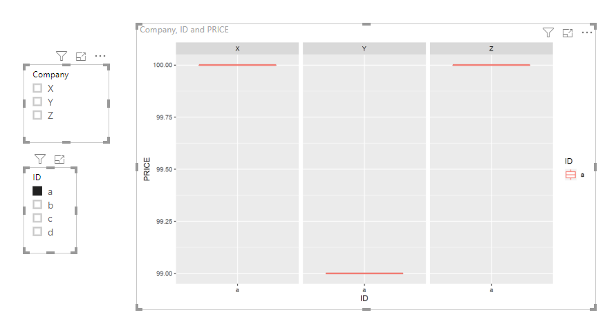
I am currently unable to fulfill your request. Maybe you can try this.
The code in R Script Editor is below:
data<-dataset
library(ggplot2)
ggplot(data,aes(ID,PRICE))+geom_boxplot()+geom_boxplot(aes(colour = ID))+facet_grid(~Company)
Best Regards,
Icey
If this post helps, then please consider Accept it as the solution to help the other members find it more quickly.
Helpful resources
| User | Count |
|---|---|
| 53 | |
| 40 | |
| 35 | |
| 24 | |
| 22 |
| User | Count |
|---|---|
| 136 | |
| 111 | |
| 58 | |
| 43 | |
| 38 |


