FabCon is coming to Atlanta
Join us at FabCon Atlanta from March 16 - 20, 2026, for the ultimate Fabric, Power BI, AI and SQL community-led event. Save $200 with code FABCOMM.
Register now!- Power BI forums
- Get Help with Power BI
- Desktop
- Service
- Report Server
- Power Query
- Mobile Apps
- Developer
- DAX Commands and Tips
- Custom Visuals Development Discussion
- Health and Life Sciences
- Power BI Spanish forums
- Translated Spanish Desktop
- Training and Consulting
- Instructor Led Training
- Dashboard in a Day for Women, by Women
- Galleries
- Data Stories Gallery
- Themes Gallery
- Contests Gallery
- Quick Measures Gallery
- Notebook Gallery
- Translytical Task Flow Gallery
- TMDL Gallery
- R Script Showcase
- Webinars and Video Gallery
- Ideas
- Custom Visuals Ideas (read-only)
- Issues
- Issues
- Events
- Upcoming Events
Join the Fabric FabCon Global Hackathon—running virtually through Nov 3. Open to all skill levels. $10,000 in prizes! Register now.
- Power BI forums
- Forums
- Get Help with Power BI
- Desktop
- Re: Due Date vs. Issued Date Graph
- Subscribe to RSS Feed
- Mark Topic as New
- Mark Topic as Read
- Float this Topic for Current User
- Bookmark
- Subscribe
- Printer Friendly Page
- Mark as New
- Bookmark
- Subscribe
- Mute
- Subscribe to RSS Feed
- Permalink
- Report Inappropriate Content
Due Date vs. Issued Date Graph
Hi,
I'm looking to compare due dates vs. issued dates on a line graph (or open to any other suggestions). I essentially want to visually display how we are performing by issuing items before their due date. This graph only needs to show 1 years worth of data as each item is only due once per year.
Currently the data I have is:
Column 1 - Items (31 in total)
Column 2 - Due Date (DD/MM/YYYY)
Column 3 - Issued Date (DD/MM/YYYY)
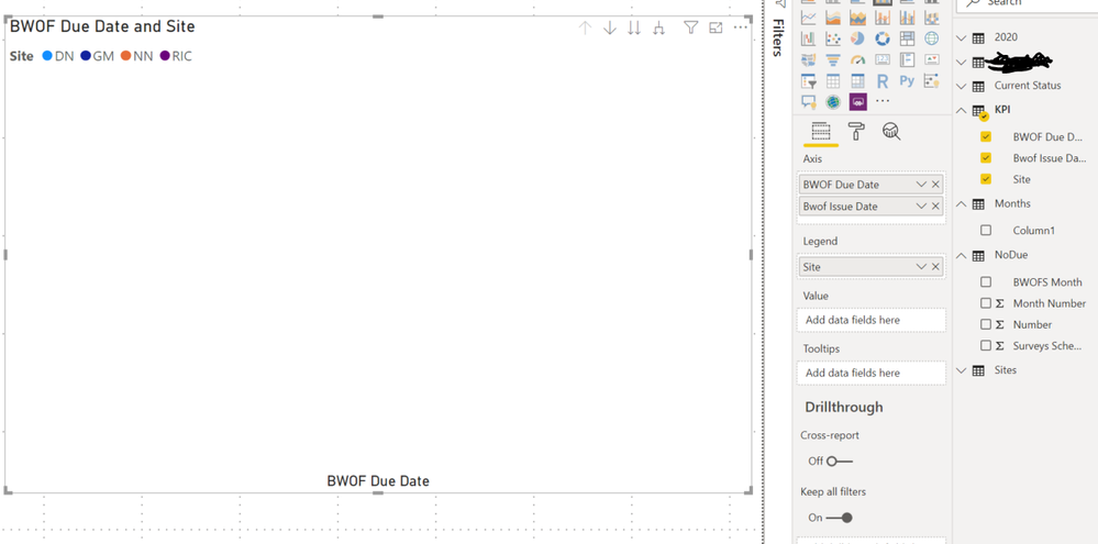
Using this data in Power BI, I cannot get it to work even trying multiple different ways. Currently i'm just getting no data on the line graph and just a Key at the top with the item names.
Any help would be much appreciated.
Cheers,
Dom
Solved! Go to Solution.
- Mark as New
- Bookmark
- Subscribe
- Mute
- Subscribe to RSS Feed
- Permalink
- Report Inappropriate Content
Hi,
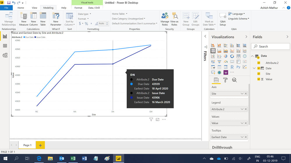
I don't think we can plot Dates on the Y axis. Therefore, i converted the dates to numbers, hid the Y axis and create a tooltip to show the 2 dates per category on mouse hover. You may download my PBI file from here.
Hope this helps.
Regards,
Ashish Mathur
http://www.ashishmathur.com
https://www.linkedin.com/in/excelenthusiasts/
- Mark as New
- Bookmark
- Subscribe
- Mute
- Subscribe to RSS Feed
- Permalink
- Report Inappropriate Content
- Mark as New
- Bookmark
- Subscribe
- Mute
- Subscribe to RSS Feed
- Permalink
- Report Inappropriate Content
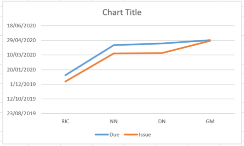
I'm not too sure of the best way to display the data, very much open to suggestions. I managed to create this one in Excel but think there's definitely better ways to display it and I also can't figure how to duplicate it in Power BI.
- Mark as New
- Bookmark
- Subscribe
- Mute
- Subscribe to RSS Feed
- Permalink
- Report Inappropriate Content
Hi,
I don't think we can plot Dates on the Y axis. Therefore, i converted the dates to numbers, hid the Y axis and create a tooltip to show the 2 dates per category on mouse hover. You may download my PBI file from here.
Hope this helps.
Regards,
Ashish Mathur
http://www.ashishmathur.com
https://www.linkedin.com/in/excelenthusiasts/
- Mark as New
- Bookmark
- Subscribe
- Mute
- Subscribe to RSS Feed
- Permalink
- Report Inappropriate Content
- Mark as New
- Bookmark
- Subscribe
- Mute
- Subscribe to RSS Feed
- Permalink
- Report Inappropriate Content
Hi,
I do not have the file. Please share some data, explain the question and show the expected result.
Regards,
Ashish Mathur
http://www.ashishmathur.com
https://www.linkedin.com/in/excelenthusiasts/
- Mark as New
- Bookmark
- Subscribe
- Mute
- Subscribe to RSS Feed
- Permalink
- Report Inappropriate Content
"I don't think we can plot Dates on the Y axis. Therefore, i converted the dates to numbers, hid the Y axis and create a tooltip to show the 2 dates per category on mouse hover. You may download my PBI file from here.
Hope this helps."
If you no longer have the file - a lot has happened since 2019 ha! then that is okay. I came up with the plan to convert my dates and hide as well, i am having trouble getting the two lines to show up at the same time since they use different values. but the image does help.
- Mark as New
- Bookmark
- Subscribe
- Mute
- Subscribe to RSS Feed
- Permalink
- Report Inappropriate Content
- Mark as New
- Bookmark
- Subscribe
- Mute
- Subscribe to RSS Feed
- Permalink
- Report Inappropriate Content


