FabCon is coming to Atlanta
Join us at FabCon Atlanta from March 16 - 20, 2026, for the ultimate Fabric, Power BI, AI and SQL community-led event. Save $200 with code FABCOMM.
Register now!- Power BI forums
- Get Help with Power BI
- Desktop
- Service
- Report Server
- Power Query
- Mobile Apps
- Developer
- DAX Commands and Tips
- Custom Visuals Development Discussion
- Health and Life Sciences
- Power BI Spanish forums
- Translated Spanish Desktop
- Training and Consulting
- Instructor Led Training
- Dashboard in a Day for Women, by Women
- Galleries
- Data Stories Gallery
- Themes Gallery
- Contests Gallery
- QuickViz Gallery
- Quick Measures Gallery
- Visual Calculations Gallery
- Notebook Gallery
- Translytical Task Flow Gallery
- TMDL Gallery
- R Script Showcase
- Webinars and Video Gallery
- Ideas
- Custom Visuals Ideas (read-only)
- Issues
- Issues
- Events
- Upcoming Events
Get Fabric Certified for FREE during Fabric Data Days. Don't miss your chance! Request now
- Power BI forums
- Forums
- Get Help with Power BI
- Desktop
- Re: Dual slicer stacked cumulative sum area plot
- Subscribe to RSS Feed
- Mark Topic as New
- Mark Topic as Read
- Float this Topic for Current User
- Bookmark
- Subscribe
- Printer Friendly Page
- Mark as New
- Bookmark
- Subscribe
- Mute
- Subscribe to RSS Feed
- Permalink
- Report Inappropriate Content
Dual slicer stacked cumulative sum area plot
I want to preface this by pointing out that I am still a novice with Power BI, so please feel free to suggest any odd area where something could be improved.
I am struggling with understanding how to model a data set to accommodate slicers that has two different columns that need to be filtered for two different cumulative sums for reporting on stacked area plots. I have production output that can be classed as many different designs where the specific instance of a design could be production, development, or another kind of manufacturing type. The goal of the report is to be able to view a stacked area plot of all output with slicers included to allow drilling down to specific designs, specific manufacturing types, or a combination such as all A-design production or B-design development where the output is cumulatively summed over date completed to view volume out over time.
Here is a sample dummy data set. The table is sparse in that records only appear for the dates completed for the specific kinds out. Here I calculated the cumulative totals as an example. The first part I'm struggling with is how to best model this to generate a full table of results for each day for proper visualization for all output on all days.
| Design | Type | Number Completed | Date Completed | Cumulative Design Outs | Cumulative Type Outs |
| A | Production | 10 | 1-Jan-23 | 10 | 10 |
| B | Production | 10 | 2-Jan-23 | 10 | 20 |
| A | Development | 5 | 3-Jan-23 | 25 | 8 |
| A | Production | 10 | 3-Jan-23 | 25 | 30 |
| B | Development | 3 | 3-Jan-23 | 13 | 8 |
| B | Development | 15 | 4-Jan-23 | 28 | 23 |
| B | Development | 5 | 5-Jan-23 | 33 | 28 |
| A | Production | 5 | 7-Jan-23 | 30 | 35 |
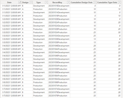
The following is an attempted model trying to replicate the cross-join within PBI where I hoped to get the slicers working. Please excuse the various keying columns from testing. I suspect there is a better approach than what is shown here. The 1:1 relationship back to the Facts table by the RecordKey appears to introduce undesired artifacts that I don't quite understand.

Here's the main table I setup for reporting:
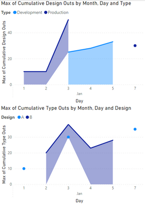
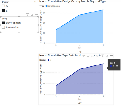
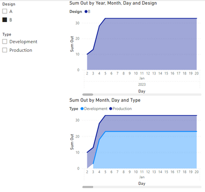
Additionally, when applying the filters, the numbers don't add up despite the plot looking more like it should. Here you can see the summation by type is correct, but the the summation by design should only include the same 28 output in its tally yet it reports 33 total. This appears to be including a Production type entry that should have been filtered out as it is not in the selected data set. This isn't the only discrepancy, all of the points are off. It's as though the calculation is not taking only the selected, but instead the full data set.
Solved! Go to Solution.
- Mark as New
- Bookmark
- Subscribe
- Mute
- Subscribe to RSS Feed
- Permalink
- Report Inappropriate Content
I solved the problem. I just wanted to report back for future users' sake who rely on these kinds of posts as I do.
The root cause is the misunderstanding of the limits of calculated columns. The DAX expressions, despite giving the impression of a dynamic aggregation similar to measures, do not appear to support sub-group aggregation with the slicers as I thought. Measures are required to evaluate in this way.
Creating the following measure allowed implementing the dynamic sub-group aggregation with slicing as desired.

- Mark as New
- Bookmark
- Subscribe
- Mute
- Subscribe to RSS Feed
- Permalink
- Report Inappropriate Content
Anyone else with input on this? I'm still searching for a solution or at least understanding if what I am trying to do is technically possible within Power BI. I would appreciate if anyone could link me to any documentation or guides on understanding the fundamentals to how the data filtering layers are intended to work as I suspect a lot of my struggle is that I can't conceptualize how the DAX filter layers and other cross-visual filters are applying to the dataset prior to aggregation.
- Mark as New
- Bookmark
- Subscribe
- Mute
- Subscribe to RSS Feed
- Permalink
- Report Inappropriate Content
Why is a measure preferred? I tried this, and it doesn't seem to help in any notable way. The results are essentially the same.
I tested with this calculated measure with the bare minimum for a cumulative sum (ignoring any of the requirements for the slicer).
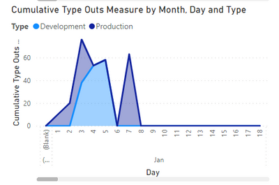
It doesn't retain the accumulated sum for days that are missing from the original sparse data set. Instead it reports blank resulting in plots like in my first post or as above when I include the ISBLANK check to report zero instead. Basically, it is returning a cummulative sum of zero on days where there is no record in the base set rather than the result from the prior day.
When I run the same calculation in the column formula, it reports the correct cummulative sum for all days later in the calendar. The values it plots past the end in the visual are simply wrong. This appears to be because it is reporting an empty value rather than the actual result. I'm not sure why though as I'm plotting against the date in this table which exists all the way out to the end of the year. There is no apparent reason why it should be filtering the dates out of the calculation based on the sparse table. This is true even if I change from ALLSELECTED to ALL in the filter.
- Mark as New
- Bookmark
- Subscribe
- Mute
- Subscribe to RSS Feed
- Permalink
- Report Inappropriate Content
@sbiedrzycki , Prefer to create measure in such case
example
Cumm Sales = CALCULATE(SUM(Sales[Sales Amount]),filter(all('Date'),'Date'[date] <=max('Date'[date])))
Cumm Sales = CALCULATE(SUM(Sales[Sales Amount]),filter(allselected(date),date[date] <=max(date[Date])))
Cumm Based on Date = CALCULATE([Net], Window(1,ABS,0,REL, ALL('date'[date]),ORDERBY('Date'[date],ASC)))
Cumm Based on Date = CALCULATE([Net], Window(1,ABS,0,REL, ALLSELECTED('date'[date]),ORDERBY('Date'[date],ASC)))
you can add filter function to filter additional data
Running Total/ Cumulative:
https://www.youtube.com/watch?v=h2wsO332LUo&list=PLPaNVDMhUXGaaqV92SBD5X2hk3TMNlHhb&index=42
Power BI Window function Rolling, Cumulative/Running Total, WTD, MTD, QTD, YTD, FYTD: https://youtu.be/nxc_IWl-tTc
Helpful resources

Power BI Monthly Update - November 2025
Check out the November 2025 Power BI update to learn about new features.

Fabric Data Days
Advance your Data & AI career with 50 days of live learning, contests, hands-on challenges, study groups & certifications and more!

