FabCon is coming to Atlanta
Join us at FabCon Atlanta from March 16 - 20, 2026, for the ultimate Fabric, Power BI, AI and SQL community-led event. Save $200 with code FABCOMM.
Register now!- Power BI forums
- Get Help with Power BI
- Desktop
- Service
- Report Server
- Power Query
- Mobile Apps
- Developer
- DAX Commands and Tips
- Custom Visuals Development Discussion
- Health and Life Sciences
- Power BI Spanish forums
- Translated Spanish Desktop
- Training and Consulting
- Instructor Led Training
- Dashboard in a Day for Women, by Women
- Galleries
- Data Stories Gallery
- Themes Gallery
- Contests Gallery
- QuickViz Gallery
- Quick Measures Gallery
- Visual Calculations Gallery
- Notebook Gallery
- Translytical Task Flow Gallery
- TMDL Gallery
- R Script Showcase
- Webinars and Video Gallery
- Ideas
- Custom Visuals Ideas (read-only)
- Issues
- Issues
- Events
- Upcoming Events
The Power BI Data Visualization World Championships is back! Get ahead of the game and start preparing now! Learn more
- Power BI forums
- Forums
- Get Help with Power BI
- Desktop
- Re: Double Heading Matrix
- Subscribe to RSS Feed
- Mark Topic as New
- Mark Topic as Read
- Float this Topic for Current User
- Bookmark
- Subscribe
- Printer Friendly Page
- Mark as New
- Bookmark
- Subscribe
- Mute
- Subscribe to RSS Feed
- Permalink
- Report Inappropriate Content
Double Heading Matrix
Hi All,
I am trying to do a matrix as in the picture below, but within each month I would like to include columns that distinguish version (Outlook or Actual values). For instance I want to see all row values for January with the two values (Outlook & Actual) for my two different versions. At the same time, when I drill up, I would like to see the same for each Quarter. Is it possible to do so?


Many thanks in advance,
Regards
Estefania
Solved! Go to Solution.
- Mark as New
- Bookmark
- Subscribe
- Mute
- Subscribe to RSS Feed
- Permalink
- Report Inappropriate Content
Hi @estefaniamc,
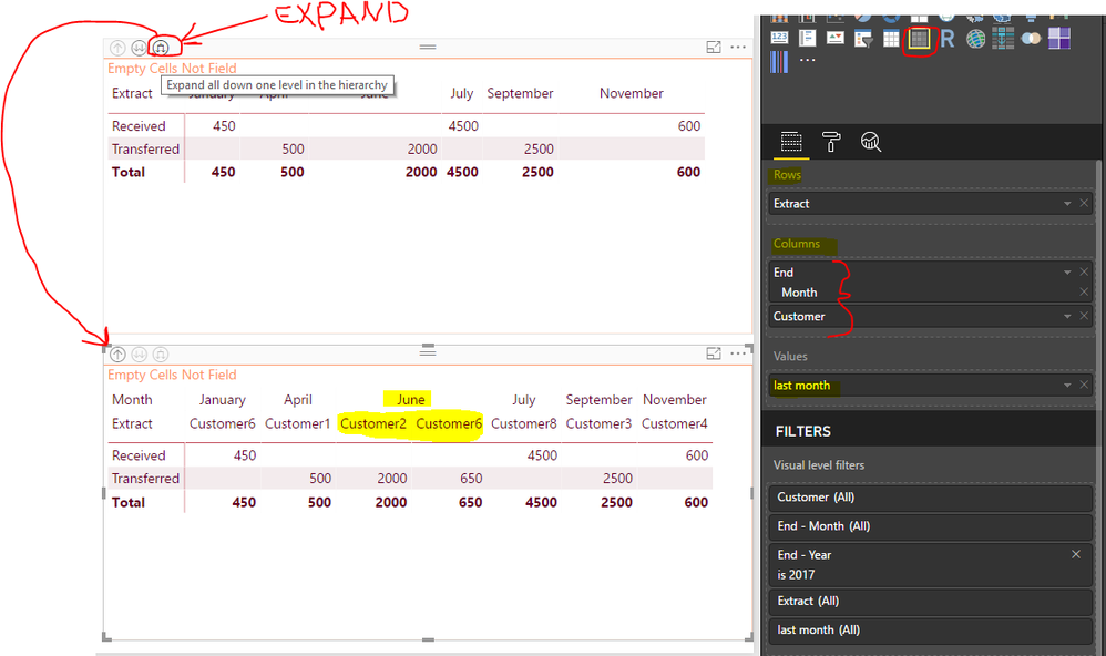
Use Matrix table and then drop your fields as follows:
- Step 1
- Step 2
Hope this solves your issue.
Regards
Abduvali
- Mark as New
- Bookmark
- Subscribe
- Mute
- Subscribe to RSS Feed
- Permalink
- Report Inappropriate Content
Hi @estefaniamc,
Yes. It's available to create such a Matrix.
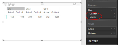
Add date hierarchy into column section, remove "Year" and "Day" values.
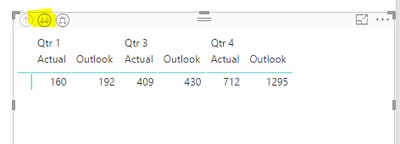
By default, the top group level is Quarter. To drill down to Month level, click the second "Drill Down" icon.
To show both Quarter and Month level as column header, you could click the third "Drill Down" icon.
Best regards,
Yuliana Gu
If this post helps, then please consider Accept it as the solution to help the other members find it more quickly.
- Mark as New
- Bookmark
- Subscribe
- Mute
- Subscribe to RSS Feed
- Permalink
- Report Inappropriate Content
Thanks for your contribution, it helped resolve my issue as well 🙂
- Mark as New
- Bookmark
- Subscribe
- Mute
- Subscribe to RSS Feed
- Permalink
- Report Inappropriate Content
- Mark as New
- Bookmark
- Subscribe
- Mute
- Subscribe to RSS Feed
- Permalink
- Report Inappropriate Content
Hi All,
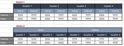
Is it possible to create the matrix demonstrated, but instead of the [Actual] and [Outlook] columns existing per quarter, have the quarters exist per each of those value headings.
So, instead of having Option 1, you would have Option 2 (both below).
Thanks
Shane
- Mark as New
- Bookmark
- Subscribe
- Mute
- Subscribe to RSS Feed
- Permalink
- Report Inappropriate Content
Thanks for your suggestion @shanelthiggs but the problem comes when I tried to calculate the difference between actual and outlook per Region.
I managed to calculate it by creating new columns and add some measures that can be filtered through different supporting tables that I created.
Regards,
Estefania
- Mark as New
- Bookmark
- Subscribe
- Mute
- Subscribe to RSS Feed
- Permalink
- Report Inappropriate Content
Hi @estefaniamc - apologies, I was more tagging on to your original question in the hope of finding one myself; not much of a solution I know.
My desired format (Option 2 in my image) is something we can do on an existing SSAS product but can't seem to replicate that format in Power BI. The below images are what we would have in our existing product; its' effectively making the measures' headings primary, and the dimensions' headers secondary.


Hope that clarifies a little more what I was after.
Cheers
Shane
- Mark as New
- Bookmark
- Subscribe
- Mute
- Subscribe to RSS Feed
- Permalink
- Report Inappropriate Content
Hi @estefaniamc,
Yes. It's available to create such a Matrix.
Add date hierarchy into column section, remove "Year" and "Day" values.
By default, the top group level is Quarter. To drill down to Month level, click the second "Drill Down" icon.
To show both Quarter and Month level as column header, you could click the third "Drill Down" icon.
Best regards,
Yuliana Gu
If this post helps, then please consider Accept it as the solution to help the other members find it more quickly.
- Mark as New
- Bookmark
- Subscribe
- Mute
- Subscribe to RSS Feed
- Permalink
- Report Inappropriate Content
Hi @estefaniamc,
Use Matrix table and then drop your fields as follows:
- Step 1
- Step 2

Hope this solves your issue.
Regards
Abduvali
Helpful resources

Power BI Dataviz World Championships
The Power BI Data Visualization World Championships is back! Get ahead of the game and start preparing now!

| User | Count |
|---|---|
| 39 | |
| 38 | |
| 38 | |
| 28 | |
| 27 |
| User | Count |
|---|---|
| 124 | |
| 88 | |
| 73 | |
| 66 | |
| 65 |
