FabCon is coming to Atlanta
Join us at FabCon Atlanta from March 16 - 20, 2026, for the ultimate Fabric, Power BI, AI and SQL community-led event. Save $200 with code FABCOMM.
Register now!- Power BI forums
- Get Help with Power BI
- Desktop
- Service
- Report Server
- Power Query
- Mobile Apps
- Developer
- DAX Commands and Tips
- Custom Visuals Development Discussion
- Health and Life Sciences
- Power BI Spanish forums
- Translated Spanish Desktop
- Training and Consulting
- Instructor Led Training
- Dashboard in a Day for Women, by Women
- Galleries
- Data Stories Gallery
- Themes Gallery
- Contests Gallery
- QuickViz Gallery
- Quick Measures Gallery
- Visual Calculations Gallery
- Notebook Gallery
- Translytical Task Flow Gallery
- TMDL Gallery
- R Script Showcase
- Webinars and Video Gallery
- Ideas
- Custom Visuals Ideas (read-only)
- Issues
- Issues
- Events
- Upcoming Events
The Power BI Data Visualization World Championships is back! Get ahead of the game and start preparing now! Learn more
- Power BI forums
- Forums
- Get Help with Power BI
- Desktop
- Re: Dotted Line/ Dashed Lines on a Bar Chart
- Subscribe to RSS Feed
- Mark Topic as New
- Mark Topic as Read
- Float this Topic for Current User
- Bookmark
- Subscribe
- Printer Friendly Page
- Mark as New
- Bookmark
- Subscribe
- Mute
- Subscribe to RSS Feed
- Permalink
- Report Inappropriate Content
Dotted Line/ Dashed Lines on a Bar Chart
Hi everyone,
I am trying to make something fairly simple but it does not look like its doable.
I have a bar chart along with a line, the client wants the line to be "dotted" instead of solid. Since the line is supposed to represent foreceast. There does not seem to be a way to do this!
Any ideas?
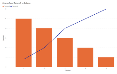
Here is the data along with the chart:
Column1Column2Column3
| A | 5 | 30 |
| B | 10 | 25 |
| C | 15 | 20 |
| D | 20 | 10 |
| E | 25 | 4 |
Solved! Go to Solution.
- Mark as New
- Bookmark
- Subscribe
- Mute
- Subscribe to RSS Feed
- Permalink
- Report Inappropriate Content
Hi @Gladiator909 ,
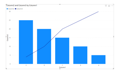
You can change the style of line to Dotted by using format visual:
Output:
Kind Regards,
Bubble
If this post helps, then please consider Accept it as the solution to help the other members find it more quickly.
- Mark as New
- Bookmark
- Subscribe
- Mute
- Subscribe to RSS Feed
- Permalink
- Report Inappropriate Content
Do you mean a column chart? I don't think there is any way to have lines on a standard bar chart. Can you show the expected outcome?
- Mark as New
- Bookmark
- Subscribe
- Mute
- Subscribe to RSS Feed
- Permalink
- Report Inappropriate Content
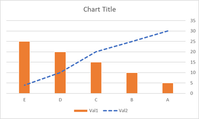
Thank you very much for responding to my question. I basically want the line on the chart above to be dotted. This is what I was able to reproduce within Excel but not in PowerBI:
Any ideas how this can be replicated on PowerBI?
- Mark as New
- Bookmark
- Subscribe
- Mute
- Subscribe to RSS Feed
- Permalink
- Report Inappropriate Content
That is a column chart.
The line makes no sense as there is no relation between the categories. Line charts should only be used with temporal data, or correlated categories. Looks like you want a Pareto instead?
This is where Tableau is better than Power BI - It wouldn't even allow you to attempt this.
- Mark as New
- Bookmark
- Subscribe
- Mute
- Subscribe to RSS Feed
- Permalink
- Report Inappropriate Content
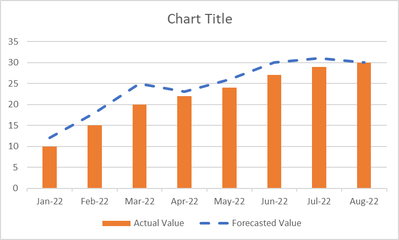
The data that I showed is not the real dataset I am working with, just dummy data to convey what I am trying to do. Maybe something like this would make more sense:
Just want the forecasted line to be dashed/dotted in PowerBI
- Mark as New
- Bookmark
- Subscribe
- Mute
- Subscribe to RSS Feed
- Permalink
- Report Inappropriate Content
Phew! That makes so much more sense... Please provide sanitized sample data that fully covers your issue.
Helpful resources

Power BI Dataviz World Championships
The Power BI Data Visualization World Championships is back! Get ahead of the game and start preparing now!

| User | Count |
|---|---|
| 39 | |
| 39 | |
| 37 | |
| 29 | |
| 24 |
| User | Count |
|---|---|
| 120 | |
| 95 | |
| 70 | |
| 69 | |
| 65 |


