Join us at FabCon Vienna from September 15-18, 2025
The ultimate Fabric, Power BI, SQL, and AI community-led learning event. Save €200 with code FABCOMM.
Get registered- Power BI forums
- Get Help with Power BI
- Desktop
- Service
- Report Server
- Power Query
- Mobile Apps
- Developer
- DAX Commands and Tips
- Custom Visuals Development Discussion
- Health and Life Sciences
- Power BI Spanish forums
- Translated Spanish Desktop
- Training and Consulting
- Instructor Led Training
- Dashboard in a Day for Women, by Women
- Galleries
- Data Stories Gallery
- Themes Gallery
- Contests Gallery
- Quick Measures Gallery
- Notebook Gallery
- Translytical Task Flow Gallery
- TMDL Gallery
- R Script Showcase
- Webinars and Video Gallery
- Ideas
- Custom Visuals Ideas (read-only)
- Issues
- Issues
- Events
- Upcoming Events
Compete to become Power BI Data Viz World Champion! First round ends August 18th. Get started.
- Power BI forums
- Forums
- Get Help with Power BI
- Desktop
- Do I need to split a row to graph unique values
- Subscribe to RSS Feed
- Mark Topic as New
- Mark Topic as Read
- Float this Topic for Current User
- Bookmark
- Subscribe
- Printer Friendly Page
- Mark as New
- Bookmark
- Subscribe
- Mute
- Subscribe to RSS Feed
- Permalink
- Report Inappropriate Content
Do I need to split a row to graph unique values
Good day,
I have the following table that tracks orders and the category(ies) that the items belong in:
| Order Number | Item Number | Agency | County | Category 1 | Category 2 | Category 3 | Category 4 | Category 5 | Category 6 | Category 7 | Category 8 | Category 9 | Category 10 | Category 11 | Category 12 | |||
| 201905378 | 2-1 | ACME, Inc. | New Hanover | Y | Y | |||||||||||||
| 201905378 | 2-1 | ACME, Inc. | New Hanover | Y | ||||||||||||||
| 201905378 | 2-2 | ACME, Inc. | New Hanover | Y | Y | |||||||||||||
| 201917154 | 2 | JustAnotherPlace | Craven | Y | ||||||||||||||
| 201917154 | 3 | JustAnotherPlace | Craven | Y | ||||||||||||||
| 202000456 | 1 | Knowhere | Craven | Y | Y | |||||||||||||
| 202000456 | 1 | Knowhere | Craven | Y | ||||||||||||||
| 202002107 | 1 | Places | Pasquotank | Y | Y | Y | ||||||||||||
| 202002345 | 1 | NothingKnew | Jones | Y | Y | Y | ||||||||||||
| 202002818 | 1 | AlwaysOld | Pamlico | Y | Y |
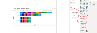
On my visualization, I need this table as-is but also need a Stacked Bar Chart that graphs the data by Agency and Category:
When an item has only one category, it graphs correctly. However, when an order has multiple categories for the same item (Order Number 202002345) the graph only picks up the last indicated category. Order Number 202002345 only counts Category 8 and ignores Category 2 and Category 4.
The actual table is roughly 25,000 rows so manually splitting isn't feasible. Is there a way to dynamically code it where I actually can catch multiple categories for the same Order Number and Item.
Thanks
Solved! Go to Solution.
- Mark as New
- Bookmark
- Subscribe
- Mute
- Subscribe to RSS Feed
- Permalink
- Report Inappropriate Content
Hi @M_Capps
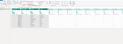
To work effectively with the data in the table, it is necessary to unpivot it.
Don't worry 25K rows is a very small database for a power bi engine.
The steps for unpivot on power query:
1. Select all columns except of categories
2. Use the option of "unpivot other columns"
3. close and apply.
4. Create the graph:
Please consider Accepting it as the solution to help the other members find it more quickly
Rita Fainshtein | Microsoft MVP
https://www.linkedin.com/in/rita-fainshtein/
Blog : https://www.madeiradata.com/profile/ritaf/profile
- Mark as New
- Bookmark
- Subscribe
- Mute
- Subscribe to RSS Feed
- Permalink
- Report Inappropriate Content
- Mark as New
- Bookmark
- Subscribe
- Mute
- Subscribe to RSS Feed
- Permalink
- Report Inappropriate Content
Glad to help 🙂
Rita Fainshtein | Microsoft MVP
https://www.linkedin.com/in/rita-fainshtein/
Blog : https://www.madeiradata.com/profile/ritaf/profile


