FabCon is coming to Atlanta
Join us at FabCon Atlanta from March 16 - 20, 2026, for the ultimate Fabric, Power BI, AI and SQL community-led event. Save $200 with code FABCOMM.
Register now!- Power BI forums
- Get Help with Power BI
- Desktop
- Service
- Report Server
- Power Query
- Mobile Apps
- Developer
- DAX Commands and Tips
- Custom Visuals Development Discussion
- Health and Life Sciences
- Power BI Spanish forums
- Translated Spanish Desktop
- Training and Consulting
- Instructor Led Training
- Dashboard in a Day for Women, by Women
- Galleries
- Data Stories Gallery
- Themes Gallery
- Contests Gallery
- QuickViz Gallery
- Quick Measures Gallery
- Visual Calculations Gallery
- Notebook Gallery
- Translytical Task Flow Gallery
- TMDL Gallery
- R Script Showcase
- Webinars and Video Gallery
- Ideas
- Custom Visuals Ideas (read-only)
- Issues
- Issues
- Events
- Upcoming Events
The Power BI Data Visualization World Championships is back! Get ahead of the game and start preparing now! Learn more
- Power BI forums
- Forums
- Get Help with Power BI
- Desktop
- Re: Divide the Bar based on Count with the same Ca...
- Subscribe to RSS Feed
- Mark Topic as New
- Mark Topic as Read
- Float this Topic for Current User
- Bookmark
- Subscribe
- Printer Friendly Page
- Mark as New
- Bookmark
- Subscribe
- Mute
- Subscribe to RSS Feed
- Permalink
- Report Inappropriate Content
Divide the Bar based on Count with the same Category
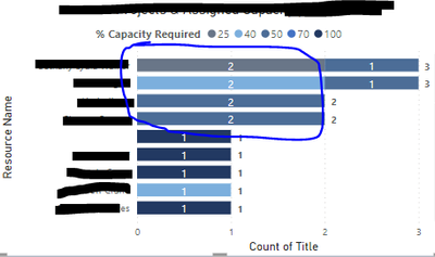
Hi Power BI Experts. Asking for your help please. I wish to divide the category on the bar based on the count the % capacity required appeared.
The scenario:
An employee has a maximum percent (ex. 100%, 70% or 50%). He is being assigned with a certain percent to work. If the employee has 100% max percent and he was assigned with 25%, 25% and 50%, I want to see in one bar the division of these 3 percents.
What I have now:
As you can see the 25 percent (which has "2" count) was merged in the first slice of the bar. I want to split the two 25 percents.
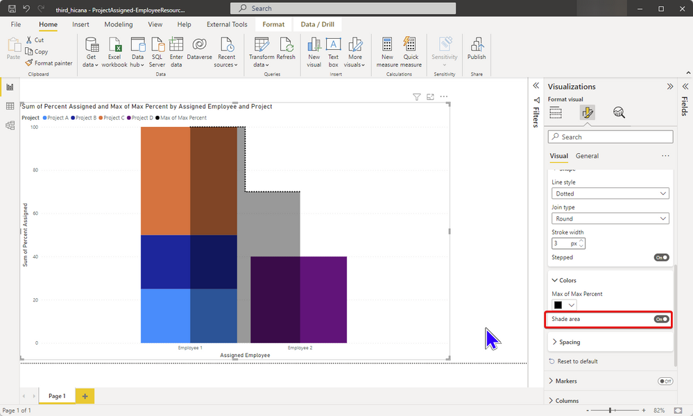
What I wish to have:
Thank you for your help 🙂
Solved! Go to Solution.
- Mark as New
- Bookmark
- Subscribe
- Mute
- Subscribe to RSS Feed
- Permalink
- Report Inappropriate Content
Makes sense.
I've attached a PBIX file for you to look at.
Before I spend too much time on it, I thought it might be easier to start with this and see what is non-negotiable.
The layout may be difficult to achieve without a custom visual.
There are options for custom visuals but it may not add much value.
All of this working is dependent on the actual model/data so have a look at the PBIX attached and let me know if you have any questions.
(check the Power Query steps to see what I've done there)
| Have I solved your problem? Please click Accept as Solution so I don't keep coming back to this post, oh yeah, others may find it useful also ;). |
- Mark as New
- Bookmark
- Subscribe
- Mute
- Subscribe to RSS Feed
- Permalink
- Report Inappropriate Content
No problem. Happy to help.
Did you figure out the max capacity bar?
You may prefer the markers off and line on also.
It's annoying that you can do this layout with a column chart but not a bar chart.
| Have I solved your problem? Please click Accept as Solution so I don't keep coming back to this post, oh yeah, others may find it useful also ;). |
- Mark as New
- Bookmark
- Subscribe
- Mute
- Subscribe to RSS Feed
- Permalink
- Report Inappropriate Content
Can you paste some sample data please?
It will make it much easier to help you.
| Have I solved your problem? Please click Accept as Solution so I don't keep coming back to this post, oh yeah, others may find it useful also ;). |
- Mark as New
- Bookmark
- Subscribe
- Mute
- Subscribe to RSS Feed
- Permalink
- Report Inappropriate Content
Hi @KNP Thank you. Here's the sample data. For the employee 2 in "What I wsh to have" graph, the 30 there is the remaining percent left to the employee.
| Project | Assigned Employee | Percent Assigned |
| Project A | Employee 1 | 25 |
| Project B | Employee 1 | 25 |
| Project C | Employee 1 | 50 |
| Project D | Employee2 | 40 |
| Employee | Max Percent |
| Employee 1 | 100 |
| Employee 2 | 70 |
- Mark as New
- Bookmark
- Subscribe
- Mute
- Subscribe to RSS Feed
- Permalink
- Report Inappropriate Content
Thanks for the data.
Unless I'm doing math wrong, I don't get the employee 2 scenario.
30 + 40 = 70
| Have I solved your problem? Please click Accept as Solution so I don't keep coming back to this post, oh yeah, others may find it useful also ;). |
- Mark as New
- Bookmark
- Subscribe
- Mute
- Subscribe to RSS Feed
- Permalink
- Report Inappropriate Content
Hi @KNP I added another table.
I have another table for the list of employees with max percent.
So that math would be
Employee 1 : 100 -25 -25- 50 = 0% (which means 100% is maximised or utilised)
Employee 2 = 70- 40 = 30% (which means 40% assigned , 30% available percent or left from 70% maximum capacity
- Mark as New
- Bookmark
- Subscribe
- Mute
- Subscribe to RSS Feed
- Permalink
- Report Inappropriate Content
Makes sense.
I've attached a PBIX file for you to look at.
Before I spend too much time on it, I thought it might be easier to start with this and see what is non-negotiable.
The layout may be difficult to achieve without a custom visual.
There are options for custom visuals but it may not add much value.
All of this working is dependent on the actual model/data so have a look at the PBIX attached and let me know if you have any questions.
(check the Power Query steps to see what I've done there)
| Have I solved your problem? Please click Accept as Solution so I don't keep coming back to this post, oh yeah, others may find it useful also ;). |
- Mark as New
- Bookmark
- Subscribe
- Mute
- Subscribe to RSS Feed
- Permalink
- Report Inappropriate Content
- Mark as New
- Bookmark
- Subscribe
- Mute
- Subscribe to RSS Feed
- Permalink
- Report Inappropriate Content
No problem. Happy to help.
Did you figure out the max capacity bar?
You may prefer the markers off and line on also.
It's annoying that you can do this layout with a column chart but not a bar chart.
| Have I solved your problem? Please click Accept as Solution so I don't keep coming back to this post, oh yeah, others may find it useful also ;). |
- Mark as New
- Bookmark
- Subscribe
- Mute
- Subscribe to RSS Feed
- Permalink
- Report Inappropriate Content
Hi @KNP the marker is fine. I just really need the division of assigned percent. Superb. Thanks again.
Helpful resources

Power BI Dataviz World Championships
The Power BI Data Visualization World Championships is back! Get ahead of the game and start preparing now!

Power BI Monthly Update - November 2025
Check out the November 2025 Power BI update to learn about new features.

| User | Count |
|---|---|
| 59 | |
| 43 | |
| 42 | |
| 23 | |
| 17 |
| User | Count |
|---|---|
| 190 | |
| 122 | |
| 96 | |
| 66 | |
| 47 |


