Fabric Data Days starts November 4th!
Advance your Data & AI career with 50 days of live learning, dataviz contests, hands-on challenges, study groups & certifications and more!
Get registered- Power BI forums
- Get Help with Power BI
- Desktop
- Service
- Report Server
- Power Query
- Mobile Apps
- Developer
- DAX Commands and Tips
- Custom Visuals Development Discussion
- Health and Life Sciences
- Power BI Spanish forums
- Translated Spanish Desktop
- Training and Consulting
- Instructor Led Training
- Dashboard in a Day for Women, by Women
- Galleries
- Data Stories Gallery
- Themes Gallery
- Contests Gallery
- Quick Measures Gallery
- Visual Calculations Gallery
- Notebook Gallery
- Translytical Task Flow Gallery
- TMDL Gallery
- R Script Showcase
- Webinars and Video Gallery
- Ideas
- Custom Visuals Ideas (read-only)
- Issues
- Issues
- Events
- Upcoming Events
Join us at FabCon Atlanta from March 16 - 20, 2026, for the ultimate Fabric, Power BI, AI and SQL community-led event. Save $200 with code FABCOMM. Register now.
- Power BI forums
- Forums
- Get Help with Power BI
- Desktop
- Displaying integer data with events marked on a ti...
- Subscribe to RSS Feed
- Mark Topic as New
- Mark Topic as Read
- Float this Topic for Current User
- Bookmark
- Subscribe
- Printer Friendly Page
- Mark as New
- Bookmark
- Subscribe
- Mute
- Subscribe to RSS Feed
- Permalink
- Report Inappropriate Content
Displaying integer data with events marked on a timeline
I have data like the following table:
I want to display the increasing data values by showing the difference on a Waterfall chart across x-axis time. I also want the graph to indicate the events at the proper times when they have occured. Is this possible in PowerBI? Please help if it can be done. I can't seem to find any chart type in PowerBI desktop that supports this.
- Mark as New
- Bookmark
- Subscribe
- Mute
- Subscribe to RSS Feed
- Permalink
- Report Inappropriate Content
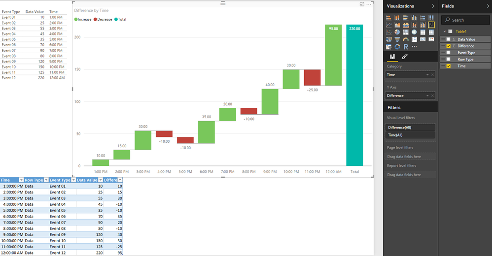
How about this set up? Its a bit different but... Why do you have separate rows for the Events?
- Mark as New
- Bookmark
- Subscribe
- Mute
- Subscribe to RSS Feed
- Permalink
- Report Inappropriate Content
Thanks Sean for replying. I have come up with the same solution but it does not look neat (its kinda a hack). Is there any way to overlay two types of data on a single chart with common x-axis? Also, if you notice the total is wrong since it takes dummy event data into account. Is it possible to remove the total at the end from the chart?
- Mark as New
- Bookmark
- Subscribe
- Mute
- Subscribe to RSS Feed
- Permalink
- Report Inappropriate Content
@Abhaykumar wrote:
Is there any way to overlay two types of data on a single chart with common x-axis? ?
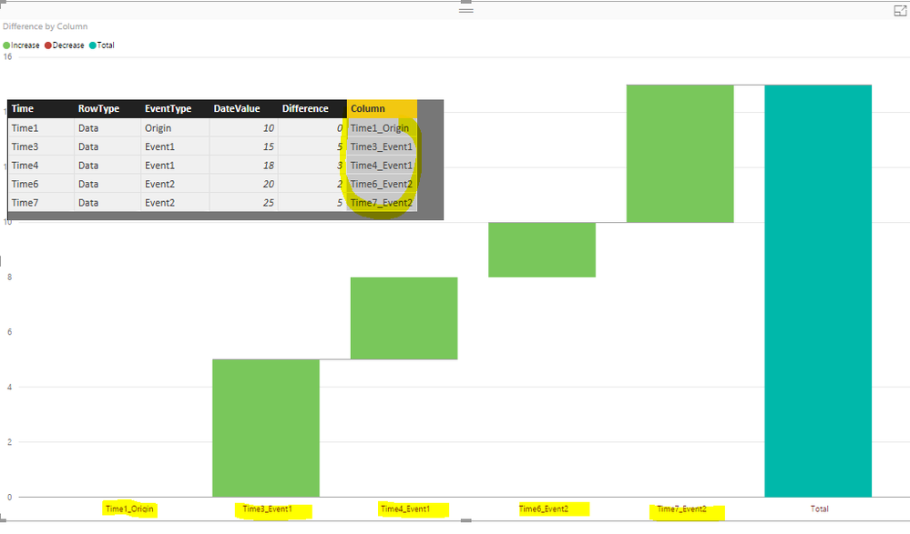
There seems no straightforward way to do this, as a trick, you can create a new column and merge the time and eventype into one.
By the way, the data in Sean's demo looks more normalized. Enable/Disable the total sounds reasonable, we will report this internally and you can also vote for this idea.
- Mark as New
- Bookmark
- Subscribe
- Mute
- Subscribe to RSS Feed
- Permalink
- Report Inappropriate Content
Can you post an example of what you expect the result to look like?
I agree about the Total - I wish there was an On/Off switch for it.
- Mark as New
- Bookmark
- Subscribe
- Mute
- Subscribe to RSS Feed
- Permalink
- Report Inappropriate Content
In the example chart that you have posted, in place of the red bars (denoting decreasing value), it would be great if there is a marker like a vertical line or even a dot with the label of event name.This would clearly depict there was an event at this time and distinguish this from other data points represented as bars.
![2016-04-25 16_41_18-Yi_LowPowerStatePowerPlanIncluded.xlsx [Read-Only] - Excel.jpg 2016-04-25 16_41_18-Yi_LowPowerStatePowerPlanIncluded.xlsx [Read-Only] - Excel.jpg](/t5/image/serverpage/image-id/4761i6055F710E2BCCD40/image-size/large?v=v2&px=999)


