Join the Fabric User Panel to shape the future of Fabric.
Share feedback directly with Fabric product managers, participate in targeted research studies and influence the Fabric roadmap.
Sign up now- Power BI forums
- Get Help with Power BI
- Desktop
- Service
- Report Server
- Power Query
- Mobile Apps
- Developer
- DAX Commands and Tips
- Custom Visuals Development Discussion
- Health and Life Sciences
- Power BI Spanish forums
- Translated Spanish Desktop
- Training and Consulting
- Instructor Led Training
- Dashboard in a Day for Women, by Women
- Galleries
- Data Stories Gallery
- Themes Gallery
- Contests Gallery
- QuickViz Gallery
- Quick Measures Gallery
- Visual Calculations Gallery
- Notebook Gallery
- Translytical Task Flow Gallery
- TMDL Gallery
- R Script Showcase
- Webinars and Video Gallery
- Ideas
- Custom Visuals Ideas (read-only)
- Issues
- Issues
- Events
- Upcoming Events
Get Fabric certified for FREE! Don't miss your chance! Learn more
- Power BI forums
- Forums
- Get Help with Power BI
- Desktop
- Displaying Change Indicators
- Subscribe to RSS Feed
- Mark Topic as New
- Mark Topic as Read
- Float this Topic for Current User
- Bookmark
- Subscribe
- Printer Friendly Page
- Mark as New
- Bookmark
- Subscribe
- Mute
- Subscribe to RSS Feed
- Permalink
- Report Inappropriate Content
Displaying Change Indicators
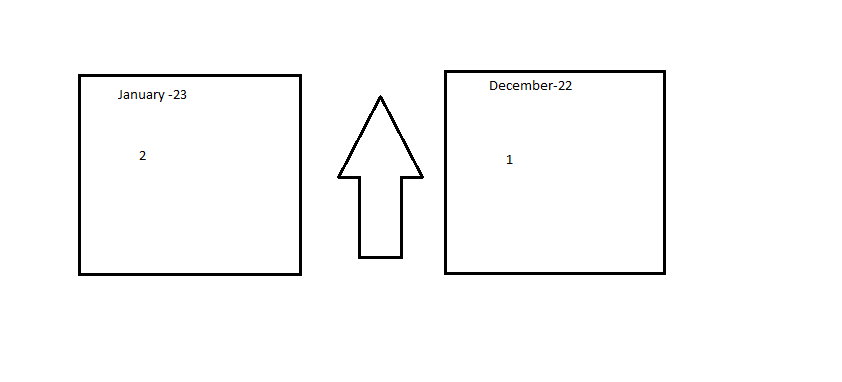
I Have a requirement to show the previous month value and previous of previous month value in individually and betwwen these two to have an arrow indication if the present month value has increased,decreased or same when compared with the previous month .
Are there any specific visuals which can help me in this regard or if there are any workaround with the exisiting visuals . the values are currently represented in the card visual but arrows indications i cant figure out how to put them .
SOmething like this
Any Help is Appreciated !
Solved! Go to Solution.
- Mark as New
- Bookmark
- Subscribe
- Mute
- Subscribe to RSS Feed
- Permalink
- Report Inappropriate Content
hi @SaiJ301120
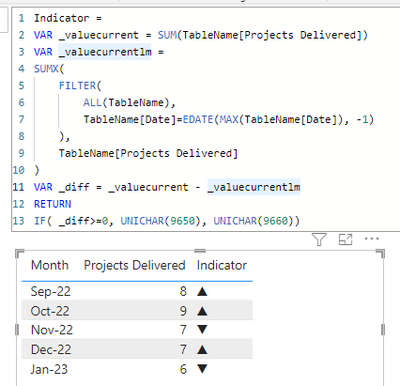
something like this?
Indicator =
VAR _valuecurrent = SUM(TableName[Projects Delivered])
VAR _valuecurrentlm =
SUMX(
    FILTER(
        ALL(TableName),
        TableName[Date]=EDATE(MAX(TableName[Date]), -1)
    ),
    TableName[Projects Delivered]
)
VAR _diff = _valuecurrent - _valuecurrentlm
RETURN
IF( _diff>=0, UNICHAR(9650), UNICHAR(9660))
- Mark as New
- Bookmark
- Subscribe
- Mute
- Subscribe to RSS Feed
- Permalink
- Report Inappropriate Content
hi @SaiJ301120
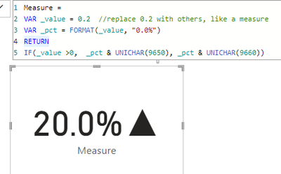
it is achievable with the standard card visual.
try to feed the measure with a measure like:
Measure =
VAR _value = 0.2  //replace 0.2 with others, like a measure
VAR _pct = FORMAT(_value, "0.0%")
RETURN
IF(_value >0,  _pct & UNICHAR(9650), _pct & UNICHAR(9660))
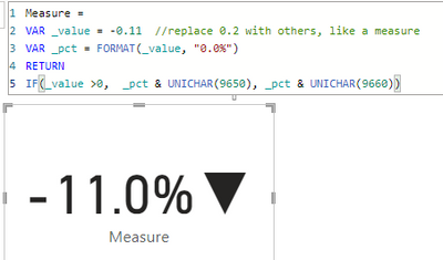
it worked like:
- Mark as New
- Bookmark
- Subscribe
- Mute
- Subscribe to RSS Feed
- Permalink
- Report Inappropriate Content
Hey Freeman , Thanks for answering my quesion but can you elaborate on this please i can provide you with the sample data if needed .
what i precisely need is as per the picture i have provided and giving me the measure defintions would be more helpful .
Thanks
- Mark as New
- Bookmark
- Subscribe
- Mute
- Subscribe to RSS Feed
- Permalink
- Report Inappropriate Content
- Mark as New
- Bookmark
- Subscribe
- Mute
- Subscribe to RSS Feed
- Permalink
- Report Inappropriate Content
This is the sample data , what i wanted to do is display is both dec and jan values and have an indicator displayed with the difference indication if project delivery has increased or decreased .i do not need the difference to be displayed just the indicator should be enough
| Month | Projects Delivered | Value | Comments |
| Sep-22 | 8 | 120 | No issue |
| Oct-22 | 9 | 110 | NA |
| Nov-22 | 7 | 60 | No issue |
| Dec-22 | 7 | 70 | No issue |
| Jan-23 | 6 | 100 | Data Breach Issue |
- Mark as New
- Bookmark
- Subscribe
- Mute
- Subscribe to RSS Feed
- Permalink
- Report Inappropriate Content
hi @SaiJ301120
something like this?
Indicator =
VAR _valuecurrent = SUM(TableName[Projects Delivered])
VAR _valuecurrentlm =
SUMX(
    FILTER(
        ALL(TableName),
        TableName[Date]=EDATE(MAX(TableName[Date]), -1)
    ),
    TableName[Projects Delivered]
)
VAR _diff = _valuecurrent - _valuecurrentlm
RETURN
IF( _diff>=0, UNICHAR(9650), UNICHAR(9660))
- Mark as New
- Bookmark
- Subscribe
- Mute
- Subscribe to RSS Feed
- Permalink
- Report Inappropriate Content
Hey @FreemanZ Thanks Heaps for all the support you have provided , i was able to crack the requirement and it is now working good .
- Mark as New
- Bookmark
- Subscribe
- Mute
- Subscribe to RSS Feed
- Permalink
- Report Inappropriate Content
This can work but i want to display only the last two months that too in a format like two individual visuals for the previous and previous of previous (Just those two) and and an indicator for which i suppose we can use a card with unichar values for indications .
one like the picture i have provided in the doubt above
Thanks for all the Effort .
Helpful resources

Join our Community Sticker Challenge 2026
If you love stickers, then you will definitely want to check out our Community Sticker Challenge!

Power BI Monthly Update - January 2026
Check out the January 2026 Power BI update to learn about new features.

| User | Count |
|---|---|
| 64 | |
| 63 | |
| 49 | |
| 21 | |
| 18 |
| User | Count |
|---|---|
| 122 | |
| 120 | |
| 38 | |
| 36 | |
| 29 |


