FabCon is coming to Atlanta
Join us at FabCon Atlanta from March 16 - 20, 2026, for the ultimate Fabric, Power BI, AI and SQL community-led event. Save $200 with code FABCOMM.
Register now!- Power BI forums
- Get Help with Power BI
- Desktop
- Service
- Report Server
- Power Query
- Mobile Apps
- Developer
- DAX Commands and Tips
- Custom Visuals Development Discussion
- Health and Life Sciences
- Power BI Spanish forums
- Translated Spanish Desktop
- Training and Consulting
- Instructor Led Training
- Dashboard in a Day for Women, by Women
- Galleries
- Data Stories Gallery
- Themes Gallery
- Contests Gallery
- QuickViz Gallery
- Quick Measures Gallery
- Visual Calculations Gallery
- Notebook Gallery
- Translytical Task Flow Gallery
- TMDL Gallery
- R Script Showcase
- Webinars and Video Gallery
- Ideas
- Custom Visuals Ideas (read-only)
- Issues
- Issues
- Events
- Upcoming Events
The Power BI Data Visualization World Championships is back! Get ahead of the game and start preparing now! Learn more
- Power BI forums
- Forums
- Get Help with Power BI
- Desktop
- Display empty values in area chart
- Subscribe to RSS Feed
- Mark Topic as New
- Mark Topic as Read
- Float this Topic for Current User
- Bookmark
- Subscribe
- Printer Friendly Page
- Mark as New
- Bookmark
- Subscribe
- Mute
- Subscribe to RSS Feed
- Permalink
- Report Inappropriate Content
Display empty values in area chart
I've given up trying to define a measure that returns the bank account balance and cash flow, even for days when there are no movements. After lots of different combinations, I realized it's not worth the effort.
Therefore, I'm living with BLANK for those days, which in a matrix is OK.
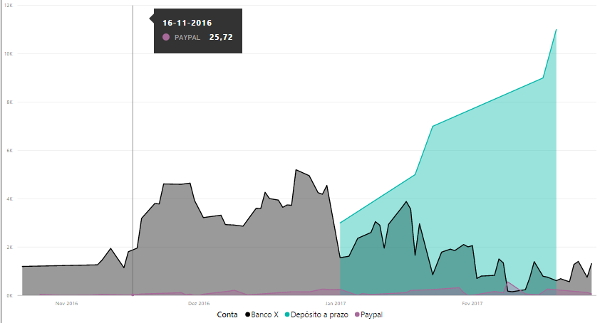
However, in a Area Chart, I'd like to show the balance for all the days within the dates range. But this is showing empty values for thoses days with no movements:
This doesn't look good with empty spots...
Also, why are the three series not accumulating? That's the whole idea of this chart, right?
Thanks for helping!
Solved! Go to Solution.
- Mark as New
- Bookmark
- Subscribe
- Mute
- Subscribe to RSS Feed
- Permalink
- Report Inappropriate Content
Hi,
I've figured out I must have a value for each day in my dates range for the ending balance.
Otherwise, charts and visuals in general will look terrible.
This is the expression I've managed to find:
Saldo em EUR =
IF (
    AND (
        'Consolidado'[DataCorrente] <= 'Consolidado'[DataMáxima];
        'Consolidado'[DataCorrente] >= 'Consolidado'[DataMínima]
    );
    CALCULATE (
        0 + SUM ( 'Consolidado'[Fluxo em EUR (intermédio)] );
        FILTER (
            ALL ( 'Calendário'[Data] );
            'Calendário'[Data] <= MAX ( 'Calendário'[Data] )
        )
    )
)
Initially, a simple measure but required to define intermediate calculations.
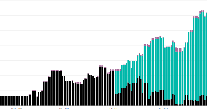
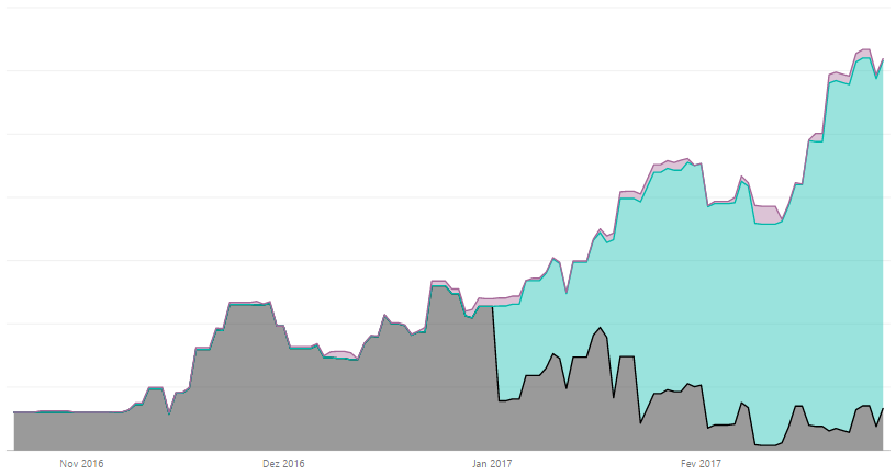
Now, the charts are looking better:
- Mark as New
- Bookmark
- Subscribe
- Mute
- Subscribe to RSS Feed
- Permalink
- Report Inappropriate Content
2nd question first - use a stacked area chart (you just have a standard area chart)
As to the 1st question, can you replace BLANK with 0 in the data? There have been other dicussions that the area/stacked are chart leaves whitespots when there is missing data - it's a "bug" that seems to be low priority to be addressed.
You could also use a stacked column chart, which will show basically the same thing as the stacked area chart, but with "gaps" in between each X value.
Hope this helps
David
- Mark as New
- Bookmark
- Subscribe
- Mute
- Subscribe to RSS Feed
- Permalink
- Report Inappropriate Content
Thanks a lot for your support.
The thing is, if you check your bank account on a day without transactions, you should still be able to see the balance (not a blank).
- Mark as New
- Bookmark
- Subscribe
- Mute
- Subscribe to RSS Feed
- Permalink
- Report Inappropriate Content
So it sounds like your value needs to be a running total? Here is a DAX pattern for running total (assume Table1 and DateTable have a Many-to-1 relationship:
RunningMeasure = CALCULATE (
    SUM ( 'Table1'[Value Column]),
    FILTER (
        ALL ( 'DateTable'[Date] ),
        'Table1'[Date] <= MAX ( 'DateTable'[Date] )
    )
)
Hope this helps
David
- Mark as New
- Bookmark
- Subscribe
- Mute
- Subscribe to RSS Feed
- Permalink
- Report Inappropriate Content
Hi,
I've figured out I must have a value for each day in my dates range for the ending balance.
Otherwise, charts and visuals in general will look terrible.
This is the expression I've managed to find:
Saldo em EUR =
IF (
    AND (
        'Consolidado'[DataCorrente] <= 'Consolidado'[DataMáxima];
        'Consolidado'[DataCorrente] >= 'Consolidado'[DataMínima]
    );
    CALCULATE (
        0 + SUM ( 'Consolidado'[Fluxo em EUR (intermédio)] );
        FILTER (
            ALL ( 'Calendário'[Data] );
            'Calendário'[Data] <= MAX ( 'Calendário'[Data] )
        )
    )
)
Initially, a simple measure but required to define intermediate calculations.
Now, the charts are looking better:
- Mark as New
- Bookmark
- Subscribe
- Mute
- Subscribe to RSS Feed
- Permalink
- Report Inappropriate Content
Thank you for a good solution! However I can't get it to work on my dataset. Would you mind to share the .pbix? It would help to get an overview of the measure.
Kind regards,
Anders
- Mark as New
- Bookmark
- Subscribe
- Mute
- Subscribe to RSS Feed
- Permalink
- Report Inappropriate Content
Is your X-Axis Continuous?
Helpful resources

Power BI Dataviz World Championships
The Power BI Data Visualization World Championships is back! Get ahead of the game and start preparing now!

| User | Count |
|---|---|
| 38 | |
| 36 | |
| 33 | |
| 31 | |
| 28 |
| User | Count |
|---|---|
| 129 | |
| 88 | |
| 79 | |
| 68 | |
| 63 |


