Become a Certified Power BI Data Analyst!
Join us for an expert-led overview of the tools and concepts you'll need to pass exam PL-300. The first session starts on June 11th. See you there!
Get registered- Power BI forums
- Get Help with Power BI
- Desktop
- Service
- Report Server
- Power Query
- Mobile Apps
- Developer
- DAX Commands and Tips
- Custom Visuals Development Discussion
- Health and Life Sciences
- Power BI Spanish forums
- Translated Spanish Desktop
- Training and Consulting
- Instructor Led Training
- Dashboard in a Day for Women, by Women
- Galleries
- Webinars and Video Gallery
- Data Stories Gallery
- Themes Gallery
- Contests Gallery
- Quick Measures Gallery
- Notebook Gallery
- Translytical Task Flow Gallery
- R Script Showcase
- Ideas
- Custom Visuals Ideas (read-only)
- Issues
- Issues
- Events
- Upcoming Events
Power BI is turning 10! Let’s celebrate together with dataviz contests, interactive sessions, and giveaways. Register now.
- Power BI forums
- Forums
- Get Help with Power BI
- Desktop
- Re: Display dashed/dotted lines in legend
- Subscribe to RSS Feed
- Mark Topic as New
- Mark Topic as Read
- Float this Topic for Current User
- Bookmark
- Subscribe
- Printer Friendly Page
- Mark as New
- Bookmark
- Subscribe
- Mute
- Subscribe to RSS Feed
- Permalink
- Report Inappropriate Content
Display dashed/dotted lines in legend
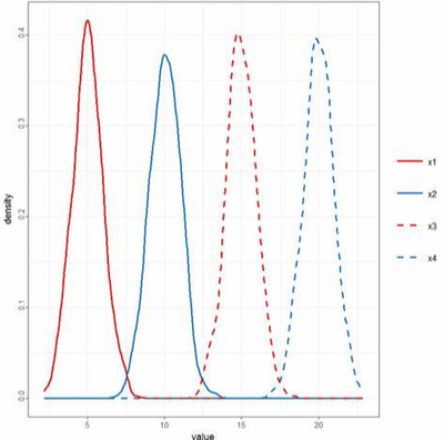
Please allow an option for the legend to display a line or a dot for colour (and dotted/dashed lines to match the line on the chart, like the figure below):
Context:
I would like to display four lines on my line chart:
- this year's rates for my Region,
- last year's rates for my Region,
- this year's rates for my Province/Territory/State, and
- last year's rates for my Province/Territory/State.
I would like last year's rates to be displayed as dotted lines, this year's rates to be displayed as solid lines, my Region's rates for both last year and this year to be the same colour, and the rates for my Province/Territory/State for both last year and this year to be the same colour. But if I were to do that right now in PBI, last year's and this year's rates would look the same in the legend because there is no differentiation between solid and dotted lines in the legend.
Solved! Go to Solution.
- Mark as New
- Bookmark
- Subscribe
- Mute
- Subscribe to RSS Feed
- Permalink
- Report Inappropriate Content
Hi @DesireeS ,
Is this the outcome you want?
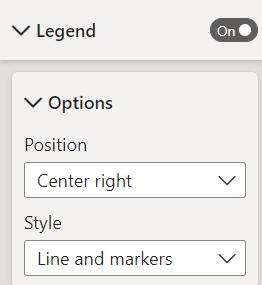
You can go to Legend and setting like this, then the legend will reflect the dotted/solid lines.
Best regards,
- Mark as New
- Bookmark
- Subscribe
- Mute
- Subscribe to RSS Feed
- Permalink
- Report Inappropriate Content
hi @DesireeS
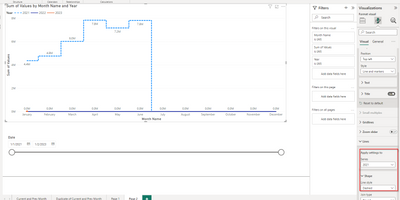
The line chart visual has an option to chang the legend shape (marker and line) for each series.
Dane Belarmino | Microsoft MVP | Proud to be a Super User!
Did I answer your question? Mark my post as a solution!
"Tell me and I’ll forget; show me and I may remember; involve me and I’ll understand."
Need Power BI consultation, get in touch with me on LinkedIn or hire me on UpWork.
Learn with me on YouTube @DAXJutsu or follow my page on Facebook @DAXJutsuPBI.
- Mark as New
- Bookmark
- Subscribe
- Mute
- Subscribe to RSS Feed
- Permalink
- Report Inappropriate Content
Hi @DesireeS
If I understand you correctly it is achievable.
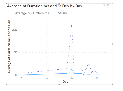
you can format every line separately :
Legend will be referenced according to your formatting.
If this post helps, then please consider Accepting it as the solution to help the other members find it more quickly
Rita Fainshtein | Microsoft MVP
https://www.linkedin.com/in/rita-fainshtein/
Blog : https://www.madeiradata.com/profile/ritaf/profile
- Mark as New
- Bookmark
- Subscribe
- Mute
- Subscribe to RSS Feed
- Permalink
- Report Inappropriate Content
hi @DesireeS
The line chart visual has an option to chang the legend shape (marker and line) for each series.
Dane Belarmino | Microsoft MVP | Proud to be a Super User!
Did I answer your question? Mark my post as a solution!
"Tell me and I’ll forget; show me and I may remember; involve me and I’ll understand."
Need Power BI consultation, get in touch with me on LinkedIn or hire me on UpWork.
Learn with me on YouTube @DAXJutsu or follow my page on Facebook @DAXJutsuPBI.
- Mark as New
- Bookmark
- Subscribe
- Mute
- Subscribe to RSS Feed
- Permalink
- Report Inappropriate Content
Hi @DesireeS ,
Is this the outcome you want?
You can go to Legend and setting like this, then the legend will reflect the dotted/solid lines.
Best regards,
Helpful resources

Join our Fabric User Panel
This is your chance to engage directly with the engineering team behind Fabric and Power BI. Share your experiences and shape the future.

Power BI Monthly Update - June 2025
Check out the June 2025 Power BI update to learn about new features.

| User | Count |
|---|---|
| 78 | |
| 76 | |
| 53 | |
| 37 | |
| 31 |
| User | Count |
|---|---|
| 101 | |
| 56 | |
| 51 | |
| 45 | |
| 40 |


