FabCon is coming to Atlanta
Join us at FabCon Atlanta from March 16 - 20, 2026, for the ultimate Fabric, Power BI, AI and SQL community-led event. Save $200 with code FABCOMM.
Register now!- Power BI forums
- Get Help with Power BI
- Desktop
- Service
- Report Server
- Power Query
- Mobile Apps
- Developer
- DAX Commands and Tips
- Custom Visuals Development Discussion
- Health and Life Sciences
- Power BI Spanish forums
- Translated Spanish Desktop
- Training and Consulting
- Instructor Led Training
- Dashboard in a Day for Women, by Women
- Galleries
- Data Stories Gallery
- Themes Gallery
- Contests Gallery
- Quick Measures Gallery
- Notebook Gallery
- Translytical Task Flow Gallery
- TMDL Gallery
- R Script Showcase
- Webinars and Video Gallery
- Ideas
- Custom Visuals Ideas (read-only)
- Issues
- Issues
- Events
- Upcoming Events
Calling all Data Engineers! Fabric Data Engineer (Exam DP-700) live sessions are back! Starting October 16th. Sign up.
- Power BI forums
- Forums
- Get Help with Power BI
- Desktop
- Re: Display custom text tooltip on different Bars ...
- Subscribe to RSS Feed
- Mark Topic as New
- Mark Topic as Read
- Float this Topic for Current User
- Bookmark
- Subscribe
- Printer Friendly Page
- Mark as New
- Bookmark
- Subscribe
- Mute
- Subscribe to RSS Feed
- Permalink
- Report Inappropriate Content
Display custom text tooltip on different Bars in Clustered and bar Chart
Hi Team,
I hope someone will be able to help me find a solution for the below scenario:
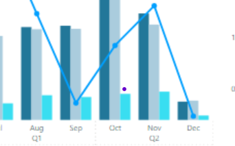
1) I have line and clustered Bar chart created using 4 different measures.
2) I have new page with table visual having 2 different columns all of text values which I will be using as a custom tooltip on line and clustered chart.
Question: When I am trying to displaying the tooltip it is showing the tooltip on all 3 bars and line chart data point for that FY and month. Since the bar chart is based on the measure values. How can I display tooltip related to that measure?
Thanks,
A
- Mark as New
- Bookmark
- Subscribe
- Mute
- Subscribe to RSS Feed
- Permalink
- Report Inappropriate Content
@amitchandak : Can you please let me know if the feature to display different annotations on different bars in a clustered chart a proposed idea? or we need to raise the idea?
- Mark as New
- Bookmark
- Subscribe
- Mute
- Subscribe to RSS Feed
- Permalink
- Report Inappropriate Content
Hi @Asahara20,
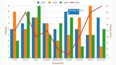
Here is Line and clustered column chart With Custom Tooltip which will help you to get different tooltip for each chart.


Download link for the custom visual file in this page
https://pbivizedit.com/gallery/line-and-clustered-column-with-custom-tooltip
This was made with our Custom Visual creator tool PBIVizEdit.com. With this tool,
- anyone, irrespective of technical skills, can create their own visuals
- 15 minutes to create a visual from scratch
- opens up many additional attributes to edit (for e.g. labels, tooltips, legends position, etc)
Give this a shot and let us know if you face any problem/errors.
You can use the editor to modify your visual further (some modifications cannot be done in Power BI window and have to be in editor).
Thanks,
Team PBIVizEdit
- Mark as New
- Bookmark
- Subscribe
- Mute
- Subscribe to RSS Feed
- Permalink
- Report Inappropriate Content
Thankyou all for your time in replying back to my question.
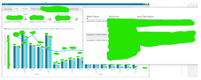
Below is how my report page should look like:
here is the scenario: There are 4 different items that have to be displayed in the clustered bar and line chart.
Bar chat has scanned items, flagged items, reviewed items and these are called as metric names: 3 different measures are created to display these metric values.
Now, I have created an additonal page in the same report to display that page as tooltip.That can be seen in below image.
So my requirement is if the metric name in the tooltip page = scanned content items then the tooltip has to display only on that bar for that month and year. But instead currently even the metric name = scanned content items the tooltip is displayed on all 3 metric bars.
so now I have 2 different tables
1) Table 1 has all data related to the 3 metric names along with other data.
2) Table 2 has all data related to tooltip
I have created new common column in both the tables with date&itemid&metric name in both the tables to make each row unique and joined the tables.
So, can someone please suggest as what can be done to meet my requirement, if the feature does not exist can we raise a feature request?
Thanks, Anusha
- Mark as New
- Bookmark
- Subscribe
- Mute
- Subscribe to RSS Feed
- Permalink
- Report Inappropriate Content
The tooltip is needed to show the data anamolies. This is all manually entered text data which is coming from excel file.
Example: in the bar visual we have 3 cluster bars ( lets call them A,B,C ) and one Line chart (D)
So, for A we have one data anomaly which we want to show when the user hovers on bar A.
So, for B there are no data anomalies so when user hovers mouse on Bar B the tooltip should not display any text.
Now for C there are 2 data anomalies so when user hovers mouse on Bar C the tooltip should display those 2 text items..
As I mentioned all A,B,C and D are measures. So with the current tooltip it is displaying all three 3 text items( 1 of A and 2 of B) on Bar A, B,C and Line chart D.
- Mark as New
- Bookmark
- Subscribe
- Mute
- Subscribe to RSS Feed
- Permalink
- Report Inappropriate Content
Hi, @Asahara20
What does data abnormality mean? I don’t understand your needs very well, So I’m not sure if it can be realized.
Can you share some sample data and your desired result(If you can’t use visual to display, pictures are also okay)? So we can help you soon.
Best Regards,
Community Support Team _ Janey
- Mark as New
- Bookmark
- Subscribe
- Mute
- Subscribe to RSS Feed
- Permalink
- Report Inappropriate Content
@Asahara20 , Is there a filter in the measure which you need to pass, that is not possible as of now.
If you want to change tooltip based on the measure, that is also not possible
What is the exact need
Helpful resources

FabCon Global Hackathon
Join the Fabric FabCon Global Hackathon—running virtually through Nov 3. Open to all skill levels. $10,000 in prizes!

Power BI Monthly Update - October 2025
Check out the October 2025 Power BI update to learn about new features.


