FabCon is coming to Atlanta
Join us at FabCon Atlanta from March 16 - 20, 2026, for the ultimate Fabric, Power BI, AI and SQL community-led event. Save $200 with code FABCOMM.
Register now!- Power BI forums
- Get Help with Power BI
- Desktop
- Service
- Report Server
- Power Query
- Mobile Apps
- Developer
- DAX Commands and Tips
- Custom Visuals Development Discussion
- Health and Life Sciences
- Power BI Spanish forums
- Translated Spanish Desktop
- Training and Consulting
- Instructor Led Training
- Dashboard in a Day for Women, by Women
- Galleries
- Data Stories Gallery
- Themes Gallery
- Contests Gallery
- Quick Measures Gallery
- Notebook Gallery
- Translytical Task Flow Gallery
- TMDL Gallery
- R Script Showcase
- Webinars and Video Gallery
- Ideas
- Custom Visuals Ideas (read-only)
- Issues
- Issues
- Events
- Upcoming Events
To celebrate FabCon Vienna, we are offering 50% off select exams. Ends October 3rd. Request your discount now.
- Power BI forums
- Forums
- Get Help with Power BI
- Desktop
- Re: Display axe with a table custom
- Subscribe to RSS Feed
- Mark Topic as New
- Mark Topic as Read
- Float this Topic for Current User
- Bookmark
- Subscribe
- Printer Friendly Page
- Mark as New
- Bookmark
- Subscribe
- Mute
- Subscribe to RSS Feed
- Permalink
- Report Inappropriate Content
Display axe with a table custom
Hello!!
I have a issue, help please!!
I want to display a custom axis in an X-axis graph.
So I created a table with the different data of my axis, I created a measurement to display my data in the basket but I can’t do it in dax. If someone has an idea...
Here’s what I want
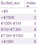
I have a table:
here my measure :
Solved! Go to Solution.
- Mark as New
- Bookmark
- Subscribe
- Mute
- Subscribe to RSS Feed
- Permalink
- Report Inappropriate Content
hi @majid_75
For your case, you could refer to this blog:
https://powerpivotpro.com/2015/03/creating-a-histogram-with-a-user-defined-number-of-buckets/
If you still have the problem, please share some sample data and your expected output.
Regards,
Lin
If this post helps, then please consider Accept it as the solution to help the other members find it more quickly.
- Mark as New
- Bookmark
- Subscribe
- Mute
- Subscribe to RSS Feed
- Permalink
- Report Inappropriate Content
Hi @majid_75 ,
You have to convert your measure to a Calculated column in-order to use it on x-axis on the chart.
You can't use a measure on axis with text values.
Thanks,
Pragati
- Mark as New
- Bookmark
- Subscribe
- Mute
- Subscribe to RSS Feed
- Permalink
- Report Inappropriate Content
I have a table with my bucket (not related).
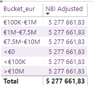
Here, i have this test
i want my NBI with my bucket "€1M-€7,5M".
And then to do with a chart
- Mark as New
- Bookmark
- Subscribe
- Mute
- Subscribe to RSS Feed
- Permalink
- Report Inappropriate Content
hi @majid_75
For your case, you could refer to this blog:
https://powerpivotpro.com/2015/03/creating-a-histogram-with-a-user-defined-number-of-buckets/
If you still have the problem, please share some sample data and your expected output.
Regards,
Lin
If this post helps, then please consider Accept it as the solution to help the other members find it more quickly.


