New Offer! Become a Certified Fabric Data Engineer
Check your eligibility for this 50% exam voucher offer and join us for free live learning sessions to get prepared for Exam DP-700.
Get Started- Power BI forums
- Get Help with Power BI
- Desktop
- Service
- Report Server
- Power Query
- Mobile Apps
- Developer
- DAX Commands and Tips
- Custom Visuals Development Discussion
- Health and Life Sciences
- Power BI Spanish forums
- Translated Spanish Desktop
- Training and Consulting
- Instructor Led Training
- Dashboard in a Day for Women, by Women
- Galleries
- Community Connections & How-To Videos
- COVID-19 Data Stories Gallery
- Themes Gallery
- Data Stories Gallery
- R Script Showcase
- Webinars and Video Gallery
- Quick Measures Gallery
- 2021 MSBizAppsSummit Gallery
- 2020 MSBizAppsSummit Gallery
- 2019 MSBizAppsSummit Gallery
- Events
- Ideas
- Custom Visuals Ideas
- Issues
- Issues
- Events
- Upcoming Events
Don't miss out! 2025 Microsoft Fabric Community Conference, March 31 - April 2, Las Vegas, Nevada. Use code MSCUST for a $150 discount. Prices go up February 11th. Register now.
- Power BI forums
- Forums
- Get Help with Power BI
- Desktop
- Re: Display all dates on a staked column chart
- Subscribe to RSS Feed
- Mark Topic as New
- Mark Topic as Read
- Float this Topic for Current User
- Bookmark
- Subscribe
- Printer Friendly Page
- Mark as New
- Bookmark
- Subscribe
- Mute
- Subscribe to RSS Feed
- Permalink
- Report Inappropriate Content
Display all dates on a staked column chart
I'm trying to have all dates shown on the X-axis of a stacked column chart.
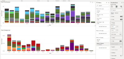
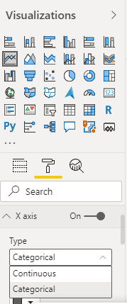
Couldn't find any setting to do so directly. The only thing I found was posts saying to change the x-axis from Continuous to Categorical. But if I do that, my data change drastically.
Columns seems to contain less different items and the total cost drop a lot. (Y-axis drop from about 3.5M to 0.5M).
Any help on this topic would be greatly appreicated.
- Mark as New
- Bookmark
- Subscribe
- Mute
- Subscribe to RSS Feed
- Permalink
- Report Inappropriate Content
- Mark as New
- Bookmark
- Subscribe
- Mute
- Subscribe to RSS Feed
- Permalink
- Report Inappropriate Content
My post is specifying that when I switch to Categorical the data change.
Top graph is with Continuous, second is Categorical.
The order of magnitude is about 7 time smaller and the data is distributed quite differently.
I did try extracting the year and then building the graph based on the year only (instead of the full date), but both Categorical (and Continuous) graphs are the same regarless of if I use only the year or the full date.
- Mark as New
- Bookmark
- Subscribe
- Mute
- Subscribe to RSS Feed
- Permalink
- Report Inappropriate Content
@VincentCWork, The X-axis date value will be displayed based on the visual width and the number of records in this date column. I see you are trying to show more than 10 years of data. I would suggest you apply a date filter to show the last 2-3 years of data if that makes sense. Another option will be, Use data hierarchy (Year/Month/Day) with drill-down.
- Mark as New
- Bookmark
- Subscribe
- Mute
- Subscribe to RSS Feed
- Permalink
- Report Inappropriate Content
If I understand correctly, there is no way to display all the years (we do require all 18 years in our analysis)?
As you suggested, I did try using it in drill mode, but I get the exact same graph as the Continuous graph using only the year (i.e. only multiples of 5 shown)
Do you have any clues as to why the data changes when switching the type?
Helpful resources

Join us at the Microsoft Fabric Community Conference
March 31 - April 2, 2025, in Las Vegas, Nevada. Use code MSCUST for a $150 discount! Prices go up Feb. 11th.

Power BI Monthly Update - January 2025
Check out the January 2025 Power BI update to learn about new features in Reporting, Modeling, and Data Connectivity.

| User | Count |
|---|---|
| 143 | |
| 75 | |
| 62 | |
| 51 | |
| 47 |
| User | Count |
|---|---|
| 213 | |
| 81 | |
| 64 | |
| 60 | |
| 56 |


