Join us at FabCon Vienna from September 15-18, 2025
The ultimate Fabric, Power BI, SQL, and AI community-led learning event. Save €200 with code FABCOMM.
Get registered- Power BI forums
- Get Help with Power BI
- Desktop
- Service
- Report Server
- Power Query
- Mobile Apps
- Developer
- DAX Commands and Tips
- Custom Visuals Development Discussion
- Health and Life Sciences
- Power BI Spanish forums
- Translated Spanish Desktop
- Training and Consulting
- Instructor Led Training
- Dashboard in a Day for Women, by Women
- Galleries
- Data Stories Gallery
- Themes Gallery
- Contests Gallery
- Quick Measures Gallery
- Notebook Gallery
- Translytical Task Flow Gallery
- TMDL Gallery
- R Script Showcase
- Webinars and Video Gallery
- Ideas
- Custom Visuals Ideas (read-only)
- Issues
- Issues
- Events
- Upcoming Events
Enhance your career with this limited time 50% discount on Fabric and Power BI exams. Ends September 15. Request your voucher.
- Power BI forums
- Forums
- Get Help with Power BI
- Desktop
- Re: Display Spend and Distinct Brand Count in a Tr...
- Subscribe to RSS Feed
- Mark Topic as New
- Mark Topic as Read
- Float this Topic for Current User
- Bookmark
- Subscribe
- Printer Friendly Page
- Mark as New
- Bookmark
- Subscribe
- Mute
- Subscribe to RSS Feed
- Permalink
- Report Inappropriate Content
Display Spend and Distinct Brand Count in a Tree-map
Hello,
I have data like below:
Country, Advertiser, Brand, Spend
C1, A1, B1, 10
C1, A1, B2, 5
C1, A2, B3, 0
C1, A2, B4, 20
C2, A1, B1, 8
C2, A1, B5, 7
C2, A2, B6, 4
C2, A2, B3, 3
C2, A2, B7, 2
C2, A3, B8, 9
There, the distinct count of brand by country is as follow:
C1 => 4
C2 => 6
and total spend by country is as follow:
C1 => 35
C2 => 33
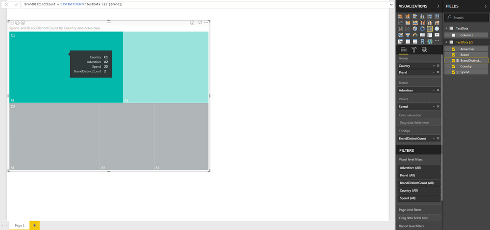
I created a tree map to visualize 'Spend and BrandDistinctCount by Country and by Advertiser as follow:
As you can see, the tooltip shows the 'Spend' and 'DistinctBrandCount' when mouse is hovered over the area. What I'd like is more of a permanent display (for all blocks in the Tree-map) of 'Spend' and "DistinctBrandCount'. Is there a way to customize the look of Tree-map in Power BI desktop and if so, how do I accomplish that?
Thank you in advance for your answers!
- Mark as New
- Bookmark
- Subscribe
- Mute
- Subscribe to RSS Feed
- Permalink
- Report Inappropriate Content
Helpful resources
| User | Count |
|---|---|
| 69 | |
| 64 | |
| 62 | |
| 55 | |
| 28 |
| User | Count |
|---|---|
| 112 | |
| 80 | |
| 65 | |
| 48 | |
| 38 |


