Fabric Data Days starts November 4th!
Advance your Data & AI career with 50 days of live learning, dataviz contests, hands-on challenges, study groups & certifications and more!
Get registered- Power BI forums
- Get Help with Power BI
- Desktop
- Service
- Report Server
- Power Query
- Mobile Apps
- Developer
- DAX Commands and Tips
- Custom Visuals Development Discussion
- Health and Life Sciences
- Power BI Spanish forums
- Translated Spanish Desktop
- Training and Consulting
- Instructor Led Training
- Dashboard in a Day for Women, by Women
- Galleries
- Data Stories Gallery
- Themes Gallery
- Contests Gallery
- QuickViz Gallery
- Quick Measures Gallery
- Visual Calculations Gallery
- Notebook Gallery
- Translytical Task Flow Gallery
- TMDL Gallery
- R Script Showcase
- Webinars and Video Gallery
- Ideas
- Custom Visuals Ideas (read-only)
- Issues
- Issues
- Events
- Upcoming Events
Get Fabric Certified for FREE during Fabric Data Days. Don't miss your chance! Request now
- Power BI forums
- Forums
- Get Help with Power BI
- Desktop
- Re: Display Percent Changes alongside a Line Chart
- Subscribe to RSS Feed
- Mark Topic as New
- Mark Topic as Read
- Float this Topic for Current User
- Bookmark
- Subscribe
- Printer Friendly Page
- Mark as New
- Bookmark
- Subscribe
- Mute
- Subscribe to RSS Feed
- Permalink
- Report Inappropriate Content
Display Percent Changes alongside a Line Chart
Hello everyone,
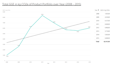
is it possible to display percent changes alongside a line chart?
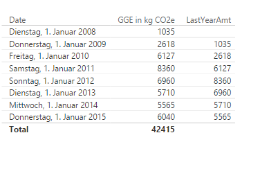
That is my use case:
I would like to display this in the graph in between the sum values.
E.g. from 2009 with 2618 to 2010 with 6127.
This functionality would be sufficent for consecutive years .
Thanks and Regards,
Chris
Solved! Go to Solution.
- Mark as New
- Bookmark
- Subscribe
- Mute
- Subscribe to RSS Feed
- Permalink
- Report Inappropriate Content
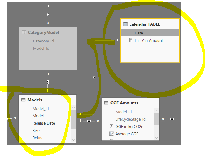
- Create a calendar table.
calendar TABLE = CALENDAR("2001-01-01","2016-12-31") - Map one:many relationship.
- Change your measure to
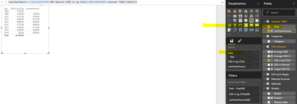
LastYearAmount = CALCULATE(SUM('GGE Amounts'[GGE in kg CO2e]),PREVIOUSYEAR('calendar TABLE'[Date])) - Done
Check the details in the attached pbix, the unzip password is sent via private message.
- Mark as New
- Bookmark
- Subscribe
- Mute
- Subscribe to RSS Feed
- Permalink
- Report Inappropriate Content
A line and column combo chart would be a better visual to show. In this case, the key is the PREVIOUSYEAR function. Check more details in the attached pbix.
Percent Change =
VAR LastYearAmt =
    CALCULATE ( SUM ( Table1[GGE in kg CO2e] ), PREVIOUSYEAR ( Table1[Date] ) )
RETURN
    IF (
        ISBLANK ( LastYearAmt ),
        0,
        ( SUM ( Table1[GGE in kg CO2e] ) - LastYearAmt )
            / LastYearAmt
    )
- Mark as New
- Bookmark
- Subscribe
- Mute
- Subscribe to RSS Feed
- Permalink
- Report Inappropriate Content
Hi!
I'm having the same problem as in this post. I checked your PBIX file and the solution seems to do what it should but in your example, you have only one entry per year:
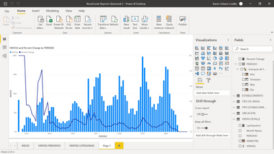
In my case, I have several entries per month in each year. So, what I get is this:
Is showing me the trend along each month from (sept) 2013 to (July) 2020. How can I make it appear only per the year 2013 to 2020?
I hope you could answer this post as I know is pretty old.
Thanks in advance!
- Mark as New
- Bookmark
- Subscribe
- Mute
- Subscribe to RSS Feed
- Permalink
- Report Inappropriate Content
Hi Eric,
that is a very cool possibility.
I can't get it work with my setting.
You have my .pbix, could you maybe try it?
I tried: LastYearAmount = CALCULATE(SUM('GGE Amounts'[GGE in kg CO2e]);PREVIOUSYEAR('Models'[Release Date]))
I don't get an error with that, but it's not given an result.
I would expect to get this table (from your example) but with my dates:
Best would be to only have the years in the first row.
Therefore, I tried it with my year extraction: YEAR('Models'[Release Date]), but that's not working at all.
Thanks and Regards,
Chris
- Mark as New
- Bookmark
- Subscribe
- Mute
- Subscribe to RSS Feed
- Permalink
- Report Inappropriate Content
- Create a calendar table.
calendar TABLE = CALENDAR("2001-01-01","2016-12-31") - Map one:many relationship.
- Change your measure to
LastYearAmount = CALCULATE(SUM('GGE Amounts'[GGE in kg CO2e]),PREVIOUSYEAR('calendar TABLE'[Date])) - Done
Check the details in the attached pbix, the unzip password is sent via private message.
- Mark as New
- Bookmark
- Subscribe
- Mute
- Subscribe to RSS Feed
- Permalink
- Report Inappropriate Content
Hi Eric,
thank you very much, that works!
But it is not possible without the calender table, right?
Why can't I use my year column for that?
Regards,
Chris
- Mark as New
- Bookmark
- Subscribe
- Mute
- Subscribe to RSS Feed
- Permalink
- Report Inappropriate Content
The function PREVIOUSYEAR/MONTH and some other timeintelligence functions should be on contiguous, nonrepeating dates.
- Mark as New
- Bookmark
- Subscribe
- Mute
- Subscribe to RSS Feed
- Permalink
- Report Inappropriate Content

- Mark as New
- Bookmark
- Subscribe
- Mute
- Subscribe to RSS Feed
- Permalink
- Report Inappropriate Content
Hi @Patt,
Show a dataset, explain the question and show the expected result.
Regards,
Ashish Mathur
http://www.ashishmathur.com
https://www.linkedin.com/in/excelenthusiasts/
- Mark as New
- Bookmark
- Subscribe
- Mute
- Subscribe to RSS Feed
- Permalink
- Report Inappropriate Content
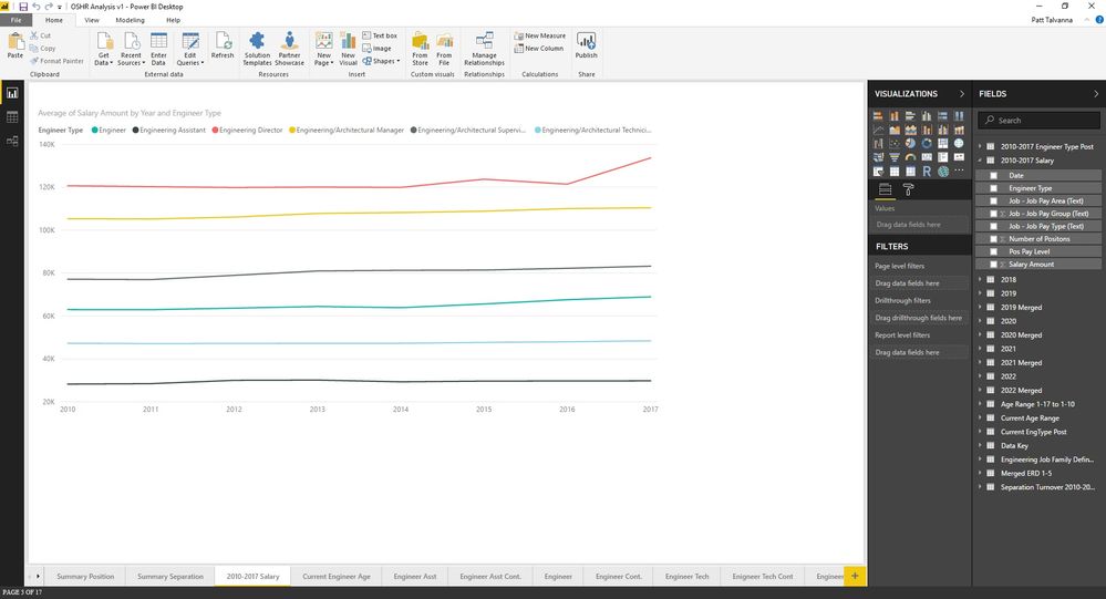
The data set shows staff levels (each liene and average salary (y-axis) from 2010 to 2017 (x-axis). I would like to show the year on year percent change for salary over the 2010 to 2017 period on the graph. Screenshot of the data and graph are attached. The data used for the line chart are the engineer types, engineer salary and date (dd/mm/yyy).


- Mark as New
- Bookmark
- Subscribe
- Mute
- Subscribe to RSS Feed
- Permalink
- Report Inappropriate Content
Hi,
Share the link from where i can download your file.
Regards,
Ashish Mathur
http://www.ashishmathur.com
https://www.linkedin.com/in/excelenthusiasts/
Helpful resources

Fabric Data Days
Advance your Data & AI career with 50 days of live learning, contests, hands-on challenges, study groups & certifications and more!

Power BI Monthly Update - October 2025
Check out the October 2025 Power BI update to learn about new features.

