Join the Fabric User Panel to shape the future of Fabric.
Share feedback directly with Fabric product managers, participate in targeted research studies and influence the Fabric roadmap.
Sign up now- Power BI forums
- Get Help with Power BI
- Desktop
- Service
- Report Server
- Power Query
- Mobile Apps
- Developer
- DAX Commands and Tips
- Custom Visuals Development Discussion
- Health and Life Sciences
- Power BI Spanish forums
- Translated Spanish Desktop
- Training and Consulting
- Instructor Led Training
- Dashboard in a Day for Women, by Women
- Galleries
- Data Stories Gallery
- Themes Gallery
- Contests Gallery
- QuickViz Gallery
- Quick Measures Gallery
- Visual Calculations Gallery
- Notebook Gallery
- Translytical Task Flow Gallery
- TMDL Gallery
- R Script Showcase
- Webinars and Video Gallery
- Ideas
- Custom Visuals Ideas (read-only)
- Issues
- Issues
- Events
- Upcoming Events
Get Fabric certified for FREE! Don't miss your chance! Learn more
- Power BI forums
- Forums
- Get Help with Power BI
- Desktop
- Display Bi Weekly data in Line Chart
- Subscribe to RSS Feed
- Mark Topic as New
- Mark Topic as Read
- Float this Topic for Current User
- Bookmark
- Subscribe
- Printer Friendly Page
- Mark as New
- Bookmark
- Subscribe
- Mute
- Subscribe to RSS Feed
- Permalink
- Report Inappropriate Content
Display Bi Weekly data in Line Chart
Hi All,
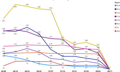
I currently have a line chart with x-axis displaying weekly data and would like to display Every 2 weeks data instead of weekly. Please suggest some ideas to achieve this requirement.
From the below chart, I want to show only 06/16, 06/30, and so on.
Thank You!
Solved! Go to Solution.
- Mark as New
- Bookmark
- Subscribe
- Mute
- Subscribe to RSS Feed
- Permalink
- Report Inappropriate Content
@Anonymous
In your calendar table you could add a column like this to group the dates into 14 day buckets.
Bi-Weekly Date =
VAR _Date = 'Date'[Date]
VAR _WkNum = WEEKNUM ( _Date )
VAR _WkDay = WEEKDAY ( _Date ) - 1
VAR _SoY = STARTOFYEAR ( 'Date'[Date] )
VAR _WkStart = IF ( ISODD ( _WkNum ) , _Date - _WkDay, _Date - ( _WkDay + 7 ) )
RETURN
MAX ( _SoY , _WkStart )- Mark as New
- Bookmark
- Subscribe
- Mute
- Subscribe to RSS Feed
- Permalink
- Report Inappropriate Content
You should create a calendar table that has a column the groups the weeks together. Call it what you like, Ie "period". It would be something like
week, period
1,1
2,1
3,2
4,2
5,3
etc.
Or you can put the period ending date if you prefer.
Here are some of my articles that may help you
https://exceleratorbi.com.au/power-pivot-calendar-tables/
https://exceleratorbi.com.au/build-reusable-calendar-table-power-query/
* Matt is an 8 times Microsoft MVP (Power BI) and author of the Power BI Book Supercharge Power BI.
I will not give you bad advice, even if you unknowingly ask for it.
Helpful resources

Join our Community Sticker Challenge 2026
If you love stickers, then you will definitely want to check out our Community Sticker Challenge!

Power BI Monthly Update - January 2026
Check out the January 2026 Power BI update to learn about new features.

| User | Count |
|---|---|
| 62 | |
| 61 | |
| 42 | |
| 21 | |
| 18 |
| User | Count |
|---|---|
| 122 | |
| 117 | |
| 37 | |
| 34 | |
| 30 |

