Join the #PBI10 DataViz contest
Power BI is turning 10, and we’re marking the occasion with a special community challenge. Use your creativity to tell a story, uncover trends, or highlight something unexpected.
Get started- Power BI forums
- Get Help with Power BI
- Desktop
- Service
- Report Server
- Power Query
- Mobile Apps
- Developer
- DAX Commands and Tips
- Custom Visuals Development Discussion
- Health and Life Sciences
- Power BI Spanish forums
- Translated Spanish Desktop
- Training and Consulting
- Instructor Led Training
- Dashboard in a Day for Women, by Women
- Galleries
- Webinars and Video Gallery
- Data Stories Gallery
- Themes Gallery
- Contests Gallery
- Quick Measures Gallery
- Notebook Gallery
- Translytical Task Flow Gallery
- R Script Showcase
- Ideas
- Custom Visuals Ideas (read-only)
- Issues
- Issues
- Events
- Upcoming Events
Join us for an expert-led overview of the tools and concepts you'll need to become a Certified Power BI Data Analyst and pass exam PL-300. Register now.
- Power BI forums
- Forums
- Get Help with Power BI
- Desktop
- Re: Display 3 metric values in a gauge chart
- Subscribe to RSS Feed
- Mark Topic as New
- Mark Topic as Read
- Float this Topic for Current User
- Bookmark
- Subscribe
- Printer Friendly Page
- Mark as New
- Bookmark
- Subscribe
- Mute
- Subscribe to RSS Feed
- Permalink
- Report Inappropriate Content
Display 3 metric values in a gauge chart
Hi All,
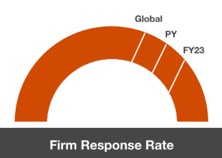
I have a requirement to display 3 metric values in a gauge chart (as shown below) but I can't add more than one value and I would like to display all the datasets on it. It seems that it's not possible in PowerBI as we can only display current value, min, max and target.
Can you suggest a better visualization to display the 3 metrics (Global, PY and FY) in PowerBI.
Thanks in Advance!
Solved! Go to Solution.
- Mark as New
- Bookmark
- Subscribe
- Mute
- Subscribe to RSS Feed
- Permalink
- Report Inappropriate Content
Hi,
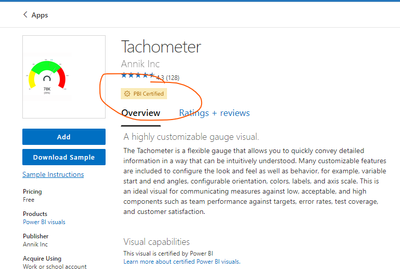
The POWER BI team has tested this visual for security issues.
Please see the attached documentation of microsoft for more information.
https://learn.microsoft.com/en-gb/power-bi/developer/visuals/power-bi-custom-visuals-certified
Unfortunately, the standard graph does not allow you to achieve what you want.
Anyhow, the visualizations of various Gauges are not really informative, so I recommend again using the graph type as in my previous answer.
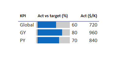
Something like this :
I made a sample file if you want to experiment with it
If this post helps, then please consider Accept it as the solution to help the other members find it more quickly.
Rita Fainshtein | Microsoft MVP
https://www.linkedin.com/in/rita-fainshtein/
Blog : https://www.madeiradata.com/profile/ritaf/profile
- Mark as New
- Bookmark
- Subscribe
- Mute
- Subscribe to RSS Feed
- Permalink
- Report Inappropriate Content
Hi @Ritaf1983 ,
Thanks for your suggestion, but my organization dont allow to use any 3rd party custom visuals which are not published by Microsoft because of security concerns.
- Mark as New
- Bookmark
- Subscribe
- Mute
- Subscribe to RSS Feed
- Permalink
- Report Inappropriate Content
Hi,
The POWER BI team has tested this visual for security issues.
Please see the attached documentation of microsoft for more information.
https://learn.microsoft.com/en-gb/power-bi/developer/visuals/power-bi-custom-visuals-certified
Unfortunately, the standard graph does not allow you to achieve what you want.
Anyhow, the visualizations of various Gauges are not really informative, so I recommend again using the graph type as in my previous answer.
Something like this :
I made a sample file if you want to experiment with it
If this post helps, then please consider Accept it as the solution to help the other members find it more quickly.
Rita Fainshtein | Microsoft MVP
https://www.linkedin.com/in/rita-fainshtein/
Blog : https://www.madeiradata.com/profile/ritaf/profile
- Mark as New
- Bookmark
- Subscribe
- Mute
- Subscribe to RSS Feed
- Permalink
- Report Inappropriate Content
Hi @Saloni_Gupta
If you only need a graph of this style,
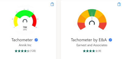
You can take the tachnonometer.
Please refer to my answer in the link for more information about it and its uses
https://community.fabric.microsoft.com/t5/Desktop/How-to-have-custom-color-filled-in-guage-chart/m-p...
In terms of correct data visualization, these types of graphs are less efficient at transferring information between parts/measurements.
Instead, I recommend using a graph table.
According to the link:
https://community.fabric.microsoft.com/t5/Desktop/Need-a-customed-bar-chart/m-p/3175101#M1071193
If this post helps, then please consider Accept it as the solution to help the other members find it more quickly.
Rita Fainshtein | Microsoft MVP
https://www.linkedin.com/in/rita-fainshtein/
Blog : https://www.madeiradata.com/profile/ritaf/profile
Helpful resources

Join our Fabric User Panel
This is your chance to engage directly with the engineering team behind Fabric and Power BI. Share your experiences and shape the future.

Power BI Monthly Update - June 2025
Check out the June 2025 Power BI update to learn about new features.

| User | Count |
|---|---|
| 78 | |
| 77 | |
| 58 | |
| 35 | |
| 32 |
| User | Count |
|---|---|
| 100 | |
| 59 | |
| 56 | |
| 46 | |
| 41 |


