FabCon is coming to Atlanta
Join us at FabCon Atlanta from March 16 - 20, 2026, for the ultimate Fabric, Power BI, AI and SQL community-led event. Save $200 with code FABCOMM.
Register now!- Power BI forums
- Get Help with Power BI
- Desktop
- Service
- Report Server
- Power Query
- Mobile Apps
- Developer
- DAX Commands and Tips
- Custom Visuals Development Discussion
- Health and Life Sciences
- Power BI Spanish forums
- Translated Spanish Desktop
- Training and Consulting
- Instructor Led Training
- Dashboard in a Day for Women, by Women
- Galleries
- Data Stories Gallery
- Themes Gallery
- Contests Gallery
- QuickViz Gallery
- Quick Measures Gallery
- Visual Calculations Gallery
- Notebook Gallery
- Translytical Task Flow Gallery
- TMDL Gallery
- R Script Showcase
- Webinars and Video Gallery
- Ideas
- Custom Visuals Ideas (read-only)
- Issues
- Issues
- Events
- Upcoming Events
The Power BI Data Visualization World Championships is back! Get ahead of the game and start preparing now! Learn more
- Power BI forums
- Forums
- Get Help with Power BI
- Desktop
- Re: Dinamic change date in axis of a line chart
- Subscribe to RSS Feed
- Mark Topic as New
- Mark Topic as Read
- Float this Topic for Current User
- Bookmark
- Subscribe
- Printer Friendly Page
- Mark as New
- Bookmark
- Subscribe
- Mute
- Subscribe to RSS Feed
- Permalink
- Report Inappropriate Content
Dinamic change date in axis of a line chart
Hello all,
I'm trying to dynamically change the axis data in a Line chart with a slicer.
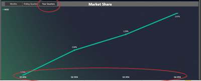
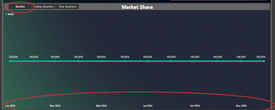
So, when I select Months, Year Quarter, or Rolling Quarter, it'll show the same data with another time dimension. Something like this

I have already created a table with the data i need
But now what I have is this, but I'm stuck and can't make it work. The chart doesn't allow me to use this measure in Axis, and the measure is not working at all.
Any ideas?
Solved! Go to Solution.
- Mark as New
- Bookmark
- Subscribe
- Mute
- Subscribe to RSS Feed
- Permalink
- Report Inappropriate Content
Hi @IrsFreire ,
You can refer this article about creating dynamic X-axis in power bi:
Dynamic dimensions in Power BI
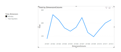
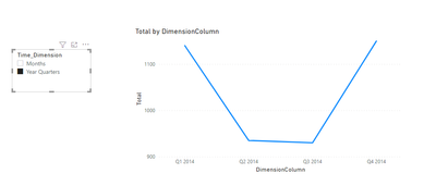
To achieve dynamic X-axis, you need to create a bridge table to crossjoin the dimension column and the Date column. Create a calculated table like this:
Bridge table =
SUMMARIZE ( CROSSJOIN ( 'Table', 'Time_Dimension' ), [Date], [Time_Dimension] )
Follow the above article to create relationships between these tables and create a new calculated column based on this calculated table:
DimensionColumn =
SWITCH (
    FIRSTNONBLANK ( 'Time_Dimension'[Time_Dimension], 1 ),
    "Months", RELATED ( 'Table'[Months] ),
    "Year Quarters", RELATED ( 'Table'[Year Quarters] )
)
Attached a sample file in the below, hopes it could help.
Best Regards,
Community Support Team _ Yingjie Li
If this post helps, then please consider Accept it as the solution to help the other members find it more quickly.
- Mark as New
- Bookmark
- Subscribe
- Mute
- Subscribe to RSS Feed
- Permalink
- Report Inappropriate Content
Hello @v-yingjl
Thanks for the solution. Have already accepted as the solution, but now if you can, the other problem is to create the rolling quarters 😅 Month and Quarter working fine.
But I need another dimension to return the accumulate of every 3 months, ending on the lastest data. So, i´ll not be the year quarter.
If the latest data is February, I need:
1. Dec, Jan, Feb
2. Sep, Oct, Nov
3. Jun, Jul, Aug
4. So on and so forth
- Mark as New
- Bookmark
- Subscribe
- Mute
- Subscribe to RSS Feed
- Permalink
- Report Inappropriate Content
@IrsFreire ,Dynamically change chart axis in Power BI , first option is bookmark -https://radacad.com/bookmarks-and-buttons-making-power-bi-charts-even-more-interactive
Other is unpivot table
https://www.youtube.com/watch?v=6jeSIRpjv0M
With direct query
https://datamonkeysite.com/2020/10/22/change-dimension-dynamically-using-parameter-in-powerbi/
Helpful resources

Power BI Dataviz World Championships
The Power BI Data Visualization World Championships is back! Get ahead of the game and start preparing now!

Power BI Monthly Update - November 2025
Check out the November 2025 Power BI update to learn about new features.

| User | Count |
|---|---|
| 59 | |
| 43 | |
| 42 | |
| 23 | |
| 17 |
| User | Count |
|---|---|
| 190 | |
| 122 | |
| 96 | |
| 66 | |
| 47 |


