Fabric Data Days starts November 4th!
Advance your Data & AI career with 50 days of live learning, dataviz contests, hands-on challenges, study groups & certifications and more!
Get registered- Power BI forums
- Get Help with Power BI
- Desktop
- Service
- Report Server
- Power Query
- Mobile Apps
- Developer
- DAX Commands and Tips
- Custom Visuals Development Discussion
- Health and Life Sciences
- Power BI Spanish forums
- Translated Spanish Desktop
- Training and Consulting
- Instructor Led Training
- Dashboard in a Day for Women, by Women
- Galleries
- Data Stories Gallery
- Themes Gallery
- Contests Gallery
- QuickViz Gallery
- Quick Measures Gallery
- Visual Calculations Gallery
- Notebook Gallery
- Translytical Task Flow Gallery
- TMDL Gallery
- R Script Showcase
- Webinars and Video Gallery
- Ideas
- Custom Visuals Ideas (read-only)
- Issues
- Issues
- Events
- Upcoming Events
Get Fabric Certified for FREE during Fabric Data Days. Don't miss your chance! Request now
- Power BI forums
- Forums
- Get Help with Power BI
- Desktop
- Dinamic bar chart dependent on slicer button
- Subscribe to RSS Feed
- Mark Topic as New
- Mark Topic as Read
- Float this Topic for Current User
- Bookmark
- Subscribe
- Printer Friendly Page
- Mark as New
- Bookmark
- Subscribe
- Mute
- Subscribe to RSS Feed
- Permalink
- Report Inappropriate Content
Dinamic bar chart dependent on slicer button
Hi Guys!
I am pretty new using power BI so the task that I was requested to do might by a bit advanced to my current level, that's why I appreciate any advice.
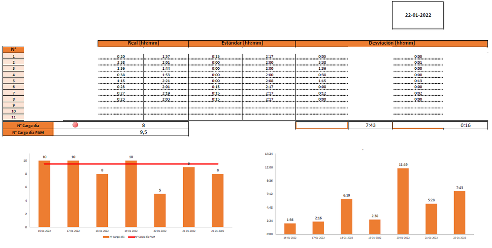
I have a table with dates and the number of time an equipment is loaded per day so I would like to show a bar chart with the info of the last 7 days, so when I select a new date on the slicer button the chart update.
So far I've been able to get it done however the slicer is not link to the rest of the info on the report and it only update the chart but not the rest of tables,
Thanks in Advance!
Solved! Go to Solution.
- Mark as New
- Bookmark
- Subscribe
- Mute
- Subscribe to RSS Feed
- Permalink
- Report Inappropriate Content
That makes more sense. I don't have time for a detailed reply just now but I think you could adapt one of these to what you want.
https://www.youtube.com/watch?v=duMSovyosXE&t=565s&ab_channel=BIElite
https://www.youtube.com/watch?v=MooZofz5GOI&ab_channel=EnterpriseDNA
| Have I solved your problem? Please click Accept as Solution so I don't keep coming back to this post, oh yeah, others may find it useful also ;). |
- Mark as New
- Bookmark
- Subscribe
- Mute
- Subscribe to RSS Feed
- Permalink
- Report Inappropriate Content
BI Elite has some good demos on this topic.
https://www.youtube.com/c/BIElite/search?query=dynamic%20chart%20with%20slicer
I'm not sure I fully understand your scenario, may need some screen shots and data to be able to better help.
| Have I solved your problem? Please click Accept as Solution so I don't keep coming back to this post, oh yeah, others may find it useful also ;). |
- Mark as New
- Bookmark
- Subscribe
- Mute
- Subscribe to RSS Feed
- Permalink
- Report Inappropriate Content
Thanks for your reply!,
Actually, I'm trying to replicate this report on BI
So everytime a different date is selected the bar chart changes showing the last 7 days since the date selected, meanwhile the table has the info of the day.
Here is part of the data I do have
The left bar chart has the total amount of "cps" per day,
I hope I explained myself a bit better, Thank you.
- Mark as New
- Bookmark
- Subscribe
- Mute
- Subscribe to RSS Feed
- Permalink
- Report Inappropriate Content
Hi,
See if my solution here helps - Flex a Pivot Table to show data for x months ended a certain user defined month.
Regards,
Ashish Mathur
http://www.ashishmathur.com
https://www.linkedin.com/in/excelenthusiasts/
- Mark as New
- Bookmark
- Subscribe
- Mute
- Subscribe to RSS Feed
- Permalink
- Report Inappropriate Content
That makes more sense. I don't have time for a detailed reply just now but I think you could adapt one of these to what you want.
https://www.youtube.com/watch?v=duMSovyosXE&t=565s&ab_channel=BIElite
https://www.youtube.com/watch?v=MooZofz5GOI&ab_channel=EnterpriseDNA
| Have I solved your problem? Please click Accept as Solution so I don't keep coming back to this post, oh yeah, others may find it useful also ;). |
- Mark as New
- Bookmark
- Subscribe
- Mute
- Subscribe to RSS Feed
- Permalink
- Report Inappropriate Content
Thank you! I will give it a try.
Helpful resources

Power BI Monthly Update - November 2025
Check out the November 2025 Power BI update to learn about new features.

Fabric Data Days
Advance your Data & AI career with 50 days of live learning, contests, hands-on challenges, study groups & certifications and more!


