Fabric Data Days starts November 4th!
Advance your Data & AI career with 50 days of live learning, dataviz contests, hands-on challenges, study groups & certifications and more!
Get registered- Power BI forums
- Get Help with Power BI
- Desktop
- Service
- Report Server
- Power Query
- Mobile Apps
- Developer
- DAX Commands and Tips
- Custom Visuals Development Discussion
- Health and Life Sciences
- Power BI Spanish forums
- Translated Spanish Desktop
- Training and Consulting
- Instructor Led Training
- Dashboard in a Day for Women, by Women
- Galleries
- Data Stories Gallery
- Themes Gallery
- Contests Gallery
- Quick Measures Gallery
- Visual Calculations Gallery
- Notebook Gallery
- Translytical Task Flow Gallery
- TMDL Gallery
- R Script Showcase
- Webinars and Video Gallery
- Ideas
- Custom Visuals Ideas (read-only)
- Issues
- Issues
- Events
- Upcoming Events
Join us at FabCon Atlanta from March 16 - 20, 2026, for the ultimate Fabric, Power BI, AI and SQL community-led event. Save $200 with code FABCOMM. Register now.
- Power BI forums
- Forums
- Get Help with Power BI
- Desktop
- Differences in well-log plotting between Jupyter N...
- Subscribe to RSS Feed
- Mark Topic as New
- Mark Topic as Read
- Float this Topic for Current User
- Bookmark
- Subscribe
- Printer Friendly Page
- Mark as New
- Bookmark
- Subscribe
- Mute
- Subscribe to RSS Feed
- Permalink
- Report Inappropriate Content
Differences in well-log plotting between Jupyter Notebook and Power BI
I'm using python visuals for plotting 2 columns (DEPTH and GR) of a Well-Log dataset in a "vertical line chart".
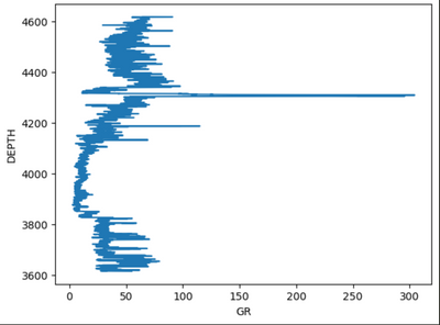
The target chart looks like this:
The Python script in jupyter notebook is pretty simple:
import lasio
file_path = "Well-Logs-and-Petrophysics/Data/15-9-19_SR_COMP.LAS"
las = lasio.read(file_path)
df = las.df()
df.reset_index(drop=False, inplace=True)
df.rename(columns={'index': 'Index', 'DEPT':'DEPTH'}, inplace=True)
df.dropna(how='any', axis=0, inplace=True)

x = df['GR']
y = df['DEPTH']
plt.plot(x, y)
For loading the data into Power BI, I'm using the same firsts lines to read (and clean) the LAS file as a dataframe.
Finally, I'm using the using the following code for the python visual:
import matplotlib.pyplot as plt

dataset.plot(kind='line', x='GR', y='DEPTH')
plt.show()
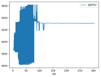
But the image plotted is the following:
Summary:
The python script is the same as in jupyter notebook, than in power bi, but power BI is not plotting the same way.
Question:
What is happening, and how to achieve desired well-log visualization in Power BI using Python visuals
Helpful resources

Fabric Data Days
Advance your Data & AI career with 50 days of live learning, contests, hands-on challenges, study groups & certifications and more!

Power BI Monthly Update - October 2025
Check out the October 2025 Power BI update to learn about new features.

| User | Count |
|---|---|
| 78 | |
| 48 | |
| 34 | |
| 31 | |
| 29 |


