FabCon is coming to Atlanta
Join us at FabCon Atlanta from March 16 - 20, 2026, for the ultimate Fabric, Power BI, AI and SQL community-led event. Save $200 with code FABCOMM.
Register now!- Power BI forums
- Get Help with Power BI
- Desktop
- Service
- Report Server
- Power Query
- Mobile Apps
- Developer
- DAX Commands and Tips
- Custom Visuals Development Discussion
- Health and Life Sciences
- Power BI Spanish forums
- Translated Spanish Desktop
- Training and Consulting
- Instructor Led Training
- Dashboard in a Day for Women, by Women
- Galleries
- Data Stories Gallery
- Themes Gallery
- Contests Gallery
- QuickViz Gallery
- Quick Measures Gallery
- Visual Calculations Gallery
- Notebook Gallery
- Translytical Task Flow Gallery
- TMDL Gallery
- R Script Showcase
- Webinars and Video Gallery
- Ideas
- Custom Visuals Ideas (read-only)
- Issues
- Issues
- Events
- Upcoming Events
Learn from the best! Meet the four finalists headed to the FINALS of the Power BI Dataviz World Championships! Register now
- Power BI forums
- Forums
- Get Help with Power BI
- Desktop
- Detailed Legend?
- Subscribe to RSS Feed
- Mark Topic as New
- Mark Topic as Read
- Float this Topic for Current User
- Bookmark
- Subscribe
- Printer Friendly Page
- Mark as New
- Bookmark
- Subscribe
- Mute
- Subscribe to RSS Feed
- Permalink
- Report Inappropriate Content
Detailed Legend?
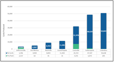
I'm looking to create a legend like the one in the picture or even a table. I can seem to find a way. Any help will be appreciated.
Solved! Go to Solution.
- Mark as New
- Bookmark
- Subscribe
- Mute
- Subscribe to RSS Feed
- Permalink
- Report Inappropriate Content
Hi @paul_jones ,
Please try:
First, create a new table:
Here is the M code:
let
    Source = Table.FromRows(Json.Document(Binary.Decompress(Binary.FromText("TY7NCsIwEIRfpeTcQ/62ac4KoqgHr6WHSFIMpElpqM/vrj3oZQZm9mNnGJhQtmMtkwIM2iVMU1hrye+YUmBjOzBtucamUyjHUJtbiTnUb9X3llItUO6uvn6QEBo4poqq0+qybx5uiX7npDaSQCMB0K5li/XvoQFNWwQ3dHTOPrrslpLiTgPvVE+TOcGHkrb5uWE1fgA=", BinaryEncoding.Base64), Compression.Deflate)), let _t = ((type nullable text) meta [Serialized.Text = true]) in type table [#"Rx Cards" = _t, #"Pre-Pack" = _t, #"X-axis" = _t]),
    #"Unpivoted Columns" = Table.UnpivotOtherColumns(Source, {"X-axis"}, "Attribute", "Value"),
    #"Pivoted Column" = Table.Pivot(#"Unpivoted Columns", List.Distinct(#"Unpivoted Columns"[#"X-axis"]), "X-axis", "Value")
in
    #"Pivoted Column"
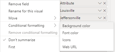
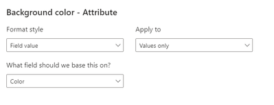
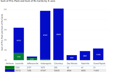
Then create a table visual and conditional format the [Attribute] column, here is the measure:
Color = IF(MAX('Table (2)'[Attribute])="Pre-Pack","Green","Blue")Then turn off the totals of the table visual:
Move the table visual to the stacked column chart:
Best Regards,
Jianbo Li
If this post helps, then please consider Accept it as the solution to help the other members find it more quickly.
Helpful resources

Join our Fabric User Panel
Share feedback directly with Fabric product managers, participate in targeted research studies and influence the Fabric roadmap.

Power BI Monthly Update - February 2026
Check out the February 2026 Power BI update to learn about new features.

| User | Count |
|---|---|
| 52 | |
| 51 | |
| 39 | |
| 15 | |
| 14 |
| User | Count |
|---|---|
| 93 | |
| 84 | |
| 33 | |
| 29 | |
| 25 |


