FabCon is coming to Atlanta
Join us at FabCon Atlanta from March 16 - 20, 2026, for the ultimate Fabric, Power BI, AI and SQL community-led event. Save $200 with code FABCOMM.
Register now!- Power BI forums
- Get Help with Power BI
- Desktop
- Service
- Report Server
- Power Query
- Mobile Apps
- Developer
- DAX Commands and Tips
- Custom Visuals Development Discussion
- Health and Life Sciences
- Power BI Spanish forums
- Translated Spanish Desktop
- Training and Consulting
- Instructor Led Training
- Dashboard in a Day for Women, by Women
- Galleries
- Data Stories Gallery
- Themes Gallery
- Contests Gallery
- Quick Measures Gallery
- Notebook Gallery
- Translytical Task Flow Gallery
- TMDL Gallery
- R Script Showcase
- Webinars and Video Gallery
- Ideas
- Custom Visuals Ideas (read-only)
- Issues
- Issues
- Events
- Upcoming Events
Join the Fabric FabCon Global Hackathon—running virtually through Nov 3. Open to all skill levels. $10,000 in prizes! Register now.
- Power BI forums
- Forums
- Get Help with Power BI
- Desktop
- Derive Column based on Slicer selection
- Subscribe to RSS Feed
- Mark Topic as New
- Mark Topic as Read
- Float this Topic for Current User
- Bookmark
- Subscribe
- Printer Friendly Page
- Mark as New
- Bookmark
- Subscribe
- Mute
- Subscribe to RSS Feed
- Permalink
- Report Inappropriate Content
Derive Column based on Slicer selection
Hi All,
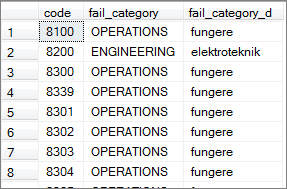
I want to change the dimension selection in a chart based on the slicer filter in POwer bi.. For ex.. i have a mapping with 2 different description per language like below
& i created a language table with 1 column called "language" with the contents "english" and "danish".
Now, my request here is that if i select english then my chart will show the info based on fail_category column else "fail_category_D" column..
I tried with selectedvalue function and other options but nothing works.. Please help to rectify this issue & let me know if you need any more details..
Solved! Go to Solution.
- Mark as New
- Bookmark
- Subscribe
- Mute
- Subscribe to RSS Feed
- Permalink
- Report Inappropriate Content
thank you.. i created the many to many releationship by using the bridge table.
this way i created the relationship b/w my transaction to fail code mapping with duplicate entries ( 1 entry for eng and 1 entry for danish). that solved my issue..
more details refer below link
https://www.seerinteractive.com/blog/join-many-many-power-bi/
- Mark as New
- Bookmark
- Subscribe
- Mute
- Subscribe to RSS Feed
- Permalink
- Report Inappropriate Content
Hi @Peter_Jeyaraj_I,
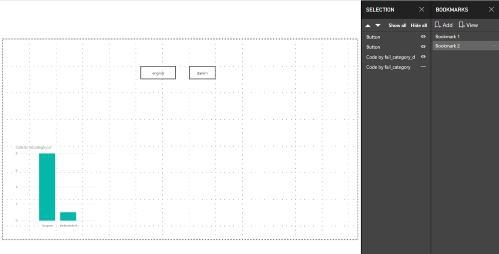
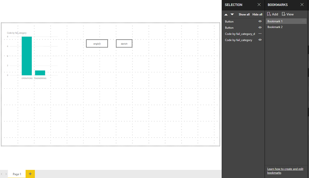
We can use bookmark to work around.
https://docs.microsoft.com/en-us/power-bi/desktop-bookmarks
I made one sample for your reference.
Attached the pbix as well.
Regards,
Frank
If this post helps, then please consider Accept it as the solution to help the others find it more quickly.
- Mark as New
- Bookmark
- Subscribe
- Mute
- Subscribe to RSS Feed
- Permalink
- Report Inappropriate Content
thank you.. i created the many to many releationship by using the bridge table.
this way i created the relationship b/w my transaction to fail code mapping with duplicate entries ( 1 entry for eng and 1 entry for danish). that solved my issue..
more details refer below link
https://www.seerinteractive.com/blog/join-many-many-power-bi/
- Mark as New
- Bookmark
- Subscribe
- Mute
- Subscribe to RSS Feed
- Permalink
- Report Inappropriate Content
Hi @Peter_Jeyaraj_I,
That's cool, Kindly mark your answer as a solution to close the case please. Thanks in advance.
Regards,
Frank
If this post helps, then please consider Accept it as the solution to help the others find it more quickly.
- Mark as New
- Bookmark
- Subscribe
- Mute
- Subscribe to RSS Feed
- Permalink
- Report Inappropriate Content
Hi Peter,
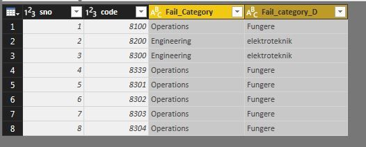
how your language table is connected with base data table. , there can also achieve this using this approach.
Name of the table is Date(2) .
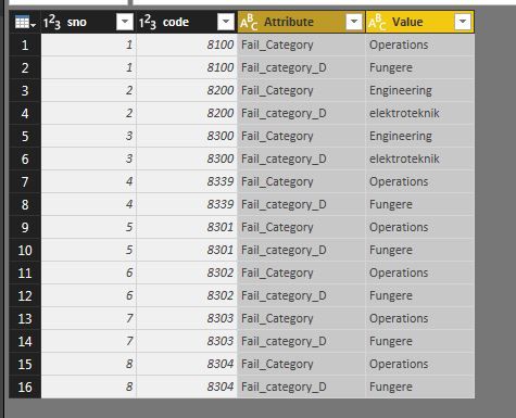
- Unpivot your table for Fail_Category and Fail_category_D
- create measure 'Count' = COUNT('Data (2)'[Value])
- drag object 'Value' to Axis and measure Count into Value
Slicer :
Create slicer using 'Value' field. ( you can change the name for category to english and Danish if needed)

Hope this helps
SS
- Mark as New
- Bookmark
- Subscribe
- Mute
- Subscribe to RSS Feed
- Permalink
- Report Inappropriate Content
@Peter_Jeyaraj_I Could you please post your expected output as well ? If possible sample data that can be copied.
Did I answer your question? Mark my post as a solution!
Proud to be a PBI Community Champion
- Mark as New
- Bookmark
- Subscribe
- Mute
- Subscribe to RSS Feed
- Permalink
- Report Inappropriate Content
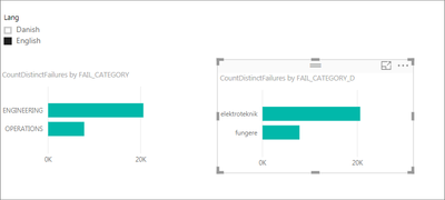
Here below i shared the sample screenshot
I have 3 different tables
1. Master ( Countof Failures measure available here )
2. Fail_Mapping ( Fail category & fail category d columns available here)
3. Language ( Lang field )
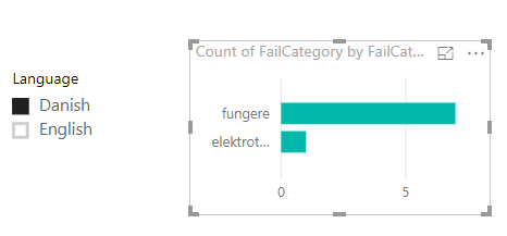
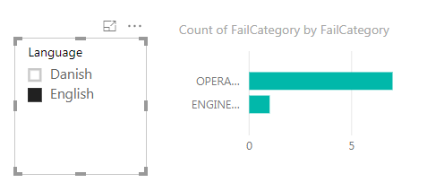
If i select english then the chart has to show the failures count by fail category
If i select danish then the chart has to show the failures by fail category d. Hope this helps
- Mark as New
- Bookmark
- Subscribe
- Mute
- Subscribe to RSS Feed
- Permalink
- Report Inappropriate Content
@Peter_Jeyaraj_I Here is the steps I've followed to solve this..
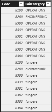
Create a new calculated table from your main table as below:
Test21ChartNew = UNION(
                        SELECTCOLUMNS(Test21Chart,"Code",[Code],"FailCategory",[FailCategory])
                       ,SELECTCOLUMNS(Test21Chart,"Code",[Code],"FailCategory",[FailCategory_D])
                      )
The output will be as :
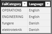
Similary, create a lookup table as below
Test21ChartSlicer = DISTINCT(
                UNION(
                        SELECTCOLUMNS(Test21Chart,"Language","English","FailCategory",Test21Chart[FailCategory])
                        ,SELECTCOLUMNS(Test21Chart,"Language","Danish","FailCategory",Test21Chart[FailCategory_D])
                    )
                )
This will be result to as below:
Now make sure these two tables have relationship on FailCategory field. That's it, now you have your output as expected.
Did I answer your question? Mark my post as a solution!
Proud to be a PBI Community Champion
- Mark as New
- Bookmark
- Subscribe
- Mute
- Subscribe to RSS Feed
- Permalink
- Report Inappropriate Content
Thanks for your response.
but i need to maintain the unique values in fail code table as i have code - code relationship b/w master table( kind of transaction table) and fail code table.
that is the reason why i created new columns to accomadate other language values.
Helpful resources

FabCon Global Hackathon
Join the Fabric FabCon Global Hackathon—running virtually through Nov 3. Open to all skill levels. $10,000 in prizes!

Power BI Monthly Update - September 2025
Check out the September 2025 Power BI update to learn about new features.

