FabCon is coming to Atlanta
Join us at FabCon Atlanta from March 16 - 20, 2026, for the ultimate Fabric, Power BI, AI and SQL community-led event. Save $200 with code FABCOMM.
Register now!- Power BI forums
- Get Help with Power BI
- Desktop
- Service
- Report Server
- Power Query
- Mobile Apps
- Developer
- DAX Commands and Tips
- Custom Visuals Development Discussion
- Health and Life Sciences
- Power BI Spanish forums
- Translated Spanish Desktop
- Training and Consulting
- Instructor Led Training
- Dashboard in a Day for Women, by Women
- Galleries
- Data Stories Gallery
- Themes Gallery
- Contests Gallery
- QuickViz Gallery
- Quick Measures Gallery
- Visual Calculations Gallery
- Notebook Gallery
- Translytical Task Flow Gallery
- TMDL Gallery
- R Script Showcase
- Webinars and Video Gallery
- Ideas
- Custom Visuals Ideas (read-only)
- Issues
- Issues
- Events
- Upcoming Events
The Power BI Data Visualization World Championships is back! Get ahead of the game and start preparing now! Learn more
- Power BI forums
- Forums
- Get Help with Power BI
- Desktop
- Delta Funnel
- Subscribe to RSS Feed
- Mark Topic as New
- Mark Topic as Read
- Float this Topic for Current User
- Bookmark
- Subscribe
- Printer Friendly Page
- Mark as New
- Bookmark
- Subscribe
- Mute
- Subscribe to RSS Feed
- Permalink
- Report Inappropriate Content
Delta Funnel
Hi,
I have a following sample table:
| Page Name | Customer ID |
| Page A | Customer 1 |
| Page A | Customer 2 |
| Page B | Customer 1 |
| Page B | Customer 2 |
| Page B | Customer 3 |
| Page B | Customer 4 |
| Page C | Customer 1 |
| Page D | Customer 1 |
| Page D | Customer 2 |
From the above table, I have created a funnel which shows the unique number of customers per page
| Page Name | No. Unique Customers |
| Page A | 2 |
| Page B | 4 |
| Page C | 1 |
| Page D | 2 |
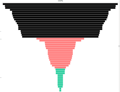
The funnel is sorted automatically as shown below (with many more page names that I have in my source data):
My question is how can I calculate or depict the number of dropped customers as they travel from most visited page (page B) to least visited page (page C) in Power BI:
| Page Name | No. Dropped Customers |
| Page B | |
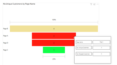
| Page A | 2 (4 in Page B - 2 in Page A) |
| Page D | 0 (2 in Page A - 2 in Page D) |
| Page C | 1 (2 in Page D - 1 in Page C) |
In other words, how can I visulaise the delta funnel?
Many thanks
Solved! Go to Solution.
- Mark as New
- Bookmark
- Subscribe
- Mute
- Subscribe to RSS Feed
- Permalink
- Report Inappropriate Content
Hi, @hamadani
As a workaround, you can try the following steps to visulaise the delta funnel.
1. add a summarize table:
calculated table:
Table 2 = SUMMARIZE('Table','Table'[Page Name],"No.Unique Customers",DISTINCTCOUNT('Table'[Customer ID]))calculatd column:
Rank = RANKX(ALLSELECTED('Table 2'),'Table 2'[No.Unique Customers],,DESC,Dense) Rankvalue =
RANKX (
'Table 2',
'Table 2'[Rank]
+ RANKX ( 'Table 2', 'Table 2'[Page Name],, ASC, DENSE )
/ CALCULATE ( COUNTROWS ( 'Table 2' ), ALLSELECTED () ),
,
ASC,
DENSE
)No.Dropped Customers =
VAR a = 'Table 2'[No.Unique Customers]
VAR b =
CALCULATE (
MAX ( 'Table 2'[No.Unique Customers] ),
FILTER (
'Table 2',
'Table 2'[Rankvalue]
= EARLIER ( 'Table 2'[Rankvalue] ) - 1
)
)
RETURN
IF ( ISBLANK ( b ), BLANK (), b - a )2. consider using custom tooltip page to show the Dropped Customers.
Result:
Best Regards,
Community Support Team _ Eason
Helpful resources

Power BI Dataviz World Championships
The Power BI Data Visualization World Championships is back! Get ahead of the game and start preparing now!

| User | Count |
|---|---|
| 40 | |
| 37 | |
| 35 | |
| 34 | |
| 28 |
| User | Count |
|---|---|
| 136 | |
| 99 | |
| 73 | |
| 66 | |
| 65 |


