FabCon is coming to Atlanta
Join us at FabCon Atlanta from March 16 - 20, 2026, for the ultimate Fabric, Power BI, AI and SQL community-led event. Save $200 with code FABCOMM.
Register now!- Power BI forums
- Get Help with Power BI
- Desktop
- Service
- Report Server
- Power Query
- Mobile Apps
- Developer
- DAX Commands and Tips
- Custom Visuals Development Discussion
- Health and Life Sciences
- Power BI Spanish forums
- Translated Spanish Desktop
- Training and Consulting
- Instructor Led Training
- Dashboard in a Day for Women, by Women
- Galleries
- Data Stories Gallery
- Themes Gallery
- Contests Gallery
- QuickViz Gallery
- Quick Measures Gallery
- Visual Calculations Gallery
- Notebook Gallery
- Translytical Task Flow Gallery
- TMDL Gallery
- R Script Showcase
- Webinars and Video Gallery
- Ideas
- Custom Visuals Ideas (read-only)
- Issues
- Issues
- Events
- Upcoming Events
The Power BI Data Visualization World Championships is back! Get ahead of the game and start preparing now! Learn more
- Power BI forums
- Forums
- Get Help with Power BI
- Desktop
- Re: Delimitate Column into Single Column
- Subscribe to RSS Feed
- Mark Topic as New
- Mark Topic as Read
- Float this Topic for Current User
- Bookmark
- Subscribe
- Printer Friendly Page
- Mark as New
- Bookmark
- Subscribe
- Mute
- Subscribe to RSS Feed
- Permalink
- Report Inappropriate Content
Delimitate Column into Single Column
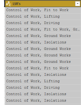
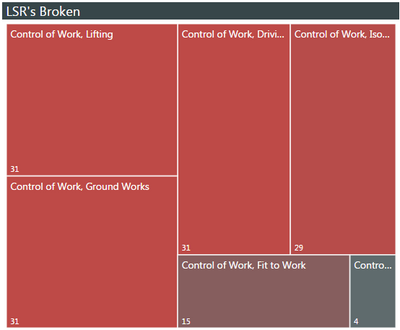
This may be a very simple thing, so please excuse my ignorance. I will try and articulate this the best that I can. When I go to edit my quiries, I have several columns with values that are comma delimited. However, when I apply these columns to a chart, or graph, it treats each combined text as a unique value.
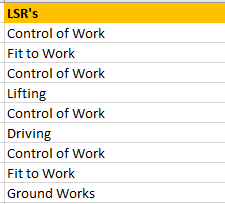
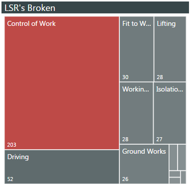
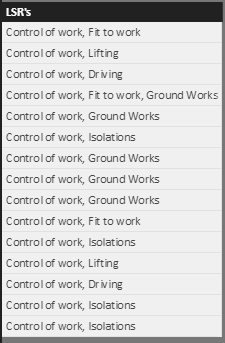
I believe that I need the be able to have the data line up like below, in order to get the chart's to break apart by the unique values.
I know that I can split each column by the coma delimeter into multiple columns, however that could be up to 30 columns. When I try and add each column into the values to plot, I can get a graph but I can't get it to slice all the other surounding graphs.
Is there a simple way to break the values apart at the coma and have them stack in the same column rather than splitting into multiple colums? That way all I have to do is "Fill Down" by the unique identifier and everyting slices just fine. I hope I'm making sence.
Aaron
Solved! Go to Solution.
- Mark as New
- Bookmark
- Subscribe
- Mute
- Subscribe to RSS Feed
- Permalink
- Report Inappropriate Content
Hi,
According to your description, you want to spilt the “LSR’s “ column by “,” and merge them to one column, right?
If as I said, you can follow below steps:
Source table:
1. Open the edit query and duplicate the base table:
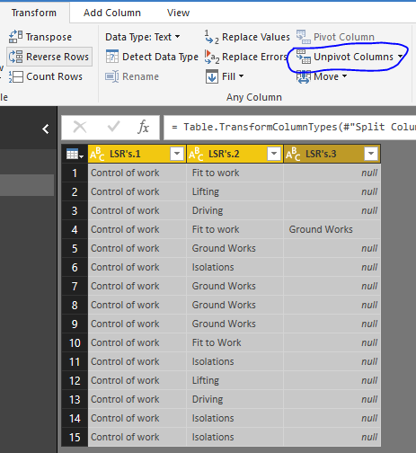
2. Right-Click on LSR’s and choose the “spilt column” -> “By Delimiter”:
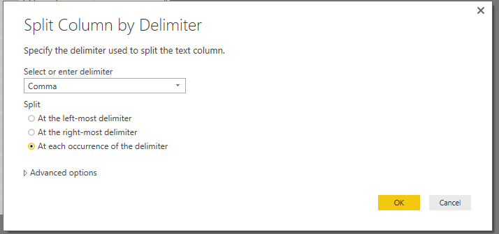
3.All select the columns and choose the “Unpivot Columns”:
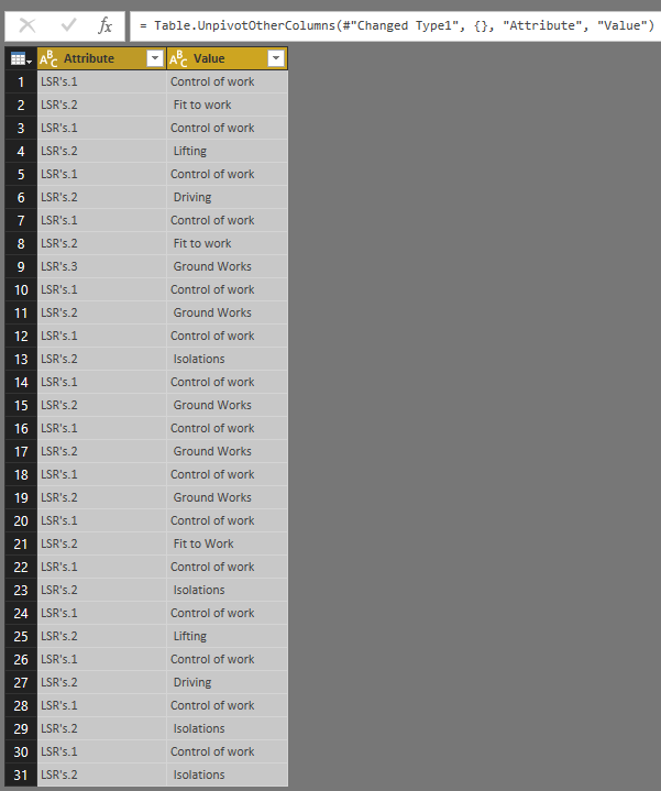
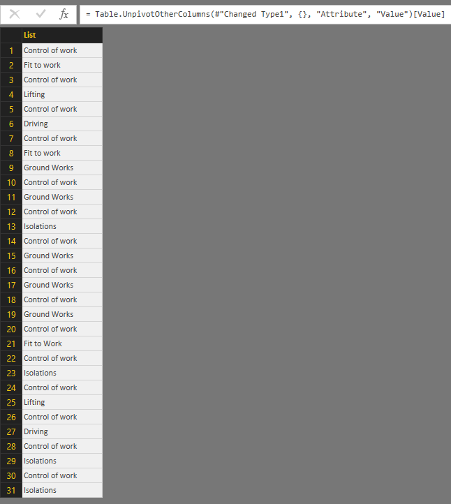
4.Modify the formula of "Unpivot Columns":
Table.UnpivotOtherColumns(#"Changed Type1", {}, "Attribute", "Value")[Value]
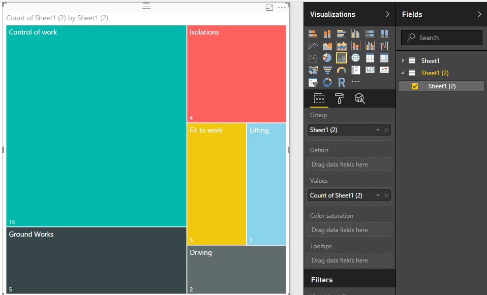
5. Close and apply the change, then create a visual.
Regards,
Xiaoxin Sheng
- Mark as New
- Bookmark
- Subscribe
- Mute
- Subscribe to RSS Feed
- Permalink
- Report Inappropriate Content
Hi,
According to your description, you want to spilt the “LSR’s “ column by “,” and merge them to one column, right?
If as I said, you can follow below steps:
Source table:
1. Open the edit query and duplicate the base table:
2. Right-Click on LSR’s and choose the “spilt column” -> “By Delimiter”:

3.All select the columns and choose the “Unpivot Columns”:

4.Modify the formula of "Unpivot Columns":
Table.UnpivotOtherColumns(#"Changed Type1", {}, "Attribute", "Value")[Value]
5. Close and apply the change, then create a visual.
Regards,
Xiaoxin Sheng
- Mark as New
- Bookmark
- Subscribe
- Mute
- Subscribe to RSS Feed
- Permalink
- Report Inappropriate Content
Xiaoxin_Sheng,
Thank you so much for your solution. It is exactly what I was looking for.
- Mark as New
- Bookmark
- Subscribe
- Mute
- Subscribe to RSS Feed
- Permalink
- Report Inappropriate Content
Split into two columns on comma. Make a hierarchy, Column1 at the top, Column2 below it and use that in your visual. This will activate drill down capabilities. Alternatively, you can use two treemaps, one for Column1 and one for Column2. Clicking on the Column1 treemap will automagically filter the other treemap.
Follow on LinkedIn
@ me in replies or I'll lose your thread!!!
Instead of a Kudo, please vote for this idea
Become an expert!: Enterprise DNA
External Tools: MSHGQM
YouTube Channel!: Microsoft Hates Greg
Latest book!: DAX For Humans
DAX is easy, CALCULATE makes DAX hard...
Helpful resources

Power BI Dataviz World Championships
The Power BI Data Visualization World Championships is back! Get ahead of the game and start preparing now!

| User | Count |
|---|---|
| 39 | |
| 36 | |
| 33 | |
| 31 | |
| 28 |
| User | Count |
|---|---|
| 129 | |
| 88 | |
| 79 | |
| 68 | |
| 63 |
