FabCon is coming to Atlanta
Join us at FabCon Atlanta from March 16 - 20, 2026, for the ultimate Fabric, Power BI, AI and SQL community-led event. Save $200 with code FABCOMM.
Register now!- Power BI forums
- Get Help with Power BI
- Desktop
- Service
- Report Server
- Power Query
- Mobile Apps
- Developer
- DAX Commands and Tips
- Custom Visuals Development Discussion
- Health and Life Sciences
- Power BI Spanish forums
- Translated Spanish Desktop
- Training and Consulting
- Instructor Led Training
- Dashboard in a Day for Women, by Women
- Galleries
- Data Stories Gallery
- Themes Gallery
- Contests Gallery
- Quick Measures Gallery
- Notebook Gallery
- Translytical Task Flow Gallery
- TMDL Gallery
- R Script Showcase
- Webinars and Video Gallery
- Ideas
- Custom Visuals Ideas (read-only)
- Issues
- Issues
- Events
- Upcoming Events
Calling all Data Engineers! Fabric Data Engineer (Exam DP-700) live sessions are back! Starting October 16th. Sign up.
- Power BI forums
- Forums
- Get Help with Power BI
- Desktop
- Re: Dax Switch with multiple answers
- Subscribe to RSS Feed
- Mark Topic as New
- Mark Topic as Read
- Float this Topic for Current User
- Bookmark
- Subscribe
- Printer Friendly Page
- Mark as New
- Bookmark
- Subscribe
- Mute
- Subscribe to RSS Feed
- Permalink
- Report Inappropriate Content
Dax Switch with multiple answers
Good afternoon,
I am trying to build a report for my client to see how many of their clients meet various safety icons.
A supplier can have more than one rating per invoice and it varries per invoice.
Their rating system goes from 1 to 10.
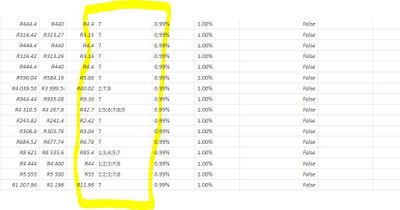
They currently fill this in on their accounting system in a single cell with ";" dividing the ratings.
So for example, see below screenshot
I used the Switch function and can manage to find the items listed but the problem is if there is more than one correct answer it doesn't calculate.
Safety Icon = SWITCH('Invoices OP'[Safety Icon],"1","Health & Happiness","2","Equity & Local Economy","3","Culture & Community","no")
This is a small snippet and doesn't include all 10 icons, only the first 3 for visual purposes.
Could someone please asssit me with the above on a way to list all found icons be it one or many in a cell.
Looking forward to your assistance fellow BI pioneers 🙂
Solved! Go to Solution.
- Mark as New
- Bookmark
- Subscribe
- Mute
- Subscribe to RSS Feed
- Permalink
- Report Inappropriate Content
Hi @Gregory-N ,
I create a table to test according to your descriptions.
Please try below steps:
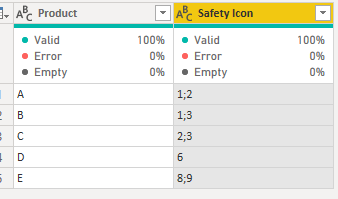
1. below is my test table
Table:
2. in power query, split a column by delimiter and split to row(Split a column of text (Power Query) (microsoft.com))
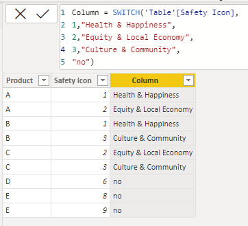
3. load into Power BI and add a new column with below dax formula
Column =
SWITCH (
    'Table'[Safety Icon],
    1, "Health & Happiness",
    2, "Equity & Local Economy",
    3, "Culture & Community",
    "no"
)
Please refer the attached .pbix file.
Best regards,
Community Support Team_ Binbin Yu
If this post helps, then please consider Accept it as the solution to help the other members find it more quickly.
- Mark as New
- Bookmark
- Subscribe
- Mute
- Subscribe to RSS Feed
- Permalink
- Report Inappropriate Content
Thank you
- Mark as New
- Bookmark
- Subscribe
- Mute
- Subscribe to RSS Feed
- Permalink
- Report Inappropriate Content
Problably the best option is to split up the columns (DAX or PQ) and display icons per category.
Afterwards you could consider creating a measure which concats icons.
If you insist on keeping this column you might want to consider using images instead of icons. You problably have to create all different variants, but then you are able to create URL's.
- Mark as New
- Bookmark
- Subscribe
- Mute
- Subscribe to RSS Feed
- Permalink
- Report Inappropriate Content
Hi @Gregory-N ,
Not sure about what exactly you want to show in the report. But if it's only about showing the attributes then you can try to split your column using a delimiter and then use you SWITCH statement.
@Gregory-N -> if this helps you then please hit the thumbs up & mark it as a solution. Thanks.
Helpful resources

FabCon Global Hackathon
Join the Fabric FabCon Global Hackathon—running virtually through Nov 3. Open to all skill levels. $10,000 in prizes!

Power BI Monthly Update - October 2025
Check out the October 2025 Power BI update to learn about new features.


