Fabric Data Days starts November 4th!
Advance your Data & AI career with 50 days of live learning, dataviz contests, hands-on challenges, study groups & certifications and more!
Get registered- Power BI forums
- Get Help with Power BI
- Desktop
- Service
- Report Server
- Power Query
- Mobile Apps
- Developer
- DAX Commands and Tips
- Custom Visuals Development Discussion
- Health and Life Sciences
- Power BI Spanish forums
- Translated Spanish Desktop
- Training and Consulting
- Instructor Led Training
- Dashboard in a Day for Women, by Women
- Galleries
- Data Stories Gallery
- Themes Gallery
- Contests Gallery
- QuickViz Gallery
- Quick Measures Gallery
- Visual Calculations Gallery
- Notebook Gallery
- Translytical Task Flow Gallery
- TMDL Gallery
- R Script Showcase
- Webinars and Video Gallery
- Ideas
- Custom Visuals Ideas (read-only)
- Issues
- Issues
- Events
- Upcoming Events
Get Fabric Certified for FREE during Fabric Data Days. Don't miss your chance! Request now
- Power BI forums
- Forums
- Get Help with Power BI
- Desktop
- Re: Date slicer filter only one value in graphic a...
- Subscribe to RSS Feed
- Mark Topic as New
- Mark Topic as Read
- Float this Topic for Current User
- Bookmark
- Subscribe
- Printer Friendly Page
- Mark as New
- Bookmark
- Subscribe
- Mute
- Subscribe to RSS Feed
- Permalink
- Report Inappropriate Content
Date slicer filter only one value in graphic and does not affect x axis
Hi All,
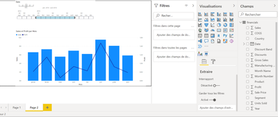
I have a dashboard like this :
The graph is filtered by date slicer.
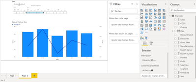
If I select for example january to May on the slicer, it will filter the graph :
My question is simple :
is it possible to select january to may in the slicer and have the x axis from January to December and the line from January to December too?
But the bars will be filtered (from January to May).
Thank you in advance 😉
Best regards
Solved! Go to Solution.
- Mark as New
- Bookmark
- Subscribe
- Mute
- Subscribe to RSS Feed
- Permalink
- Report Inappropriate Content
Hi@Anonymous,
Hi@ADN75,
You can create a new date dimension table to help you achieve this requirement.
- Create a new table:
Date Table = VALUES('Table'[Month])
- Create new measure named New Sales an New Profit.
New Sales =

IF(

MAX('Date Table'[Month]) in ALLSELECTED('Table'[Month]),

CALCULATE(MAX('Table'[Sales]),FILTER('Table','Table'[Month]=MAX('Date Table'[Month])))

)
New Profit =

IF(

MAX('Date Table'[Month]) in ALLSELECTED('Table'[Month]),

CALCULATE(MAX('Table'[Profit]),FILTER('Table','Table'[Month]=MAX('Date Table'[Month]))),

0

)
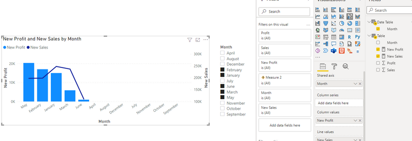
Put the New Profit and New Sales instead of the original one.
Then you can use the new “month” in Date table to interact with the visual.
You will get the result like this:
Here is the demo, please try it.
If this does not solve your problem, please provide more details and be free to let me know.
Hope it helps.
Best Regards,
Caitlyn Yan
If this post helps then please consider Accept it as the solution to help the other members find it more quickly.
- Mark as New
- Bookmark
- Subscribe
- Mute
- Subscribe to RSS Feed
- Permalink
- Report Inappropriate Content
Hi @Anonymous
thank you for your help !
"Profit" and "Sales" are measures in another table... so I didn't manage to use them in your DAX formula..
- Mark as New
- Bookmark
- Subscribe
- Mute
- Subscribe to RSS Feed
- Permalink
- Report Inappropriate Content
Hi @Anonymous,
If another table already has a Month column and you want to use it as the x-axis, you can pull that column in my measure instead.
Or would you mind providing me with a pbix file without sensitive information so that I can help you better?
Best Regards,
Caitlyn Yan
- Mark as New
- Bookmark
- Subscribe
- Mute
- Subscribe to RSS Feed
- Permalink
- Report Inappropriate Content
Hi @Anonymous ,
Sorry, it's in French, my problem is GRAPH_A expected Production Wind is a measure and the error message is : column GRAPH_A expected Production Wind in table Reporting is untraceable and isn't used in this expression.
Unfornatelly, I can attach pbix file to my message. Maybe I can send you a pbix by mail?
- Mark as New
- Bookmark
- Subscribe
- Mute
- Subscribe to RSS Feed
- Permalink
- Report Inappropriate Content
Hi@Anonymous ,
I checked your error message and because you are referencing a measure in the formula, my formula does not work for you.
For your data security, etc., we only support to solve the problem for you on the forum, you can refer to the following article:How to provide sample data in the Power BI Forum
Best Regards,
Caitlyn Yan
- Mark as New
- Bookmark
- Subscribe
- Mute
- Subscribe to RSS Feed
- Permalink
- Report Inappropriate Content
- Mark as New
- Bookmark
- Subscribe
- Mute
- Subscribe to RSS Feed
- Permalink
- Report Inappropriate Content
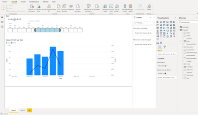
Hello,
A bit more explaination :
I managed to set the date axis from January to December (even if this is not the best solution because if I change the year, I need to change in the Format option of my graph too) :
On this visual, I just want the line (Profit) from January to December (not from January to July like in the date slicer).
Is it possible?
Thank you
- Mark as New
- Bookmark
- Subscribe
- Mute
- Subscribe to RSS Feed
- Permalink
- Report Inappropriate Content
Hi @amitchandak,
The month comes from the same table unfortunatelly. And there are data from May to December for the value I want to show...
Helpful resources

Power BI Monthly Update - November 2025
Check out the November 2025 Power BI update to learn about new features.

Fabric Data Days
Advance your Data & AI career with 50 days of live learning, contests, hands-on challenges, study groups & certifications and more!

| User | Count |
|---|---|
| 97 | |
| 70 | |
| 50 | |
| 42 | |
| 40 |
