FabCon is coming to Atlanta
Join us at FabCon Atlanta from March 16 - 20, 2026, for the ultimate Fabric, Power BI, AI and SQL community-led event. Save $200 with code FABCOMM.
Register now!- Power BI forums
- Get Help with Power BI
- Desktop
- Service
- Report Server
- Power Query
- Mobile Apps
- Developer
- DAX Commands and Tips
- Custom Visuals Development Discussion
- Health and Life Sciences
- Power BI Spanish forums
- Translated Spanish Desktop
- Training and Consulting
- Instructor Led Training
- Dashboard in a Day for Women, by Women
- Galleries
- Data Stories Gallery
- Themes Gallery
- Contests Gallery
- QuickViz Gallery
- Quick Measures Gallery
- Visual Calculations Gallery
- Notebook Gallery
- Translytical Task Flow Gallery
- TMDL Gallery
- R Script Showcase
- Webinars and Video Gallery
- Ideas
- Custom Visuals Ideas (read-only)
- Issues
- Issues
- Events
- Upcoming Events
Get Fabric Certified for FREE during Fabric Data Days. Don't miss your chance! Request now
- Power BI forums
- Forums
- Get Help with Power BI
- Desktop
- Re: Date Table cannot be filtered by visual level ...
- Subscribe to RSS Feed
- Mark Topic as New
- Mark Topic as Read
- Float this Topic for Current User
- Bookmark
- Subscribe
- Printer Friendly Page
- Mark as New
- Bookmark
- Subscribe
- Mute
- Subscribe to RSS Feed
- Permalink
- Report Inappropriate Content
Date Table cannot be filtered by visual level slicer in some reports
Ok...I'm unsure whether this is a bug or just me (probably the latter!)
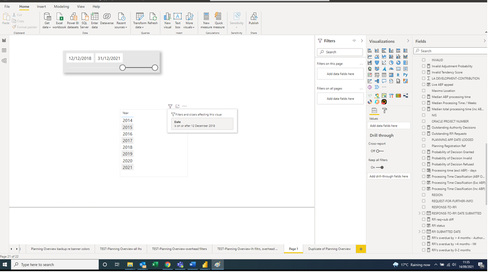
The date table shown below will not be sliced by a visual level slicer. However, it can be filtered using the right-hand 'filters' pane. The date table is generated using CALENDARAUTO(). I've tried using CALENDAR(), and manually setting the date range, but the symptoms still occur.
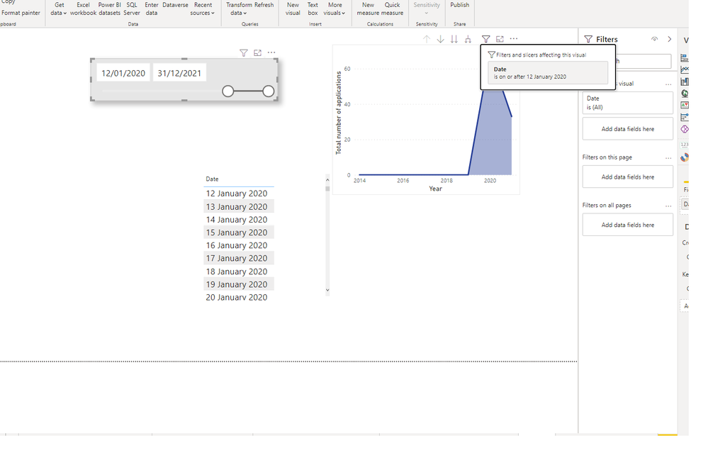
After I re-ran CALENDARAUTO() to 'refresh' the date table, the dates can now be filtered-but only if they are in a table. As demonstrated below, a line chart using data from one of the 3 datasources will show all years generated in the date table - even when a visual level slicer is applied. When 'Edit Interactions' is displayed, the slicer is shown as filtering the chart.
I've noticed that I cannot recreate this behaviour outside of a few select reports, so presumably there's some weird setting etc going on? These reports total a good few months of work, so I am keen to get this fixed. Thanks!
- Mark as New
- Bookmark
- Subscribe
- Mute
- Subscribe to RSS Feed
- Permalink
- Report Inappropriate Content
Hi @Anonymous ,
Not really sure if I understand your question, are all of the visualizations ( table and Line chart and slicer) based on the same column?
How do you have the relationships between the date table and the fact table?
Can you please share a mockup data or sample of your PBIX file. You can use a onedrive, google drive, we transfer or similar link to upload your files.
If the information is sensitive please share it trough private message.
Regards
Miguel Félix
Did I answer your question? Mark my post as a solution!
Proud to be a Super User!
Check out my blog: Power BI em Português- Mark as New
- Bookmark
- Subscribe
- Mute
- Subscribe to RSS Feed
- Permalink
- Report Inappropriate Content
Hi MFelix, apologies if I was unclear. I appear to have resolved this, and an explanation is below.
Unfortunately I couldn't find a way to attach a .pbix file to this reply, but the issue was as follows:
A table, Table1, contains 2 columns, 'Date' and 'Value'. The 'Value' column contains a series of integer values.
A centralised 'Date Table' is used for the x axis of a graph. It has a single column, 'Date', generated by CALENDARAUTO().
The 'Date' column in Table1 and the 'Date' column in Date Table are linked with a bidirectional relationship.
The 'Date' column in Date Table is used as the X axis for a line chart. The 'Value' column from Table 1 is used as the Y axis.
The 'Date' column from Date Table is also assigned to a 'between' style slicer (user picks date range by selecting start and end date).
Using this approach, the slicer filters the chart in a normal way.
But suppose a measure, 'Total', is used to summarise the data:
Total = COALESCE(SUM(Table 1[Value]),0)If 'Total' is assigned to the Y axis of the graph, rather than the raw data within the 'Value' column, then the chart will always show all dates, regardless of those specified by the slicer. Only the Y values will change.
The cause seems to be something to do with COALESCE(). This function (I believe) requires that a substitute value be present eg ('0') whenever no value is returned by its first argument (which is SUM(Table 1[Value]). So wherever no value was present (eg for 1990), the measure returned 0 rather than null. However, I'm not sure why this would cause the year to be still visible when the slicer specifies that it should be excluded.
The issue can be avoided by omitting COALESCE() from the measure concerned. Expressions like '+0' should also be avoided from what I can see.
Helpful resources

Power BI Monthly Update - November 2025
Check out the November 2025 Power BI update to learn about new features.

Fabric Data Days
Advance your Data & AI career with 50 days of live learning, contests, hands-on challenges, study groups & certifications and more!


