FabCon is coming to Atlanta
Join us at FabCon Atlanta from March 16 - 20, 2026, for the ultimate Fabric, Power BI, AI and SQL community-led event. Save $200 with code FABCOMM.
Register now!- Power BI forums
- Get Help with Power BI
- Desktop
- Service
- Report Server
- Power Query
- Mobile Apps
- Developer
- DAX Commands and Tips
- Custom Visuals Development Discussion
- Health and Life Sciences
- Power BI Spanish forums
- Translated Spanish Desktop
- Training and Consulting
- Instructor Led Training
- Dashboard in a Day for Women, by Women
- Galleries
- Data Stories Gallery
- Themes Gallery
- Contests Gallery
- QuickViz Gallery
- Quick Measures Gallery
- Visual Calculations Gallery
- Notebook Gallery
- Translytical Task Flow Gallery
- TMDL Gallery
- R Script Showcase
- Webinars and Video Gallery
- Ideas
- Custom Visuals Ideas (read-only)
- Issues
- Issues
- Events
- Upcoming Events
The Power BI Data Visualization World Championships is back! It's time to submit your entry. Live now!
- Power BI forums
- Forums
- Get Help with Power BI
- Desktop
- Re: Date Filter
- Subscribe to RSS Feed
- Mark Topic as New
- Mark Topic as Read
- Float this Topic for Current User
- Bookmark
- Subscribe
- Printer Friendly Page
- Mark as New
- Bookmark
- Subscribe
- Mute
- Subscribe to RSS Feed
- Permalink
- Report Inappropriate Content
Date Filter
I need help.
I have a bar chart (measure x date (month / year) and I have a date filter to choose only one month. (Eg, I choose January / 2017)
My chart should only show me Measure x Date (until date chosen in the filter). Measurement values for February and March 2017 should be excluded from viewing.
My model has a fact and a time dimension bound by dd /mm/yyyy
I can share my desktop if anyone offers help on skype. You can add me.
my skype is thliberato
Thanks
- Mark as New
- Bookmark
- Subscribe
- Mute
- Subscribe to RSS Feed
- Permalink
- Report Inappropriate Content
If I understand correctly, I think you can create a calculated column in the time dimension table and use the column in a slicer.
YYYYMM = FORMAT('time dimension'[DATE],"MMM-YYYY")
- Mark as New
- Bookmark
- Subscribe
- Mute
- Subscribe to RSS Feed
- Permalink
- Report Inappropriate Content
Good afternoon.
Look at the example below.
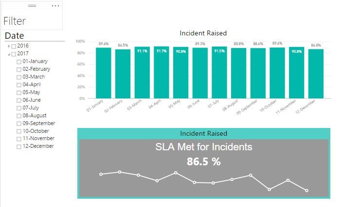
I would like to select a specific month in the filter and both charts display the history until the selected month.
For exemplo, I select 10-October. 11 and 12 Should disappear from the graph.
- Mark as New
- Bookmark
- Subscribe
- Mute
- Subscribe to RSS Feed
- Permalink
- Report Inappropriate Content
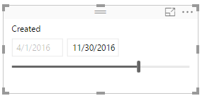
Is the visual marked "Filter" a custom visualization? With the standard "slicer" visualization in PBI, you can change it to a date range slider:
In the rop right there will be options of "between", "before", "after" etc. It's not quite as elegant as the Excel-style slicer that you show, but may serve your purposes.
Hope this helps
David
- Mark as New
- Bookmark
- Subscribe
- Mute
- Subscribe to RSS Feed
- Permalink
- Report Inappropriate Content
@thliberato wrote:
Good afternoon.
Look at the example below.
I would like to select a specific month in the filter and both charts display the history until the selected month.
For exemplo, I select 10-October. 11 and 12 Should disappear from the graph.
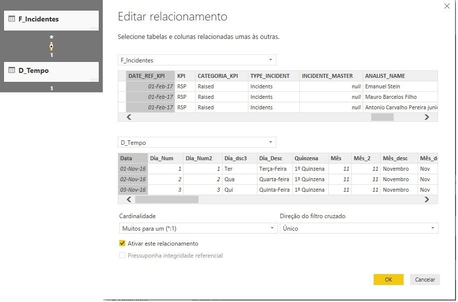
It should, as long as the date table in the filter has proper relationship with the data table.
- Mark as New
- Bookmark
- Subscribe
- Mute
- Subscribe to RSS Feed
- Permalink
- Report Inappropriate Content
@Eric_Zhang, this is the relationship.
I did not understand your suggestion to solve the problem.
I want to select a month in the filter, and my chart shows the history until the month chosen in the chart.
- Mark as New
- Bookmark
- Subscribe
- Mute
- Subscribe to RSS Feed
- Permalink
- Report Inappropriate Content
@thliberato wrote:
@Eric_Zhang, this is the relationship.
I did not understand your suggestion to solve the problem.
I want to select a month in the filter, and my chart shows the history until the month chosen in the chart.
Could you post a sample pbix for testing?
Helpful resources

Power BI Dataviz World Championships
The Power BI Data Visualization World Championships is back! It's time to submit your entry.

Power BI Monthly Update - January 2026
Check out the January 2026 Power BI update to learn about new features.

| User | Count |
|---|---|
| 60 | |
| 49 | |
| 30 | |
| 25 | |
| 23 |
| User | Count |
|---|---|
| 131 | |
| 103 | |
| 58 | |
| 39 | |
| 31 |


