FabCon is coming to Atlanta
Join us at FabCon Atlanta from March 16 - 20, 2026, for the ultimate Fabric, Power BI, AI and SQL community-led event. Save $200 with code FABCOMM.
Register now!- Power BI forums
- Get Help with Power BI
- Desktop
- Service
- Report Server
- Power Query
- Mobile Apps
- Developer
- DAX Commands and Tips
- Custom Visuals Development Discussion
- Health and Life Sciences
- Power BI Spanish forums
- Translated Spanish Desktop
- Training and Consulting
- Instructor Led Training
- Dashboard in a Day for Women, by Women
- Galleries
- Data Stories Gallery
- Themes Gallery
- Contests Gallery
- QuickViz Gallery
- Quick Measures Gallery
- Visual Calculations Gallery
- Notebook Gallery
- Translytical Task Flow Gallery
- TMDL Gallery
- R Script Showcase
- Webinars and Video Gallery
- Ideas
- Custom Visuals Ideas (read-only)
- Issues
- Issues
- Events
- Upcoming Events
Learn from the best! Meet the four finalists headed to the FINALS of the Power BI Dataviz World Championships! Register now
- Power BI forums
- Forums
- Get Help with Power BI
- Desktop
- Datatable - incorrect dates on columns
- Subscribe to RSS Feed
- Mark Topic as New
- Mark Topic as Read
- Float this Topic for Current User
- Bookmark
- Subscribe
- Printer Friendly Page
- Mark as New
- Bookmark
- Subscribe
- Mute
- Subscribe to RSS Feed
- Permalink
- Report Inappropriate Content
Datatable - incorrect dates on columns
Hello. I have created a datetable and built a stacked column visulisation. The values in the columns are correct but the dates, labelled on the axis are wrong. The dates in the tool tips are also correct. How can I resolve this please?
Solved! Go to Solution.
- Mark as New
- Bookmark
- Subscribe
- Mute
- Subscribe to RSS Feed
- Permalink
- Report Inappropriate Content
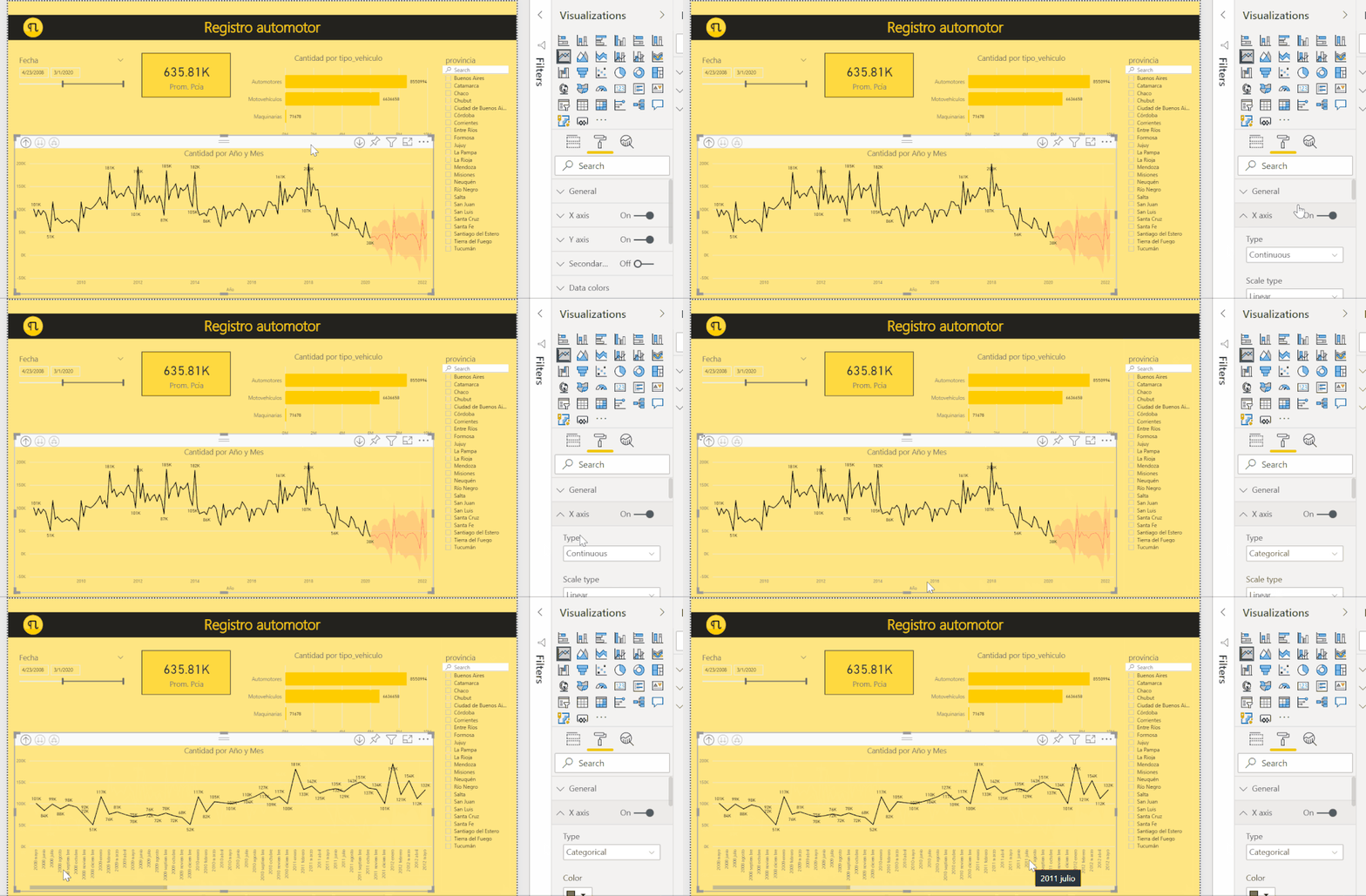
Hi, I think I see now. You have to change under formatting options the X-Axis from Continious to Categorial in order to see for each bar the exact thing you want. Otherwise it tries to draw an estimation of the places of the dates.
Like this:

Regards,
Happy to help!
- Mark as New
- Bookmark
- Subscribe
- Mute
- Subscribe to RSS Feed
- Permalink
- Report Inappropriate Content

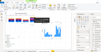
please see screen shot with images of the 2 charts affected
Chart 1, showing tool tip with correct date and column on legend with incorrect date
Chart 2, showing days in number not dates
Thanking you in anticipation
- Mark as New
- Bookmark
- Subscribe
- Mute
- Subscribe to RSS Feed
- Permalink
- Report Inappropriate Content
- Mark as New
- Bookmark
- Subscribe
- Mute
- Subscribe to RSS Feed
- Permalink
- Report Inappropriate Content
Hi. Can you explain a bit more about the problem? what is wrong with the axis? (please add a picture or describe de issue). Also it would help a lot if you explain your dataset, how is the date table built? is it related with the values in column chart?
Right now is difficult to understand the problem, the only thing I can think is that your months are not in order.
Regards,
Happy to help!
- Mark as New
- Bookmark
- Subscribe
- Mute
- Subscribe to RSS Feed
- Permalink
- Report Inappropriate Content
Hiya, I've now added a screenshot of the problem. This is a simple data set with data for 54 schools with values across a 3 month period from March to May. I am seeking to show the values, first by date, then by week. To do this I have created a dates table, based on advice from this forum. As I say, the data is correct, but table 1 has incorrect dates on the legend, althought the tooltips are correct. Table 2 shows dates as numbered days rather
than calendar dates
Hope that makes sense and looking forward to hearing from you.
Thanks for helping me
- Mark as New
- Bookmark
- Subscribe
- Mute
- Subscribe to RSS Feed
- Permalink
- Report Inappropriate Content
Hi, I think I see now. You have to change under formatting options the X-Axis from Continious to Categorial in order to see for each bar the exact thing you want. Otherwise it tries to draw an estimation of the places of the dates.
Like this:

Regards,
Happy to help!
Helpful resources

Join our Fabric User Panel
Share feedback directly with Fabric product managers, participate in targeted research studies and influence the Fabric roadmap.

Power BI Monthly Update - February 2026
Check out the February 2026 Power BI update to learn about new features.

| User | Count |
|---|---|
| 53 | |
| 51 | |
| 36 | |
| 15 | |
| 14 |
| User | Count |
|---|---|
| 92 | |
| 75 | |
| 41 | |
| 26 | |
| 25 |


